The Internet is suffering an epidemic of supply chain attacks, in which a trusted supplier of content is compromised and delivers malware to some or all of their clients. The recent SolarWinds compromise is just one glaring example. This talk reviews efforts to defend digital supply chains.Below the fold, the text of the talk with links to the sources.
A green padlock (with or without an organization name) indicates that:NB - this is misleading!
- You are definitely connected to the website whose address is shown in the address bar; the connection has not been intercepted.
- The connection between Firefox and the website is encrypted to prevent eavesdropping.
Dan Goodin One-stop counterfeit certificate shops for all your malware-signing needs
In one case, a prominent Dutch CA (DigiNotar) was compromised and the hackers were able to use the CA’s system to issue fake SSL certificates. The certificates were used to impersonate numerous sites in Iran, such as Gmail and Facebook, which enabled the operators of the fake sites to spy on unsuspecting site users. ... More recently, a large U.S.-based CA (TrustWave) admitted that it issued subordinate root certificates to one of its customers so the customer could monitor traffic on their internal network. Subordinate root certificates can be used to create SSL certificates for nearly any domain on the Internet. Although Trustwave has revoked the certificate and stated that it will no longer issue subordinate root certificates to customers, it illustrates just how easy it is for CAs to make missteps and just how severe the consequences of those missteps might be.In 2018 Sennheiser provided another example:
The issue with the two HeadSetup apps came to light earlier this year when German cyber-security firm Secorvo found that versions 7.3, 7.4, and 8.0 installed two root Certification Authority (CA) certificates into the Windows Trusted Root Certificate Store of users' computers but also included the private keys for all in the SennComCCKey.pem file.Certificates depend on public-key cryptography, which splits keys into public/private key pairs. Private keys can decrypt text encrypted by the public key, and vice versa. The security of the system depends upon private keys being kept secret. This poses two problems:
In a report published today, Secorvo researchers published proof-of-concept code showing how trivial would be for an attacker to analyze the installers for both apps and extract the private keys.Cimpanu also reports on a more recent case:
Making matters worse, the certificates are also installed for Mac users, via HeadSetup macOS app versions, and they aren't removed from the operating system's Trusted Root Certificate Store during current HeadSetup updates or uninstall operations.
...
Sennheiser's snafu ... is not the first of its kind. In 2015, Lenovo shipped laptops with a certificate that exposed its private key in a scandal that became known as Superfish. Dell did the exact same thing in 2016 in a similarly bad security incident that became known as eDellRoot.
Under the guise of a "cybersecurity exercise," the Kazakhstan government is forcing citizens in its capital of Nur-Sultan (formerly Astana) to install a digital certificate on their devices if they want to access foreign internet services.This type of “mistake” allows attackers to impersonate any Web site to affected devices.
Once installed, the certificate would allow the government to intercept all HTTPS traffic made from users' devices via a technique called MitM (Man-in-the-Middle).
The reason for the weakest-link is:
- Information asymmetry prevents buyers from knowing what CAs are really doing. Buyers are paying for the perception of security, a liability shield, and trust signals to third parties. None of these correlates verifiably with actual security. Given that CA security is largely unobservable, buyers’ demands for security do not necessarily translate into strong security incentives for CAs.
- Negative externalities of the weakest-link security of the system exacerbate these incentive problems. The failure of a single CA impacts the whole ecosystem, not just that CA’s customers. All other things being equal, these interdependencies undermine the incentives of CAs to invest, as the security of their customers depends on the efforts of all other CAs.
A crucial technical property of the HTTPS authentication model is that any CA can sign certificates for any domain name. In other words, literally anyone can request a certificate for a Google domain at any CA anywhere in the world, even when Google itself has contracted one particular CA to sign its certificate.This "technical property" is actually important, it is what enables a competitive market of CAs. Symantec in particular has exploited it wholesale:
Google's investigation revealed that over a span of years, Symantec CAs have improperly issued more than 30,000 certificates. ... They are a major violation of the so-called baseline requirements that major browser makers impose of CAs as a condition of being trusted by major browsers.But Symantec has suffered no effective sanctions because they are too big to fail:
Symantec's repeated violations underscore one of the problems Google and others have in enforcing terms of the baseline requirements. When violations are carried out by issuers with a big enough market share they're considered too big to fail. If Google were to nullify all of the Symantec-issued certificates overnight, it might cause widespread outages.My Firefox still trusts Symantec root certificates. Because Google, Mozilla and others prioritize keeping the Web working over keeping it secure, deleting misbehaving big CAs from trust lists won't happen. When Mozilla writes:
You are definitely connected to the website whose address is shown in the address bar; the connection has not been intercepted.they are assuming a world of honest CAs that isn't this world. If you have the locked padlock icon in your URL bar, you are probably talking to the right Web site, but there is a chance you aren't.
Brian Krebs Half of all Phishing Sites Now Have the Padlock
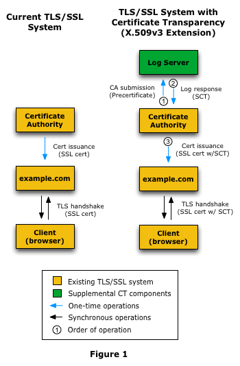
Certificate Transparency
In order to improve the security of Extended Validation (EV) certificates, Google Chrome requires Certificate Transparency (CT) compliance for all EV certificates issued after 1 Jan 2015.Clients now need two lists of trusted third parties, the CAs and the sources of CT attestations. The need for these trusted third parties is where the blockchain enthusiasts would jump in and claim (falsely) that using a blockchain would eliminate the need for trust. But CT has a much more sophisticated approach, Ronald Reagan's "Trust, but Verify". In the real world it isn't feasible to solve the problem of untrustworthy CAs by eliminating the need for trust. CT's approach instead is to provide a mechanism by which breaches of trust, both by the CAs and by the attestors, can be rapidly and unambiguously detected.
the Treasury Department, the State Department, the Commerce Department, the Energy Department and parts of the PentagonIt was not detected by any of the US government's network monitoring systems, but by FireEye, a computer security company that was also a victim. But for a mistake by the attackers at FireEye it would still be undetected. It was an extremely sophisticated attack, which has rightfully gained a lot of attention.
The malicious code was inserted in two stages into event-stream, a code library with 2 million downloads that's used by Fortune 500 companies and small startups alike. In stage one, version 3.3.6, published on September 8, included a benign module known as flatmap-stream. Stage two was implemented on October 5 when flatmap-stream was updated to include malicious code that attempted to steal bitcoin wallets and transfer their balances to a server located in Kuala Lumpur.How were the attackers able to do this? Goodin explains:
According to the Github discussion that exposed the backdoor, the longtime event-stream developer no longer had time to provide updates. So several months ago, he accepted the help of an unknown developer. The new developer took care to keep the backdoor from being discovered. Besides being gradually implemented in stages, it also narrowly targeted only the Copay wallet app. The malicious code was also hard to spot because the flatmap-stream module was encrypted.All that was needed to implement this type A attack was e-mail and github accounts, and some social engineering.
In a nutshell, the attack works this way: on launch, Nox.exe sends a request to a programming interface to query update information. The BigNox API server responds with update information that includes a URL where the legitimate update is supposed to be available. Eset speculates that the legitimate update may have been replaced with malware or, alternatively, a new filename or URL was introduced.[Slide 11]
Malware is then installed on the target’s machine. The malicious files aren’t digitally signed the way legitimate updates are. That suggests the BigNox software build system isn’t compromised; only the systems for delivering updates are. The malware performs limited reconnaissance on the targeted computer. The attackers further tailor the malicious updates to specific targets of interest.
Each Cobalt Strike DLL implant was prepared to be unique per machine and avoided at any cost overlap and reuse of folder name, file name, export function names, C2 domain/IP, HTTP requests, timestamp, file metadata, config, and child process launched. This extreme level of variance was also applied to non-executable entities, such as WMI persistence filter name, WMI filter query, passwords used for 7-zip archives, and names of output log files.
Way back in 1974, Paul Karger and Roger Schell discovered a devastating attack against computer systems. Ken Thompson described it in his classic 1984 speech, "Reflections on Trusting Trust." Basically, an attacker changes a compiler binary to produce malicious versions of some programs, INCLUDING ITSELF. Once this is done, the attack perpetuates, essentially undetectably. Thompson demonstrated the attack in a devastating way: he subverted a compiler of an experimental victim, allowing Thompson to log in as root without using a password. The victim never noticed the attack, even when they disassembled the binaries -- the compiler rigged the disassembler, too.
It is common for a program to depend, directly or indirectly, on thousands of packages and libraries. For example, Kubernetes now depends on about 1,000 packages. Open source likely makes more use of dependencies than closed source, and from a wider range of suppliers; the number of distinct entities that need to be trusted can be very high. This makes it extremely difficult to understand how open source is used in products and what vulnerabilities might be relevant. There is also no assurance that what is built matches the source code.The bulk of their post addresses improvements to the quality of the development process, with three goals:
Taking a step back, although supply-chain attacks are a risk, the vast majority of vulnerabilities are mundane and unintentional—honest errors made by well-intentioned developers. Furthermore, bad actors are more likely to exploit known vulnerabilities than to find their own: it’s just easier. As such, we must focus on making fundamental changes to address the majority of vulnerabilities, as doing so will move the entire industry far along in addressing the complex cases as well, including supply-chain attacks.
This is a big task, and currently unrealistic for the majority of open source. Part of the beauty of open source is its lack of constraints on the process, which encourages a wide range of contributors. However, that flexibility can hinder security considerations. We want contributors, but we cannot expect everyone to be equally focused on security. Instead, we must identify critical packages and protect them. Such critical packages must be held to a range of higher development standards, even though that might add developer friction.[Slide 16]
In 2019, Dominique Luster gave a super good Code4Lib talk about applying AI to metadata for the Charles “Teenie” Harris collection at the Carnegie Museum of Art — more than 70,000 photographs of Black life in Pittsburgh. They experimented with solutions to various metadata problems, but the one that’s stuck in my head since 2019 is the face recognition one. It sure would be cool if you could throw AI at your digitized archival photos to find all the instances of the same person, right? Or automatically label them, given that any of them are labeled correctly?
Sadly, because we cannot have nice things, the data sets used for pretrained face recognition embeddings are things like lots of modern photos of celebrities, a corpus which wildly underrepresents 1) archival photos and 2) Black people. So the results of the face recognition process are not all that great.
I have some extremely technical ideas for how to improve this — ideas which, weirdly, some computer science PhDs I’ve spoken with haven’t seen in the field. So I would like to experiment with them. But I must first invent the universe set up a data processing pipeline.
Three steps here:
For step 1, I’m using DPLA, which has a super straightforward and well-documented API and an easy-to-use Python wrapper (which, despite not having been updated in a while, works just fine with Python 3.6, the latest version compatible with some of my dependencies).
For step 2, I’m using mtcnn, because I’ve been following this tutorial.
For step 3, face recognition, I’m using the steps in the same tutorial, but purely for proof-of-concept — the results are garbage because archival photos from mid-century don’t actually look anything like modern-day celebrities. (Neural net: “I have 6% confidence this is Stevie Wonder!” How nice for you.) Clearly I’m going to need to build my own corpus of people, which I have a plan for (i.e. I spent some quality time thinking about numpy) but haven’t yet implemented.
So far the gotchas have been:
Gotcha 1: If you fetch a page from the API and assume you can treat its contents as an image, you will be sad. You have to treat them as a raw data stream and interpret that as an image, thusly:
from PIL import Image
import requests

response = requests.get(url, stream=True)
response.raw.decode_content = True
data = requests.get(url).content
Image.open(io.BytesIO(data))
This code is, of course, hilariously lacking in error handling, despite fetching content from a cesspool of untrustworthiness, aka the internet. It’s a first draft.
Gotcha 2: You see code snippets to convert images to pixel arrays (suitable for AI ingestion) that look kinda like this: np.array(image).astype('uint8'). Except they say astype('float32') instead of astype('uint32'). I got a creepy photonegative effect when I used floats.
Gotcha 3: Although PIL was happy to manipulate the .pngs fetched from the API, it was not happy to write them to disk; I needed to convert formats first (image.convert('RGB')).
Gotcha 4: The suggested keras_vggface library doesn’t have a Pipfile or requirements.txt, so I had to manually install keras and tensorflow. Luckily the setup.py documented the correct versions. Sadly the tensorflow version is only compatible with python up to 3.6 (hence the comment about DPyLA compatibility above). I don’t love this, but it got me up and running, and it seems like an easy enough part of the pipeline to rip out and replace if it’s bugging me too much.
The plan from here, not entirely in order, subject to change as I don’t entirely know what I’m doing until after I’ve done it:
Last Friday I was interviewed for the podcast The Grasscast — a game-themed podcast named after the book, The Grasshopper: Games, Life, and Utopia. I ramble a little bit in the episode as I tried to be more open and conversational than concise and correct. But I also spoke that way because for some of the questions, no pat answer came immediately to mind.
There was one question that stumped me but in my trying to answer, I think I found something I had not considered before. The question was, What is one bad thing about games? And I tried to convey that, unlike video games where you can play with strangers, most tabletop games are generally constrained by the preferences of your social circles. In order to convince others to spend time on a game that might think is too complicated for them or not for them, you need to have be a successful evangelist.
Also the episode drifts into chatter about libraries, copyright and ebooks.
This week, I reviewed and published another batch of works for our institutional repository from our department of History that was prepared by our library assistants at Leddy At this point, we have reviewed and uploaded the works of half the faculty from this department. I’m hoping to finish the rest this month but I think I have some outstanding H5P work that might push the end of this project til March.
This morning I assisted with an online workshop called Data Analysis and Visualization in R for Ecologists that was being lead by a colleague of mine.
R Version 4.0.3 (“Bunny-Wunnies Freak Out”) was released on 2020-10-10.
The release of R 4.0.4 (“Lost Library Book”) is scheduled for Monday 2021-02-15.
On Sunday, I published a short response to “Windsor Works – An Economic Development Strategy” which is going to City Council on Monday.
Why am I writing about this document here?
I am mention this here because the proposed strategy (L.I.F.T.) lists the following as potential metric for measuring the strategy’s success…

Take it from me, someone who knows a quite a bit about citations — the city should use another metric — perhaps one pertaining to local unemployment levels instead.
A viral post from 2019 resurfaced on my FB feed this week and unlike most of the posts I read there, this one did spark joy:

And it struck me how much I loved that the anti-prom was being at the library.
So I started doing some research!
It appears to me that some anti-proms are technically better described as alternative proms. These proms have been established as an explicitly safe place where LGBTQ young people can enjoy prom. Other anti-proms are true morps.

I now wonder what other anti-traditions should find a home at the public library.
2021-02-05T19:29:23+00:00 Mita Williams David Rosenthal: Chromebook Linux Update https://blog.dshr.org/2021/02/chromebook-linux-update.html My three Acer C720 Chromebooks running Linux are still giving yeoman service, although for obvious reasons I'm not travelling these days. But it is time for an update to 2017's Travels with a Chromebook. Below the fold, an account of some adventures in sysadmin.sudo apt-get install linux-headers-5.0.0-32 linux-headers-5.0.0-32-generic linux-image-5.0.0-32-generic linux-modules-5.0.0-32-generic linux-modules-extra-5.0.0-32-generic
GRUB_TIMEOUT_STYLE=menu
GRUB_TIMEOUT=15
GRUB_SAVEDEFAULT=true
GRUB_DEFAULT=saved
The move to systemd caused a regression in ecrypts which is responsible for mounting/unmounting encrypted home directories when you login and logout. Because of this issue, please be aware that in Mint 20 and newer releases, your encrypted home directory is no longer unmounted on logout: https://bugs.launchpad.net/ubuntu/+source/gnome-session/+bug/1734541.Mint 19 with a full-disk encryption had this problem but I haven't been able to reproduce it with Mint 20 and the 5.0.0-32 kernel. Home directory encryption works, but will leave its contents decrypted after you log out, rather spoiling the point.
Meg Foulkes discusses public impact algorithms and why they matter.

This is what Robert Williams said to police when he was presented with the evidence upon which he was arrested for stealing watches in June 2020. Williams had been identified by an algorithm, when Detroit Police ran grainy security footage from the theft through a facial recognition system. Before questioning Williams, or checking for any alibi, he was arrested. It was not until the matter came to trial that Detroit Police admitted that he had been falsely, and solely, charged on the output of an algorithm.
It’s correct to say that in many cases, when AI and algorithms go wrong, the impact is pretty innocuous – like when a music streaming service recommends music you don’t like. But often, AI and algorithms go wrong in ways that cause serious harm, as in the case of Robert Williams. Although he had done absolutely nothing wrong, he was deprived of a fundamental right on the basis of a computer output: his liberty.
It’s not just on an individual scale that these harms are felt. Algorithms are written by humans, so they can reflect human biases. What algorithms can do is amplify, through automatedly entrenching the bias, this prejudice over a massive scale.
The bias isn’t exclusively racialised; last year, an algorithm used to determine exam grades disproportionately downgraded disadvantaged students. Throughout the pandemic, universities have been turning to remote proctoring software that falsely identifies students with disabilities as cheats. For example, those who practice self-stimulatory behaviour or ‘stimming’ may get algorithmically flagged again and again for suspicious behaviour, or have to disclose sensitive medical information to avoid this.
We identify these types of algorithms as ‘public impact algorithms’ to clearly name the intended target of our concern. There is a big difference between the harm caused by inaccurate music suggestions and algorithms that have the potential to deprive us of our fundamental rights. To call out these harms, we have to precisely define the problem. Only then can we hold the deployers of public impact algorithms to account, and ultimately to achieve our mission of ensuring public impact algorithms do no harm.
2021-02-04T11:08:37+00:00 Meg Foulkes Ed Summers: Outgoing https://inkdroid.org/2021/02/04/legislators-social/

Mark Graham posed a question to me earlier today asking what we know about the Twitter accounts of the members of Congress, specifically whether they have been removed after they left office. The hypothesis was that some members of the House and Senate may decide to delete their account on leaving DC.
I was immediately reminded of the excellent congress-legislators project which collects all kinds of information about House and Senate members including their social media accounts into YAML files that are versioned in a GitHub repository. GitHub is a great place to curate a dataset like this because it allows anyone with a GitHub account to contribute to editing the data, and to share utilities to automate checks and modifications.
Unfortunately the file that tracks social media accounts is only for current members. Once they leave office they are removed from the file. The project does track other historical information for legislators. But the social media data isn’t pulled in when this transition happens, or so it seems.
Luckily Git doesn’t forget. Since the project is using a version control system all of the previously known social media links are in the history of the repository! So I wrote a small program that uses gitpython to walk the legislators-social-media.yaml file backwards in time through each commit, parse the YAML at that previous state, and merge that information into a union of all the current and past legislator information. You can see the resulting program and output in us-legislators-social.
There’s a little bit of a wrinkle in that not everything in the version history should be carried forward because errors were corrected and bugs were fixed. Without digging into the diffs and analyzing them more it’s hard to say whether a commit was a bug fix or if it was simply adding new or deleting old information. If the YAML doesn’t parse at a particular state that’s easy to ignore.
It also looks like the maintainers split out account ids from account usernames at one point. Derek Willis helpfully pointed out to me that Twitter don’t care about the capitalization of usernames in URLs, so these needed to be normalized when merging the data. The same is true of Facebook, Instagram and YouTube. I guarded against these cases but if you notice other problems let me know.
With the resulting merged historical data it’s not too hard to write a program to read in the data, identify the politicians who left office after the 116th Congress, and examine their Twitter accounts to see that they are live. It turned out to be a little bit harder than I expected because it’s not as easy as you might think to check if a Twitter account is live or not.
Twitter’s web servers return a HTTP 200 OK message even when responding to requests for URLs of non-existent accounts. To complicate things further the error message that displays indicating it is not an account only displays when the page is rendered in a browser. So a simple web scraping job that looks at the HTML is not sufficient.
And finally just because a Twitter username no longer seems to work, it’s possible that the user has changed it to a new screen_name. Fortunately the unitedstates project also tracks the Twitter User ID (sometimes). If the user account is still there you can use the Twitter API to look up their current screen_name and see if it is different.
After putting all this together it’s possible to generate a simple table of legislators who left office at the end of the 116th Congress, and their Twitter account information.
| name | url |
url_ok |
user_id | new_url |
|---|---|---|---|---|
| Lamar Alexander | https://twitter.com/senalexander | True | 76649729 | |
| Michael B. Enzi | https://twitter.com/senatorenzi | True | 291756142 | |
| Pat Roberts | https://twitter.com/senpatroberts | True | 75364211 | |
| Tom Udall | https://twitter.com/senatortomudall | True | 60828944 | |
| Justin Amash | https://twitter.com/justinamash | True | 233842454 | |
| Rob Bishop | https://twitter.com/reprobbishop | True | 148006729 | |
| K. Michael Conaway | https://twitter.com/conawaytx11 | True | 295685416 | |
| Susan A. Davis | https://twitter.com/repsusandavis | False | 432771620 | |
| Eliot L. Engel | https://twitter.com/repeliotengel | True | 164007407 | |
| Bill Flores | https://twitter.com/repbillflores | False | 237312687 | |
| Cory Gardner | https://twitter.com/sencorygardner | True | 235217558 | |
| Peter T. King | https://twitter.com/reppeteking | True | 18277655 | |
| Steve King | https://twitter.com/stevekingia | True | 48117116 | |
| Daniel Lipinski | https://twitter.com/replipinski | True | 1009269193 | |
| David Loebsack | https://twitter.com/daveloebsack | True | 510516465 | |
| Nita M. Lowey | https://twitter.com/nitalowey | True | 221792092 | |
| Kenny Marchant | https://twitter.com/repkenmarchant | True | 23976316 | |
| Pete Olson | https://twitter.com/reppeteolson | True | 20053279 | |
| Martha Roby | https://twitter.com/repmartharoby | False | 224294785 | https://twitter.com/MarthaRobyAL |
| David P. Roe | https://twitter.com/drphilroe | True | 52503751 | |
| F. James Sensenbrenner, Jr. | https://twitter.com/jimpressoffice | False | 851621377 | |
| José E. Serrano | https://twitter.com/repjoseserrano | True | 33563161 | |
| John Shimkus | https://twitter.com/repshimkus | True | 15600527 | |
| Mac Thornberry | https://twitter.com/mactxpress | True | 377534571 | |
| Scott R. Tipton | https://twitter.com/reptipton | True | 242873057 | |
| Peter J. Visclosky | https://twitter.com/repvisclosky | True | 193872188 | |
| Greg Walden | https://twitter.com/repgregwalden | True | 32010840 | |
| Rob Woodall | https://twitter.com/reprobwoodall | True | 2382685057 | |
| Ted S. Yoho | https://twitter.com/reptedyoho | True | 1071900114 | |
| Doug Collins | https://twitter.com/repdougcollins | True | 1060487274 | |
| Tulsi Gabbard | https://twitter.com/tulsipress | True | 1064206014 | |
| Susan W. Brooks | https://twitter.com/susanwbrooks | True | 1074101017 | |
| Joseph P. Kennedy III | https://twitter.com/repjoekennedy | False | 1055907624 | https://twitter.com/joekennedy |
| George Holding | https://twitter.com/repholding | True | 1058460818 | |
| Denny Heck | https://twitter.com/repdennyheck | False | 1068499286 | https://twitter.com/LtGovDennyHeck |
| Bradley Byrne | https://twitter.com/repbyrne | True | 2253968388 | |
| Ralph Lee Abraham | https://twitter.com/repabraham | True | 2962891515 | |
| Will Hurd | https://twitter.com/hurdonthehill | True | 2963445730 | |
| David Perdue | https://twitter.com/sendavidperdue | True | 2863210809 | |
| Mark Walker | https://twitter.com/repmarkwalker | True | 2966205003 | |
| Francis Rooney | https://twitter.com/reprooney | True | 816111677917851649 | |
| Paul Mitchell | https://twitter.com/reppaulmitchell | True | 811632636598910976 | |
| Doug Jones | https://twitter.com/sendougjones | True | 941080085121175552 | |
| TJ Cox | https://twitter.com/reptjcox | True | 1080875913926139910 | |
| Gilbert Ray Cisneros, Jr. | https://twitter.com/repgilcisneros | True | 1080986167003230208 | |
| Harley Rouda | https://twitter.com/repharley | True | 1075080722241736704 | |
| Ross Spano | https://twitter.com/reprossspano | True | 1090328229548826627 | |
| Debbie Mucarsel-Powell | https://twitter.com/repdmp | True | 1080941062028447744 | |
| Donna E. Shalala | https://twitter.com/repshalala | False | 1060584809095925762 | |
| Abby Finkenauer | https://twitter.com/repfinkenauer | True | 1081256295469068288 | |
| Steve Watkins | https://twitter.com/rep_watkins | False | 1080307235350241280 | |
| Xochitl Torres Small | https://twitter.com/reptorressmall | True | 1080830346915209216 | |
| Max Rose | https://twitter.com/repmaxrose | True | 1078692057940742144 | |
| Anthony Brindisi | https://twitter.com/repbrindisi | True | 1080978331535896576 | |
| Kendra S. Horn | https://twitter.com/repkendrahorn | False | 1083019402046513152 | https://twitter.com/KendraSHorn |
| Joe Cunningham | https://twitter.com/repcunningham | True | 1080198683713507335 | |
| Ben McAdams | https://twitter.com/repbenmcadams | False | 196362083 | https://twitter.com/BenMcAdamsUT |
| Denver Riggleman | https://twitter.com/repriggleman | True | 1080504024695222273 |
In most cases where the account has been updated the individual simply changed their Twitter username, sometimes remove “Rep” from it–like RepJoeKennedy to JoeKennedy. As an aside I’m kind of surprised that Twitter username wasn’t taken to be honest. Maybe that’s a perk of having a verified account or of being a politician? But if you look closely you can see there were a few that seemed to have deleted their account altogether:
| name | url |
|
user_id |
|---|---|---|---|
| Susan A. Davis | https://twitter.com/repsusandavis | False | 432771620 |
| Bill Flores | https://twitter.com/repbillflores | False | 237312687 |
| F. James Sensenbrenner, Jr. | https://twitter.com/jimpressoffice | False | 851621377 |
| Donna E. Shalala | https://twitter.com/repshalala | False | 1060584809095925762 |
| Steve Watkins | https://twitter.com/rep_watkins | False | 1080307235350241280 |
There are two notable exceptions to this. The first is Vice President Kamala Harris. My logic for determining if a person was leaving Congress was to see if they served in a term ending on 2021-01-03, and weren’t serving in a term starting then. But Harris is different because her term as a Senator is listed as ending on 2021-01-18. Her old account (???) is no longer available, but her Twitter User ID is still active and is now attached to the account at (???). The other of course is Joe Biden, who stopped being a senator in order to become the President. His Twitter account remains the same at (???).
It’s worth highlighting here how there seems to be no uniform approach to handling this process. In one case (???) is temporarily blessed as the VP, with a unified account history underneath. In the other there is a separation between (???) and (???). It seems like Twitter has some work to do on managing identities, or maybe the Congress needs to prescribe a set of procedures? Or maybe I’m missing part of the picture, and that just as (???) somehow changed back to (???) there is some namespace management going on behind the scenes?
If you are interested in other social media platforms like Facebook, Instagram and YouTube the unitedstates project tracks information for those platforms too. I merged that information into the legislators.yaml file I discussed here if you want to try to check them. I think that one thing this experiment shows is that if the platform allows for usernames to be changed it is critical to track the user id as well. I didn’t do the work to check that those accounts exist. But that’s a project for another day.
I’m not sure this list of five deleted accounts is terribly interesting at the end of all this. Possibly? But on the plus side I did learn how to interact with Git better from Python, which is something I can imagine returning to in the future. It’s not every day that you have to think of the versions of a dataset as an important feature of the data, outside of serving as a backup that can be reverted to if necessary. But of course data changes in time, and if seeing that data over time is useful, then the revision history takes on a new significance. It’s nothing new to see version control systems as critical data provenance technologies, but it felt new to actually use one that way to answer a question. Thanks Mark!
2021-02-04T05:00:00+00:00 David Rosenthal: Stablecoins https://blog.dshr.org/2020/12/stablecoins.html I have long been skeptical of Bitcoin's "price" and, despite its recent massive surge, I'm still skeptical. But it turns out I was wrong two years ago when I wrote in Blockchain: What's Not To Like?:Permissionless blockchains require an inflow of speculative funds at an average rate greater than the current rate of mining rewards if the "price" is not to collapse. To maintain Bitcoin's price at $4K requires an inflow of $300K/hour.I found it hard to believe that this much actual money would flow in, but since then Bitcoin's "price" hasn't dropped below $4K, so I was wrong. Caution — I am only an amateur economist, and what follows below the fold is my attempt to make sense of what is going on.
| Source |
 |
| Source |
 |
| Source |
 |
| Source |
 |
| Source |
the $2.8 billion worth of tethers are only 74% backed:If USDT isn't backed by USD, what is backing it, and is 1USDT really worth 1USD?Tether has cash and cash equivalents (short term securities) on hand totaling approximately $2.1 billion, representing approximately 74 percent of the current outstanding tethers.
 |
| Source |
Please note that Coinbase does not support USDT — do not send it to your Bitcoin account on Coinbase.Because of USDT's history and reputation, exchanges that do offer a "fiat off-ramp" are taking a significant risk, so they will impose a spread; the holder will get less than $1. Why would you send $1 to Tether to get less than $1 back?
|
| Source |
Rather than demand from cash investors, these patterns are most consistent with the supply‐based hypothesis of unbacked digital money inflating cryptocurrency prices.Their paper was originally published in 2018 and updated in 2019 and 2020.
A friend of mine, who works in finance, asked me to explain what Tether was.
Short version: Tether is the internal accounting system for the largest fraud since Madoff.

BaFin conducted multiple investigations against journalists and short sellers because of alleged market manipulation, in response to negative media reporting of Wirecard. ... Critics cite the German regulator, press and investor community's tendency to rally around Wirecard against what they perceive as unfair attack. ... After initially defending BaFin's actions, its president Felix Hufeld later admitted the Wirecard Scandal is a "complete disaster".Similarly, the cryptocurrency world has a long history of both attacking and ignoring realistic critiques. An example of ignoring is the DAO:
The Decentralized Autonomous Organization (The DAO) was released on 30th April 2016, but on 27th May 2016 Dino Mark, Vlad Zamfir, and Emin Gün Sirer posted A Call for a Temporary Moratorium on The DAO, pointing out some of its vulnerabilities; it was ignored. Three weeks later, when The DAO contained about 10% of all the Ether in circulation, a combination of these vulnerabilities was used to steal its contents.
|
| Source |
The purpose of the crypto industry, and all its little service sub-industries, is to generate a narrative that will maintain and enhance the flow of actual dollars from suckers, and keep the party going.Gerard links to Bryce Weiner's Hopes, Expectations, Black Holes, and Revelations — or How I Learned To Stop Worrying and Love Tether which starts from the incident in April of 2018 when Bitfinex, the cryptocurrency exchange behind Tether, encountered a serious problem:
Increasing quantities of tethers are required to make this happen. We just topped twenty billion alleged dollars’ worth of tethers, sixteen billion of those just since March 2020. If you think this is sustainable, you’re a fool.
the wildcat bank backing Tether was raided by Interpol for laundering of criminally obtained assets to the tune of about $850,000,000. The percentage of that sum which was actually Bitfinex is a matter of some debate but there’s no sufficient reason not to think it was all theirs.At the time, USDT's "market cap" was around $2.3B, so assuming Tether was actually backed by USD at that point, it lost 37% of its backing. This was a significant problem, more than enough to motivate shenanigans.
...
the nature of the problem also presented a solution: instead of backing Tether in actual dollars, stuff a bunch of cryptocurrency in a basket to the valuation of the cash that got seized and viola! A black hole is successfully filled with a black hole, creating a stable asset.
 |
| Source |
We saw about 300 million Tethers being lined up on Binance and Huobi in the week previously. These were then deployed en masse.See Cryptocurrency Pump-and-Dump Schemes by Tao Li, Donghwa Shin and Baolian Wang.
You can see the pump starting at 13:38 UTC on 16 December. BTC was $20,420.00 on Coinbase at 13:45 UTC. Notice the very long candles, as bots set to sell at $20,000 sell directly into the pump.
 |
| Source |
Lots of people deposited stablecoins to exchanges 7 mins before breaking $20k.Note that "7 mins" is about one Bitcoin block time, and by "exchange users" he means "addresses — it could have been a pre-programmed "smart contract".
Price is all about consensus. I guess the sentiment turned around to buy $BTC at that time.
...
ETH block interval is 10-20 seconds.
This chart means 127 exchange users worldwide were trying to deposit #stablecoins in a single block — 10 seconds.
USDC loudly touts claims that it’s well-regulated, and implies that it’s audited. But USDC is not audited — accountants Grant Thornton sign a monthly attestation that Centre have told them particular things, and that the paperwork shows the right numbers.
In my career working in the academic sector, I have realized that one thing that is often missing from in-house software development is “product management.”
But what does that mean exactly? You don’t know it’s missing if you don’t even realize it’s a thing and people can use different terms to mean different roles/responsibilities.
Basically, deciding what the software should do. This is not about colors on screen or margins (what our stakeholderes often enjoy micro-managing) — I’d consider those still the how of doing it, rather than the what to do. The what is often at a much higher level, about what features or components to develop at all.
When done right, it is going to be based on both knowledge of the end-user’s needs and preferences (user research); but also knowledge of internal stakeholder’s desires and preferences (overall organiational strategy, but also just practically what is going to make the right people happy to keep us resourced). Also knowledge of the local capacity, what pieces do we need to put in place to get these things developed. When done seriously, it will necessarily involve prioritization — there are many things we could possibly done, some subset of them we very well may do eventually, but which ones should we do now?
My experience tells me it is a very big mistake to try to have a developer doing this kind of product management. Not because a developer can’t have the right skillset to do them. But because having the same person leading development and product management is a mistake. The developer is too close to the development lense, and there’s just a clarification that happens when these roles are separate.
My experience also tells me that it’s a mistake to have a committee doing these things, much as that is popular in the academic sector. Because, well, just of course it is.
But okay this is all still pretty abstract. Things might become more clear if we get more specific about the actual tasks and work of this kind of product management role.
I found Damilola Ajiboye blog post on “Product Manager vs Product Marketing Manager vs Product Owner” very clear and helpful here. While it is written so as to distinguish between three different product management related roles, but Ajiboye also acknowledges that in a smaller organization “a product manager is often tasked with the duty of these 3 roles.
Regardless of if the responsibilities are to be done by one or two or three person, Ajiboye’s post serves as a concise listing of the work to be done in managing a product — deciding the what of the product, in an ongoing iterative and collaborative manner, so that developers and designers can get to the how and to implementation.
I recommend reading the whole article, and I’ll excerpt much of it here, slightly rearranged.
The Product Manager
These individuals are often referred to as mini CEOs of a product. They conduct customer surveys to figure out the customer’s pain and build solutions to address it. The PM also prioritizes what features are to be built next and prepares and manages a cohesive and digital product roadmap and strategy.
The Product Manager will interface with the users through user interviews/feedback surveys or other means to hear directly from the users. They will come up with hypotheses alongside the team and validate them through prototyping and user testing. They will then create a strategy on the feature and align the team and stakeholders around it. The PM who is also the chief custodian of the entire product roadmap will, therefore, be tasked with the duty of prioritization. Before going ahead to carry out research and strategy, they will have to convince the stakeholders if it is a good choice to build the feature in context at that particular time or wait a bit longer based on the content of the roadmap.
The Product Marketing Manager
The PMM communicates vital product value — the “why”, “what” and “when” of a product to intending buyers. He manages the go-to-market strategy/roadmap and also oversees the pricing model of the product. The primary goal of a PMM is to create demand for the products through effective messaging and marketing programs so that the product has a shorter sales cycle and higher revenue.The product marketing manager is tasked with market feasibility and discovering if the features being built align with the company’s sales and revenue plan for the period. They also make research on how sought-after the feature is being anticipated and how it will impact the budget. They communicate the values of the feature; the why, what, and when to potential buyers — In this case users in countries with poor internet connection.
[While expressed in terms of a for-profit enterprise selling something, I think it’s not hard to translate this to a non-profit or academic environment. You still have an audience whose uptake you need to be succesful, whether internal or external. — jrochkind ]
The Product Owner
A product owner (PO) maximizes the value of a product through the creation and management of the product backlog, creation of user stories for the development team. The product owner is the customer’s representative to the development team. He addresses customer’s pain points by managing and prioritizing a visible product backlog. The PO is the first point of call when the development team needs clarity about interpreting a product feature to be implemented.The product owner will first have to prioritize the backlog to see if there are no important tasks to be executed and if this new feature is worth leaving whatever is being built currently. They will also consider the development effort required to build the feature i.e the time, tools, and skill set that will be required. They will be the one to tell if the expertise of the current developers is enough or if more engineers or designers are needed to be able to deliver at the scheduled time. The product owner is also armed with the task of interpreting the product/feature requirements for the development team. They serve as the interface between the stakeholders and the development team.
When you have someone(s) doing these roles well, it ensures that the development team is actually spending time on things that meet user and business needs. I have found that it makes things so much less stressful and more rewarding for everyone involved.
When you have nobody doing these roles, or someone doing it in a cursory or un-intentional way not recognized as part of their core job responsibilities, or have a lead developer trying to do it on top of develvopment, I find it leads to feelings of: spinning wheels, everything-is-an-emergency, lack of appreciation, miscommunication and lack of shared understanding between stakeholders and developers, general burnout and dissatisfaction — and at the root, a product that is not meeting user or business needs well, leading to these inter-personal and personal problems.
2021-02-03T20:44:17+00:00 jrochkind Islandora: Islandora Open Meeting: February 23, 2021 https://islandora.ca/content/islandora-open-meeting-february-23-2021 Islandora Open Meeting: February 23, 2021 manez Wed, 02/03/2021 - 19:09We will be holding another open drop-in session on Tuesday, February 23 from 10:00 AM to 2:00 PM Eastern. Full details, and the Zoom link to join, are in this Google doc. The meeting is free form, with experienced Islandora 8 users on hand to answer questions or give demos on request. Please drop in at any time during the four-hour window.
Registration is not required. If you would like a calendar invite as a reminder, please let us know at community@islandora.ca.
Library support for bibliometrics and research impact (BRI) analysis is a growing area of library investment and service. Not just in the provision of services to researchers, but for the institutions themselves, which increasingly need to quantify research impact for a spectrum of internally and externally motivated purposes, such as strategic decision support, benchmarking, reputation analysis, support for funding requests, and to better understand research performance.
Research libraries are adopting new roles to support bibliometrics and research impact analysis, and the University of Waterloo Library’s efforts have caught my attention for some time, and for two specific reasons:
Alison Hitchens, Associate University Librarian for Collections, Technology, and Scholarly Communication, and Laura Bredahl, Bibliometrics and Research Impact Librarian, recently shared about their activities in an OCLC Research Library Partnership (RLP) Works in Progress webinar presentation entitled Case study—Supporting bibliometric and research impact analysis at the University of Waterloo. Their efforts also will be described in a forthcoming ARL Library Practice Brief on Supporting Bibliometric Data Needs at Academic Institutions.
Like many institutions, the library at Waterloo has been supporting individual researchers with bibliometrics information for reputation management for over a decade. However, around 2012 the university recognized that it needed an institutional understanding of bibliometrics because important external stakeholders like funders, governments, and other accountability organizations were using them to evaluate their organization. Additionally, as the campus developed a new strategic plan emphasizing transformational research, it also needed indicators to help chart progress. As a result, the provost established a working group on bibliometrics that included cross-institutional representation from the office of research, office of institutional analysis, library, and faculties, with the goal to provide guidance to the university on the effective and appropriate use of bibliometrics.
This working group led to a few significant outcomes:
The white paper was followed by the development of a research metrics framework, intended to provide detailed bibliometric indicators related to the work of research institutes supporting key research areas identified in the 2013-2018 strategic plan. And this in turn was followed in 2019 by the development of an internal Bibliometric Assessment Tools Report, offering an extremely detailed review of existing bibliometrics assessment tools, known use cases, and an overview of other prominent bibliometrics tools. The Working Group on Bibliometrics continues its work today, supporting the current strategic plan, particularly by advising on the definitions of research areas and the responsible use of indicators at the institutional level.
Laura described several examples of her work at Waterloo:
 Photo by Adam Nowakowski on Unsplash
Libraries seem to me to be a natural place for bibliometrics and research impact leadership. Librarians have expertise across the research and scholarly communications life cycle, understand disciplinary differences—and how these impact bibliometrics—and also have extensive knowledge with bibliographic data and tools.
In general, this type of engagement can also positively impact the library by “raising the profile of the library on campus.” For example, in the webinar Alison commented,
“It was clear to me that being connected to and known by high level administration in the Office of Research really had an impact on building partnerships in other areas such as research data management. It was a lot easier to send an email or pick up the phone and call an AVP of Research because they knew me through the working group on bibliometrics.”
Overall, this type of activity may result in greater stakeholder appreciation for the value proposition of the library, an improved understanding of the scope of library expertise, and more invitations for the library to participate on campus committees and enterprise-wide projects. At Waterloo, for example, this included opportunities for the AUL to join the Office of Research Systems Advisory Group and for the library to contribute to the institutional RIM project. As the new strategic planning effort has launched, and seven working groups were formed to develop background papers, the library was in a position to successfully advocate for a librarian on each committee.
Of course there’s much more to discuss, so we are offering affiliates with the Research Library Partnership an opportunity to continue the conversation through informal small group discussions with Alison and Laura. Please join us on the following dates:
We are interested in exploring some of these questions:
If you send me an email message, I will send you a calendar invitation (which can help to make sure all the time zones align).
The post Emerging Roles for Libraries in Bibliometric and Research Impact Analysis: Lessons Learned from the University of Waterloo appeared first on Hanging Together.
Updates
See comments & webmentions for details.
“If you want to go fast, go alone. If you want to go far, go together.” — African proverb, probbly popularised in English by Kenyan church leader Rev. Samuel Kobia (original)
This quote is a popular one in the Carpentries community, and I interpret it in this context to mean that a group of people working together is more sustainable than individuals pursuing the same goal independently. That’s something that speaks to me, and that I want to make sure is reflected in nurturing this new community for data science in galleries, archives, libraries & museums (GLAM). To succeed, this work needs to be complementary and collaborative, rather than competitive, so I want to acknowledge a range of other networks & organisations whose activities complement this.
The rest of this article is an unavoidably incomplete list of other relevant organisations whose efforts should be acknowledged and potentially built on. And it should go without saying, but just in case: if the work I’m planning fits right into an existing initiative, then I’m happy to direct my resources there rather than duplicate effort.
Groups with similar goals or undertaking similar activities, but focused on a different sector, geographic area or topic. I think we should make as much use of and contribution to these existing communities as possible since there will be significant overlap.
Probably the closest existing community to what I want to build, but primarily based in the US, so timezones (and physical distance for in-person events) make it difficult to participate fully. This is a well-established community though, with regular events including an annual conference so there’s a lot to learn here.
Similar to code4lib but an Australian focus, so the timezone problem is even bigger!
Focused on supporting the people experimenting with and developing the infrastructure to enable scholars to access GLAM materials in new ways. In some ways, a GLAM data science network would be complementary to their work, by providing people not directly involved with building GLAM Labs with the skills to make best use of GLAM Labs infrastructure.
Another existing community with very similar intentions, but focused on UK Government sector. Clearly the British Library and a few national & regional museums & archives fall into this, but much of the rest of the GLAM sector does not.
A multinational collaboration between several large libraries, archives and museums with a specific focus on the Artificial Intelligence (AI) subset of data science
A network of researchers, primarily in HEIs, with an interest in improving the transparency and reliability of academic research. Mostly science-focused but with some overlap of goals around ethical and robust use of data.
I’m less familiar with this than the others, but it seems to have a wider focus on technology generally, within the slightly narrower scope of museums specifically. Again, a lot of potential for collaboration.
Several organisations and looser groups exist specifically to develop and deliver training that will be relevant to members of this network. The network also presents an opportunity for those who have done a workshop with one of these and want to know what the “next steps” are to continue their data science journey.
These misson-driven organisations have goals that align well with what I imagine for the GLAM DSN, but operate at a more strategic level. They work by providing expert guidance and policy advice, lobbying and supporting specific projects with funding and/or effort. In particular, the SSI runs a fellowship programme which is currently providing a small amount of funding to this project.
These organisations exist to promote the interests of professionals in particular fields, including supporting professional development. I hope they will provide communication channels to their various members at the least, and may be interested in supporting more directly, depending on their mission and goals.
As I mentioned at the top of the page, this list cannot possibly be complete. This is a growing area and I’m not the only or first person to have this idea. If you can think of anything glaring that I’ve missed and you think should be on this list, leave a comment or tweet/toot at me!
 This post was written by members of the Metadata Working Group, a subgroup of DLF’s Assessment Interest Group.
Digital collections work has changed in a number of ways during the COVID-19 pandemic. For many libraries and archives, this has meant working remotely and shifting toward tasks that can be done online. Within the DLF AIG Metadata Working Group, members have discussed a number of ways that organizations have chosen to increase capacity for metadata, transcription, and other tasks related to digital collections as a way of providing work for employees who would normally work in public-serving positions. This post documents some of those projects and activities.
At the University of North Texas, our Digital Collections use a web-based metadata editing interface and we can add as many users as needed. When the stay-at-home order went into effect right after spring break, many of our library staff members (including full-time librarians/staff and part-time student workers) were no longer able to do their regular jobs and we offered metadata as an alternative. We added about 100 new editors to our system in March 2020. Additionally, we added some quickly-drafted documentation to steer people toward easy metadata projects and known issues that require clean-up (like fixing name formatting). To keep oversight manageable, new editors were still attached to their own departments (or assigned to one that needed help), with a central contact person for each department and a specific sub-set of projects. Our team of developers rushed an overhaul of the event tracking system that documents who is editing and what records they are changing so that managers could more easily verify if workers were editing when they said they were working. Tracking edits has also let us measure how significantly overall editing has increased. Multiple times since this started, we have had at least one editor working during every hour of the day. Having so many relatively-untrained editors has resulted in a large number of issues that will need to be reviewed, but we have tools built into our system to help identify those issues and have added them to our ongoing list of things to fix. Overall, this was still an extremely positive experience since the increase in editors allowed significant progress or completion of work that would not have been done otherwise. – Hannah Tarver
At the University of Utah, the COVID-19 pandemic pivot to remote work prompted the launch of transcription projects, both with handwritten materials from special collections and newspaper OCR correction. This includes the transcription of 34,000 employee records by our Digital Operations student employees which resulted in the complete transcription of the Kennecott Miner Records collection. We are also using Omeka Classic with the Scripto plug-in as the platform for manuscript transcription projects and are able to find valuable work for people to engage in when they couldn’t physically be at the library.
In addition, we developed a born-digital crowdsourced digital collection, the Utah COVID-19 Digital Collection designed to capture what is currently happening during this unusual time. We’ve gotten a great response from the University and larger Utah communities, with over 800 contributions so far available in the digital library. The COVID-19 Digital Collection has enabled us to build new partnerships and provided the library with outreach opportunities. An article detailing the project is forthcoming in a special issue of the journal Digital Library Perspectives. – Anna Neatrour
After starting with From the Page a few months earlier, moving staff and volunteers to transcription and indexing projects proved to be successful. Contributors finished a historical court case (and now working on a second one) and a year’s worth of birth certificates in only a few months using the web-based interface that integrates with CONTENTdm digital collections. With a built-in notes feature, questions can be asked and answered directly on a document’s page, which will then be exported along with the rest of the metadata. We are now preparing to open up the birth certificate indexing to the general public with additional training materials. In addition, new digital collections have been published, even with metadata developed remotely, using tools like Google Sheets for input and then converting to delimited text files for import. – Gina Strack
At the start of March, the University of Texas Libraries Collections Portal, the public-facing search and discovery interface for our Digital Asset Management System (DAMS), included approximately 2,500 items. Shortly after, the UT-Austin campus closed and many staff members from the Libraries’ first-line customer service, acquisitions and cataloging units found their roles pivoting to create metadata remotely for our DAMS system. Collection curators within UT Libraries created large-scale digital projects to help ensure continued remote work and to utilize this unusual time to turn their focus to projects that had been placed on the back burner due to more pressing obligations. Our Digital Asset Management System Coordinator and staff from our Preservation and Digital Stewardship unit created flexible pathways to support these projects and to ensure successful ingests into the DAMS. Staff at the Architecture & Planning Library and the Alexander Architectural Archives, the Nettie Lee Benson Latin American Collection, and the Perry-Castañeda Library Map Collection dedicated themselves to ingesting and describing large amounts of digital items, increasing our total number of items available online to over 20,000 by September. Digital objects newly available online as a result of this unprecedented, organization-wide collaborative effort include over 2,000 digitized architectural drawings and images, 14 historic books from the Benson Rare Book Collection and Primeros Libros de las Américas, and 14,138 scanned maps. The University of Texas Libraries documented the experience and provided a more detailed explanation of our DAMS in TexLibris. – Mandy Ryan
Colgate University’s Special Collections and University Archives (SCUA) is documenting the Colgate community’s experiences and stories of COVID-19. Digital contributions can be submitted at any time via a Google Form and may be added to Colgate’s Digital Collections portal. There have been 20 direct submissions as of October 31. Physical donations of COVID-19 related materials will be accepted once staff return to the library building. Colgate’s Metadata and Cataloging (M&C) staff have been working with SCUA’s digital collections at home for the first time, describing the work of the University’s longest-serving official photographer, Edward H. Stone. Stone documented life at Colgate from the 1890s to the 1950s, and also photographed the people, places, businesses, and industry of the village of Hamilton and Madison County, New York. M&C staff are creating and editing metadata for more than 1000 glass plate negatives scanned by SCUA staff and students. We anticipate this will be a successful collaboration between the two departments that will serve as a model for other metadata-based remote work projects on campus. M&C staff have also worked with a born-digital LGBTQ oral history project curated by students in the Explorations in LGBTQ Studies class. 22 oral history interviews with Colgate graduates active in the struggle for LGBTQ rights on campus from the 1970s to the 2010s is now available on the Digital Collections site – Rachel White
Most of our staff were able to continue doing most of our work from home, though some imaging projects shifted from actively imaging work (which would have had to be done in the office with our cameras) to working on image editing and curation work. We also had to postpone a meeting for our digitization partners. Some metadata projects that were waiting on new imaging work were shifted to complete later; metadata staff worked on metadata remediation and metadata harvesting projects. One colleague who works on newspaper imaging was shifted over to a project describing moving image footage for the Parade of Quartets collection. We set up a student transcription project to keep students teleworking while they had to remain off-campus due to COVID-19. Their transcription work was incorporated into our full-text accessibility feature for some smaller collections. Students are now working in the office and from home on newspaper collation and metadata work, and our imaging staff have worked out a schedule to work while social distancing. Our full staff meetings shifted from weekly meetings (in person) to daily meetings (via Zoom). Unit and supervisor meetings continue with the same frequency as they were held pre-COVID. Our Quarter 1-2 newsletter and our Quarter 3 newsletter both provide more details of what we have worked on throughout the year. – Mandy Mastrovita
Since the middle of March 2020, the Digital Support Services (DSS) at the Libraries has shifted the focus of its imaging assistant crew. Collaborating with the metadata staff, this crew has carried out site-wide metadata cleanup projects for the University of Florida Digital Collection (UFDC) using UFDC’s online metadata edit form. These tasks can all be done at home using a computer connected to the Internet with minimum instructions. The projects include adding missing system ID numbers, unifying the spelling of language terms, correcting diacritic displays, updating rights statements, transcribing hand-written content, merging Genre terms of different spelling variations to selected ones. So far, DSS staff has modified over 134,000 rights statements and transcribed over 125,000 words. These projects improve the overall metadata quality dramatically. For instance, the Genre terms in use will then be cut down to about 800 from the original 2000 terms gathered from all data contributors over the years. To maintain this smaller selection of Genre terms, the DSS will also implement steps to assure all incoming content uses terms from the controlled Genre list. – Xiaoli Ma
The onset of the COVID-19 pandemic necessitated a shift to telework for University Libraries’ employees. In collaboration with Metadata Initiatives and Preservation & Digitization, staff and student employees in other units and needing remote work to do were given the opportunity to do metadata telework. These entailed review and description of content for Digital Collections, a digital repository for digitized and born-digital special collections and archival materials. Catalogers worked on remediation of legacy metadata records, particularly audio and image resources. Staff and student employees with no prior metadata experience assisted with review and description of digitized audio and video content in the backlog. This group also contributed to metadata gathering and quality review for a large migration of digitized student newspapers. Virtual collaboration was conducted with Zoom, e-mail, and the university’s instance of BOX, a cloud-based content management system. This work has made a significant impact on the backlog for DC. However, Metadata Initiatives and applicable stakeholders are still reviewing the work that was done before making updates to records and ingesting the newly processed content. – Annamarie Klose
The post Metadata During COVID appeared first on DLF.
2021-02-03T14:00:33+00:00 Gayle Lucidworks: Accelerate Time to Value for Information Retrieval with AI https://lucidworks.com/post/information-retrieval-with-ai/We’ve organized the virtuous cycle of our AI and machine learning discipline to make it clear how customers can make the most of the data science innovation at their disposal.
The post Accelerate Time to Value for Information Retrieval with AI appeared first on Lucidworks.
2021-02-02T19:53:43+00:00 Radu Miclaus OCLC Dev Network: Planned maintenance: Classify API http://www.oclc.org/content/developer/worldwide/en_us/news/2021/classify-feb-2021.htmlOCLC will be performing quarterly maintenance on the experimental Classify API on 4 February 2021 from 10:00am – 10:45am Eastern US (UTC -5).
2021-02-02T17:00:00+00:00 Karen Coombs Terry Reese: MarcEdit 7.3.x/7.5.x (beta) Updates https://blog.reeset.net/archives/2941Versions are available at: https://marcedit.reeset.net/downloads
Information about the changes:
If you are using 7.x – this will prompt as normal for update. 7.5.x is the beta build, please be aware I expect to be releasing updates to this build weekly and also expect to find some issues.
Questions, let me know.
–tr
2021-02-02T06:00:21+00:00 reeset Cynthia Ng: Choosing not to go into management (again) https://cynthiang.ca/2021/02/02/choosing-not-to-go-into-management-again/ Often, to move up and get a higher pay, you have to become a manager, but not everyone is suited to become a manager, and sometimes given the preference, it’s not what someone wants to do. Thankfully at GitLab, in every engineering team including Support, we have two tracks: technical (individual contributor), and management. Progression … Continue reading "Choosing not to go into management (again)" 2021-02-02T02:24:51+00:00 Cynthia Harvard Library Innovation Lab: New Updates to Search: Advanced Filters https://lil.law.harvard.edu/blog/2021/02/02/new-updates-to-search-advanced-filters/The Caselaw Access Project offers free, public access to over 6.5 million decisions published by state and federal courts throughout American history. Because our mission is providing access to legal information, we make these decisions available in a variety of formats through a variety of different access methods.
One type of access we've been working hard on recently is our search interface, which you can get to at case.law/search. We've had basic search working for a while, and we're pleased to share our new advanced search filters.
Advanced filters work exactly as you'd expect. Start your search with keywords or phrases, and then use the filters to narrow down jurisdictions, courts, and dates. Say you're looking for Massachusetts cases from 1820 to 1840 that contain the word "whaling."
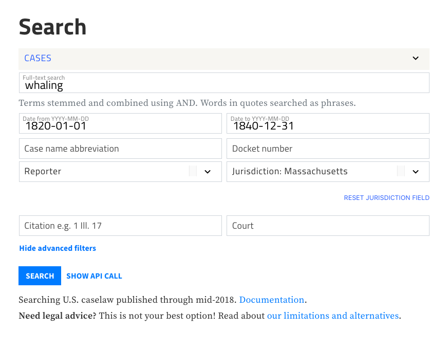
You can also access the advanced filters from the search results screen, so that you can fine-tune your search if you're not happy with the initial results. Delete or modify any of the filters as you go, and sort the results chronologically or by relevance.
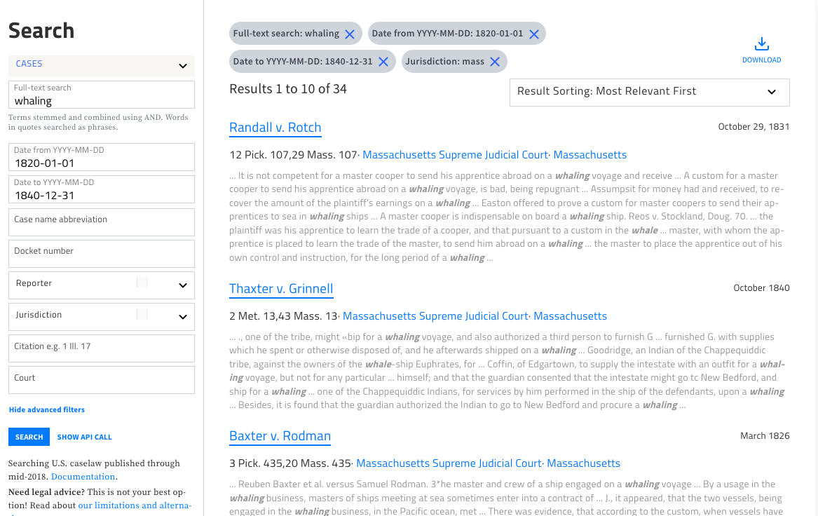
There is a lot more we hope to do with search, but we hope you enjoy this improvement. If you have ideas of your own, please share them with us at info@case.law.
CAP is a project of the Library Innovation Lab at Harvard Law School Library. We make open source software that helps people access legal information, preserve web sources with Perma.cc, and create open educational resources with H2O.
2021-02-02T00:00:00+00:00 Open Knowledge Foundation: Announcing a new partner for Open Data Day 2021 mini-grants https://blog.okfn.org/2021/02/01/announcing-a-new-partner-for-open-data-day-2021-mini-grants/
For Open Data Day 2021 on Saturday 6th March, the Open Knowledge Foundation is offering support and funding for in-person and online events anywhere in the world via our mini-grant scheme.
Today we are pleased to announce an additional partner for the Open Data Day 2021 mini-grant scheme: the Global Facility for Disaster Reduction and Recovery (GFDRR) through the GFDRR Labs and its Open Data for Resilience Initiative (OpenDRI).
GFDRR will be supporting mini-grants in the Environmental Data track, with a particular focus on ‘data for resilience’.
If you need inspiration for your event using data for resilience, some useful resources to check out include: GFDRR Labs, OpenDRI, Open Cities Project, ThinkHazard, Open Data for Resilience Index and the Risk Data Library.
We are extremely grateful to GFDRR and all our partners who have provided funding for this year’s mini-grant scheme. These include Microsoft, UK Foreign, Commonwealth and Development Office, Mapbox, Latin American Open Data Initiative (ILDA), Open Contracting Partnership and Datopian.

We are investigating moving our medium-small-ish Rails app to heroku.
We looked at both the Rails Autoscale add-on available on heroku marketplace, and the hirefire.io service which is not listed on heroku marketplace and I almost didn’t realize it existed.
I guess hirefire.io doesn’t have any kind of a partnership with heroku, but still uses the heroku API to provide an autoscale service. hirefire.io ended up looking more fully-featured and lesser priced than Rails Autoscale; so the main service of this post is just trying to increase visibility of hirefire.io and therefore competition in the field, which benefits us consumers.
At first I didn’t realize there was such a thing as “auto-scaling” on heroku, but once I did, I realized it could indeed save us lots of money.
I am more interested in scaling Rails background workers than I a web workers though — our background workers are busiest when we are doing “ingests” into our digital collections/digital asset management system, so the work is highly variable. Auto-scaling up to more when there is ingest work piling up can give us really nice inget throughput while keeping costs low.
On the other hand, our web traffic is fairly low and probably isn’t going to go up by an order of magnitude (non-profit cultural institution here). And after discovering that a “standard” dyno is just too slow, we will likely be running a performance-m or performance-l anyway — which likely can handle all anticipated traffic on it’s own. If we have an auto-scaling solution, we might configure it for web dynos, but we are especially interested in good features for background scaling.
There is a heroku built-in autoscale feature, but it only works for performance dynos, and won’t do anything for Rails background job dynos, so that was right out.
That could work for Rails bg jobs, the Rails Autoscale add-on on the heroku marketplace; and then we found hirefire.io.
As of now January 2021, hirefire.io has pretty simple and affordable pricing. $15/month/heroku application. Auto-scaling as many dynos and process types as you like.
hirefire.io by default can only check into your apps metrics to decide if a scaling event can occur once per minute. If you want more frequent than that (up to once every 15 seconds), you have to pay an additional $10/month, for $25/month/heroku application.
Even though it is not a heroku add-on, hirefire does advertise that they bill pro-rated to the second, just like heroku and heroku add-ons.
Rails autoscale has a more tiered approach to pricing that is based on number and type of dynos you are scaling. Starting at $9/month for 1-3 standard dynos, the next tier up is $39 for up to 9 standard dynos, all the way up to $279 (!) for 1 to 99 dynos. If you have performance dynos involved, from $39/month for 1-3 performance dynos, up to $599/month for up to 99 performance dynos.
For our anticipated uses… if we only scale bg dynos, I might want to scale from (low) 1 or 2 to (high) 5 or 6 standard dynos, so we’d be at $39/month. Our web dynos are likely to be performance and I wouldn’t want/need to scale more than probably 2, but that puts us into performance dyno tier, so we’re looking at $99/month.
This is of course significantly more expensive than hirefire.io’s flat rate.
Since Hirefire had an additional charge for finer than 1-minute resolution on checks for autoscaling, we’ll discuss resolution here in this section too. Rails Autoscale has same resolution for all tiers, and I think it’s generally 10 seconds, so approximately the same as hirefire if you pay the extra $10 for increased resolution.
Let’s look at configuration screens to get a sense of feature-sets.
To configure web dynos, here’s what you get, with default values:

The metric Rails Autoscale uses for scaling web dynos is time in heroku routing queue, which seems right to me — when things are spending longer in heroku routing queue before getting to a dyno, it means scale up.
For scaling worker dynos, Rails Autoscale can scale dyno type named “worker” — it can understand ruby queuing libraries Sidekiq, Resque, Delayed Job, or Que. I’m not certain if there are options for writing custom adapter code for other backends.
Here’s what the configuration options are — sorry these aren’t the defaults, I’ve already customized them and lost track of what defaults are.

You can see that worker dynos are scaled based on the metric “number of jobs queued”, and you can tell it to only pay attention to certain queues if you want.
Hirefire has far more options for customization than Rails Autoscale, which can make it a bit overwhelming, but also potentially more powerful.
You can actually configure as many Heroku process types as you have for autoscale, not just ones named “web” and “worker”. And for each, you have your choice of several metrics to be used as scaling triggers.
For web, I think Queue Time (percentile, average) matches what Rails Autoscale does, configured to percentile, 95, and is probably the best to use unless you have a reason to use another. (“Rails Autoscale tracks the 95th percentile queue time, which for most applications will hover well below the default threshold of 100ms.“)
Here’s what configuration Hirefire makes available if you are scaling on “queue time” like Rails Autoscale, configuration may vary for other metrics.

I think if you fill in the right numbers, you can configure to work equivalently to Rails Autoscale.
If you have more than one heroku process type for workers — say, working on different queues — Hirefire can scale the independently, with entirely separate configuration. This is pretty handy, and I don’t think Rails Autoscale offers this. (update i may be wrong, Rails Autoscale says they do support this, so check on it yourself if it matters to you).
For worker dynos, you could choose to scale based on actual “dyno load”, but I think this is probably mostly for types of processes where there isn’t the ability to look at “number of jobs”. A “number of jobs in queue” like Rails Autoscale does makes a lot more sense to me as an effective metric for scaling queue-based bg workers.
Hirefire’s metric is slightly difererent than Rails Autoscale’s “jobs in queue”. For recognized ruby queue systems (a larger list than Rails Autoscale’s; and you can write your own custom adapter for whatever you like), it actually measures jobs in queue plus workers currently busy. So queued+in-progress, rather than Rails Autoscale’s just queued. I actually have a bit of trouble wrapping my head around the implications of this, but basically, it means that Hirefire’s “jobs in queue” metric strategy is intended to try to scale all the way to emptying your queue, or reaching your max scale limit, whichever comes first. I think this may make sense and work out at least as well or perhaps better than Rails Autoscale’s approach?
Here’s what configuration Hirefire makes available for worker dynos scaling on “job queue” metric.

Since the metric isn’t the same as Rails Autosale, we can’t configure this to work identically. But there are a whole bunch of configuration options, some similar to Rails Autoscale’s.
The most important thing here is that “Ratio” configuration. It may not be obvious, but with the way the hirefire metric works, you are basically meant to configure this to equal the number of workers/threads you have on each dyno. I have it configured to 3 because my heroku worker processes use resque, with resque_pool, configured to run 3 resque workers on each dyno. If you use sidekiq, set ratio to your configured concurrency — or if you are running more than one sidekiq process, processes*concurrency. Basically how many jobs your dyno can be concurrently working is what you should normally set for ‘ratio’.
Hirefire isn’t actually a heroku plugin. In addition to that meaning separate invoicing, there can be some other inconveniences.
Since hirefire only can interact with heroku API, for some metrics (including the “queue time” metric that is probably optimal for web dyno scaling) you have to configure your app to log regular statistics to heroku’s “Logplex” system. This can add a lot of noise to your log, and for heroku logging add-ons that are tired based on number of log lines or bytes, can push you up to higher pricing tiers.
If you use paperclip, I think you should be able to use the log filtering feature to solve this, keep that noise out of your logs and avoid impacting data log transfer limits. However, if you ever have cause to look at heroku’s raw logs, that noise will still be there.
I asked a couple questions of both Hirefire and Rails Autoscale as part of my evaluation, and got back well-informed and easy-to-understand answers quickly from both. Support for both seems to be great.
I would say the documentation is decent-but-not-exhaustive for both products. Hirefire may have slightly more complete documentation.
There are other things you might want to compare, various kinds of observability (bar chart or graph of dynos or observed metrics) and notification. I don’t have time to get into the details (and didn’t actually spend much time exploring them to evaluate), but they seem to offer roughly similar features.
Rails Autoscale is quite a bit more expensive than hirefire.io’s flat rate, once you get past Rails Autoscale’s most basic tier (scaling no more than 3 standard dynos).
It’s true that autoscaling saves you money over not, so even an expensive price could be considered a ‘cut’ of that, and possibly for many ecommerce sites even $99 a month might a drop in the bucket (!)…. but this price difference is so significant with hirefire (which has flat rate regardless of dynos), that it seems to me it would take a lot of additional features/value to justify.
And it’s not clear that Rails Autoscale has any feature advantage. In general, hirefire.io seems to have more features and flexibility.
Until 2021, hirefire.io could only analyze metrics with 1-minute resolution, so perhaps that was a “killer feature”?
Honestly I wonder if this price difference is sustained by Rails Autoscale only because most customers aren’t aware of hirefire.io, it not being listed on the heroku marketplace? Single-invoice billing is handy, but probably not worth $80+ a month. I guess hirefire’s logplex noise is a bit inconvenient?
Or is there something else I’m missing? Pricing competition is good for the consumer.
And are there any other heroku autoscale solutions, that can handle Rails bg job dynos, that I still don’t know about?
update a day after writing djcp on a reddit thread writes:
I used to be a principal engineer for the heroku add-ons program.
One issue with hirefire is they request account level oauth tokens that essentially give them ability to do anything with your apps, where Rails Autoscaling worked with us to create a partnership and integrate with our “official” add-on APIs that limits security concerns and are scoped to the application that’s being scaled.
Part of the reason for hirefire working the way it does is historical, but we’ve supported the endpoints they need to scale for “official” partners for years now.
A lot of heroku customers use hirefire so please don’t think I’m spreading FUD, but you should be aware you’re giving a third party very broad rights to do things to your apps. They probably won’t, of course, but what if there’s a compromise?
“Official” add-on providers are given limited scoped tokens to (mostly) only the actions / endpoints they need, minimizing blast radius if they do get compromised.
You can read some more discussion at that thread.
2021-01-30T22:53:46+00:00 jrochkind Hugh Rundle: Automation workflows with GitHub Actions and Webhooks - Library Map part 3 https://www.hughrundle.net/automation-workflows-with-github-actions-and-webhooks/This is the third in my series on the Library Map. Part One dealt with why I made the map. Part 2 explained how I made it. This post is about strategies I've used to automate some things to keep it up to date.
A GitHub Action is an automated script that runs on a virtual machine when triggered by some kind of event. Triggers for actions are defined in a "workflow" configuration file at .github/workflows in your GitHub repository. The terminology can be a bit confusing, because "GitHub Actions" is what GitHub calls the whole system, but an "action" within that system is actually the smallest part in the series:
Workflow
- Job1
  - Step1
      - Action1
      - Action2
  - Step2
      - Action3
- Job2
  - Step1
      - Action1
      - Action2
GitHub Actions are really just GitHub's version of a Continuous Integration / Continuous Deployment (CI/CD) tool. I say "just", but it's extremely powerful. Unfortunately that does mean that even though GitHub Actions are quite extensively documented, the docs aren't necessarily all that clear if you're starting from scratch, and the process is quite confusing for the uninitiated. I spent a couple of days failing to make it work the way I wanted, so that you don't have to.
There are a zillion things you can use GitHub Actions for — auto-closing "stale" Issues, adding labels automatically, running code linters on pull requests, and so on. If you've read my previous posts, you might remember that I wrote a little Python script to merge the data from library_services_information.csv into boundaries.topo.json. But doing that manually every time the CSV file is updated is a tedious manual task. Wouldn't it be better if we could automate it? Well, we can automate it with GitHub Actions!
What we want to do here is set up a trigger that runs the script whenever the CSV file is changed. I originally tried doing this on a push event (every time code is pushed to the default branch), and it worked, but ultimately I decided it would be better to run it whenever someone (including me) makes a Pull Request. I'm in a reasonably consistent habit of always creating a new git branch rather than committing directly to the default branch, and there's less chance of something going wrong and the TopoJSON file being corrupted if the merge is done at the Pull Request stage and then manually pulled in — if there can't be a clean merge, GitHub will tell me before I break everything.
To set this up, we need to write a workflow configuration file, listing the jobs we want done, and the actions within each job. Jobs within each workflow are run concurrently unless the workflow configuration tells them to wait for the previous job, though in our case that doesn't matter, because there is only a single job. The structure is:
Workflow ('topo auto updater (PR)')
 - Job1 ('auto-topo-updater')
   - Step 1: git checkout code
   - Step 2: add labels
   - Step 3: merge files
   - Step 4: git commit updated code
The first step uses an Action provided by GitHub itself. It runs a git checkout on the repository before anything else happens. This means nothing will happen in the actual repository if anything in the workflow fails, because the virtual machine that checked out your code just gets destroyed without checking the code back in.
Step 2 will use an Action created by Christian Vuerings, and automatically adds labels to an Issue or Pull Request, based on whatever criteria triggered the workflow.
Step 3 runs the python script to merge the CSV data into the TopoJSON.
Step 4 (care of Stefan Zweifel) commits and pushes the updated changes into the pull request that triggered the workflow. This is where the real magic happens, because it simply adds a second commit to the pull request as soon as it is received and before the PR is merged. I initially had set this up to create a second pull request with just the merged TopoJSON changes and then tried to work out how to auto-merge that new pull request, but someone on Mastodon helpfully asked me why I would bother creating a pull request if I wanted to auto-merge it anyway. The thought of auto-committing terrified me initially because I had no idea what I was doing, but on reflection a second PR was indeed a bit silly.
To get all this to happen, we need to write a configuration file. This is written in YAML, and saved in a special directory at the top of the repository, called .github/workflows. You can name this file whatever you want, but it has to end in .yml.
First we provide some kind of trigger, and include any conditions we might want to apply. I want this workflow to happen whenever someone creates a pull request that includes changes to the website/data/library_services_information.csv file:
name: topo auto updater (PR)

on:
  pull_request:
    paths:
    - 'website/data/library_services_information.csv'

  workflow_dispatch:
The on directive lists the different 'events' that can trigger the workflow. The first one is clear enough, but what about workflow_dispatch? This event simply means "when triggered manually by pressing a button". I don't know why it has such an obscure name.
Once we've told GitHub when we want the workflow to run, we can tell it what we want it to do. First we list our jobs:
jobs:
  auto-topo-updater:
    runs-on: ubuntu-latest
    steps:
			# steps go here
The first line under 'jobs' is the name of our job (this can be anything, but without spaces). runs on tells GitHub which runner to use. A 'runner' is a special environment that runs automated continuous integration tools. In this case we're using GitHub Actions runners, but runners are also commonly used in other automated testing tools. Here we are using the "latest" Ubuntu Linux runner, which is currently using Ubuntu 18.04 even though Ubuntu 20.04 is actually the latest Ubuntu LTS release. Now we've outlined the trigger and where we want to run our steps, it's time to say what those steps are:
steps:
- uses: actions/checkout@v2
  with:
    ref: ${{ github.head_ref }}

- uses: christianvuerings/add-labels@v1
  with:
    labels: |
      auto update
      data
  env:
    GITHUB_TOKEN: $

- name: Merge CSV to TopoJSON
  run: |
    python3 ./.github/scripts/merge_csv_to_topojson.py

- uses: stefanzweifel/git-auto-commit-action@v4
  with:
    commit_message: merge csv data to topo
Whoah, that's a lot! You can see there are two ways we describe how to perform an action: uses, or name + run. The uses directive points to an Action that someone has publicly shared on GitHub. So uses: actions/checkout@v2 means "use version 2 of the Action at the repository address https://github.com/actions/checkout". This is an official GitHub action. If we want to simply run some commands, we can just give our action a name and use the run directive:
- name: Merge CSV to TopoJSON
	run: |
	python3 ./.github/scripts/merge_csv_to_topojson.py
In this example, we use a pipe (|) to indicate that the next lines should be read one after another in the default shell (basically, a tiny shell script). The first step checked out out our code, so we can now use any script that is in the repository. I moved the python merging script into .github/scripts/ to make it clearer how this script is used, and now we're calling it with the python3 command.
To pass data to an action, we use with. The step below passes a list of label names to add to the pull request ('auto update' and 'data'):
- uses: christianvuerings/add-labels@v1
  with:
    labels: |
      auto update
      data
Finally, for the labels step we need to provide an environment variable. For certain activities, GitHub requires Actions to use a GITHUB_TOKEN so that you can't just run an action against any repository without permission. This is automatically stored in the "secret store", to which you can also add other secrets like API keys and so on. The env directive passes this through to the Action:
env:
GITHUB_TOKEN: ${{ secrets.GITHUB_TOKEN }}
Now when a pull request is sent, it gets tagged auto update and data, and a commit updating the topo.json file is automatically added to it:

You can see the full config file in the Library Map repository.
I've also worked out how to reduce the filesize of my GeoJSON file, so I was able to check it in to the repository. This allowed me to automate the transformation from GeoJSON to TopoJSON whenever the GeoJSON file is updated, with a workflow that runs some commands over the GeoJSON and creates a new pull request. One little gotcha with this is that the action I used to process the GeoJSON file into TopoJSON also cleans up the GeoJSON, which means triggering the action on any change to the GeoJSON file creates a recursive loop whereby every time the new pull request is merged, it creates a new one. To get around this, I probably should just make it auto-commit rather than create a pull request, but for now I added an if statement:
jobs:
  processJson:
    if: "!contains(github.event.head_commit.message, 'from hughrun/geo-to-topo')"
...

 - name: Create Pull Request
    uses: peter-evans/create-pull-request@v3
    with:
      commit-message: Update TopoJSON boundaries
      title: Update TopoJSON boundaries
      body: 'Clean & minify GeoJSON'
      branch: geo-to-topo
      labels: auto update,data
The last action creates a pull request on a new geo-to-topo branch, so if the commit message includes "from hughrun/geo-to-topo" the job won't run. Recursive pull request problem solved!
I really like cherries, but they're not always season. Imagine me sending a text message to the local greengrocer every day in early summer, to ask whether they have any cherries yet. They text me back: usually the answer is "no", but eventually it's a "yes". Then I hit on an idea: I call them and ask them to just text me when cherries are in stock.
The first approach is how an API call works: you send a request, and the server sends a response. The second is how a webhook works — you get the response without having to even send the request, when a certain criteria is met. I've been playing around with APIs and webhooks at work, because we want to connect Eventbrite event information to a calendar on our own website. But GitHub also offers webhooks (which actually pre-dates GitHub Actions), and this is the final piece of the Library Map automation pipeline.
The big difference of course is that sending an HTTP request and receiving an HTTP request are quite different things. You can send an HTTP request in many different ways: including by just typing a URL into a browser. But to receive a request you need some kind of server. Especially if you don't know when it will be sent. Conveniently I already have a VPS that I use for a few things, including hosting this blog. So we have something to receive the webhook (a server), and something to send the webhook (GitHub). Now we need to tell those two things how to talk to each other.
What we want to do here is automatically update the data on the Library Map whenever there is an update in the repository. I could make this easier by just publishing the map with GitHub pages, but I don't want to completely rely on GitHub for everything.
First of all we need to set up the webhook. In the repository we go to settings - webhooks and then click on Add webhook. Here we enter the Payload URL (the url we will set up on our server, to receive the webhook: https://example.com/gh-library-map), the Content type (application/json), and a secret. The secret is just a password that can be any text string, but I recommend using something long and hard to guess. You could try one of my favourite URLs to create it. We want the trigger to be "Just the push event" because we don't want to trigger the webhook every time anything at all happens in the repository. Unfortunately there doesn't seem to be a way to trigger it only on a push to the primary branch, but in future we could probably put some logic in at the receiving end to filter for that. Make sure the webhook is set to "Active", and click "Add webhook".

So setting up the webhook to be sent is reasonably straightforward. Receiving it is a bit more complicated. We need to set up a little application to hang around waiting to receive HTTP requests.
First of all, we set up nginx to serve our domain — in this post I'll refer to that as 'example.com'. Then we secure it using certbot so GitHub can send the webhook to https://example.com.
Because we might want to use other webhooks on other systems for different tasks, we're going to go with a slightly over-powered option and use Express. This gives us a bit of control over routing different requests to different functions. Express is a nodejs framework for building web apps, so first we need to make sure we have a recent version of nodejs installed. Then we create a new package metadata file, and a JavaScript file:
npm init
touch webhooks.js
In our empty webhooks.js file we set up some basic routing rules with Express:
npm install express --save// webhook.js
const express = require('express')
const port = 4040
const app = express()
app.use(express.json())
app.post('/gh-library-map', (req, res, next) => {
// do stuff
})
// everything else should 404
app.use(function (req, res) {
res.status(404).send("There's nothing here")
})
app.listen(port, () => {
console.log(`Webhooks app listening on port ${port}`)
})This will do something when a POST request is received at https://example.com/gh-library-map. All other requests will receive a 404 response. You can test that now.
Returning to the delicious cherries: what happens if someone else finds out about my arrangement with the greengrocer? Maybe a nefarious strawberry farmer wants to entice me to go to the greengrocer and, upon discovering there are no cherries, buy strawberries instead. They could just send a text message to me saying "Hey it's your friendly greengrocer, I totes have cherries in stock". This is the problem with our webhook endpoint as currently set up. Anyone could send a POST request to https://example.com/gh-library-map and trigger an action. Luckily GitHub has thought of that, and has a solution.
Remember the "Secret" we set when we set up the webhook? This is where we use it. But not directly. GitHub instead creates a SHA256 hash of the entire payload using your secret and includes the resulting hash in the payload itself. The hash is sent in a header called X-Hub-Signature-256. We know what our secret is, and we can therefore check the hash by running the same process over the payload at the receiving end as GitHub did at the sending end. As long as we use a strong secret and the hashes match, we can be confident the request did indeed come from GitHub, and not a nefarious strawberry farmer. The crypto library is included in nodejs automatically, so we can use that check:
// webhook.js
const crypto = require('crypto')

app.post('/gh-library-map', (req, res, next) => {
  const hmac = crypto.createHmac('sha256', process.env.LIBRARY_MAP_GH_SECRET)
  hmac.update(JSON.stringify(req.body))

  // check has signature header and the decrypted signature matches
  if (req.get('X-Hub-Signature-256')) {
    if ( `sha256=${hmac.digest('hex').toString()}` === req.get('X-Hub-Signature-256') ){
      // do something
    } else {
      console.error("signature header received but hash did not match")
      res.status(403).send('Signature is missing or does not match')
    }
  } else {
    console.error('Signature missing')
    res.status(403).send('Signature is missing or does not match')
  }
})
Now we just need to "do something" when the hash matches 😆.
So what is the something we're going to do? The Library Map server simply contains a copy of the repository, sitting behind an nginx web proxy server. What we need to do to update it is run git pull inside that directory, and it will pull in the latest updates from the repository. Our webhook will end up calling this action more often than is strictly useful, because a "push" action happens every time someone creates a pull request, for example, but it's pretty harmless to git pull more often than necessary.
First we create a new function:
// webhook.js
const util = require('util')
const exec = util.promisify(require('child_process').exec) // run child_process.exec as a Promise/async

async function gitPull(local_repo, res) {
  try {
    const { stdout, stderr } = await exec(`cd ${local_repo} && git pull`);
    let msg = stderr ? stderr : stdout // message is the error message if there is one, else the stdout
    // do something with message
    res.status(200).send('Ok')
  } catch (err) {
    console.error(err)
    res.status(500).send('server error sorry about that')
  }
}
This function is async because we need to await the git pull before we can do something with the output. To make it "awaitable" we use util.promisify() which is another built-in function in nodejs. We call this function back in our express route, where we said we would "do something":
// webhook.js
const local_repo = "/path/to/website/directory"
if (req.get('X-Hub-Signature-256')) {
	if ( `sha256=${hmac.digest('hex').toString()}` === req.get('X-Hub-Signature-256') ){
    gitPull(local_repo, res)
	} else { ...
	}
...
}
Sweet! Now every time someone does a git push we can do a git pull to add the change to the website! Maybe we want to be sure that happened though, so we can add a final piece to this, by sending ourselves an email using emailjs every time the webhook is successfully received:
npm install emailjs// webhook.js
const { SMTPClient } = require('emailjs')
function sendEmail(msg, trigger) {
const client = new SMTPClient({
user: process.env.EMAIL_USER,
password: process.env.EMAIL_PASSWORD,
host: process.env.SMTP_DOMAIN,
ssl: true,
});
// send the message and get a callback with an error or details of the message that was sent
client.send(
{
text: `GitHub webhook for ${trigger} has triggered a "git pull" event with the following result:\n\n${msg}`,
from: `Webhook Alerts<${process.env.EMAIL_SEND_ADDRESS}>`,
to: process.env.EMAIL_RECEIVE_ADDRESS,
subject: `GitHub triggered a pull for ${trigger}`,
},
(err, message) => {
console.log(err || message);
}
);
}
async function gitPull(local_repo, res) {
try {
const { stdout, stderr } = await exec(`cd ${local_repo} && git pull`);
let msg = stderr ? stderr : stdout
sendEmail(msg, 'mysite.com')
res.status(200).send('Ok')
} catch (err) {
console.error(err)
res.status(500).send('server error sorry about that')
}
}We can now test the webhook:
node webhooks.jsExpress will start up. We can use curl to send some test payloads from a new console session on our local machine:
curl -d '{"key1":"value1", "key2":"value2"}' -H "Content-Type: application/json" -X POST https://example.com/gh-library-map

curl -H "X-Hub-Signature-256: blah" -d '{"key1":"value1", "key2":"value2"}' -H "Content-Type: application/json" -X POST https://example.com/gh-library-map
Both requests should return a 403 with Signature is missing or does not match, but in the server console the second one should log a message signature header received but hash did not match.
The last thing we need to do is set up our little express app to run automatically as a background process on the server. We can do this using systemd. I personally find the official documentation rather impenetrable, but there are lots of helpful tutorials online. Systemd helps us with two tasks:
First we create a "unit file" called webhooks.service at /etc/systemd/system:
# /etc/systemd/system/webhooks.service
Description=Keeps the webhooks express server running
After=network.target

[Service]
Type=simple
ExecStart=/usr/bin/node webhooks.js
Restart=always
RestartSec=10
User=username
WorkingDirectory=/home/username/webhooks
EnvironmentFile=/etc/systemd/system/webhooks.env

[Install]
WantedBy=multi-user.target
The User is your username, and WorkingDirectory is wherever you installed your express app. Since we're responsible server administrators, we have unattended-upgrades running, so occasionally the server will reboot itself to finish installing security updates. We can ensure the webhooks service always comes back up by setting Restart to always.
Next we create the EnvironmentFile mentioned in the unit file:
# /etc/systemd/system/webhooks.env
LIBRARY_MAP_GH_SECRET="your GitHub secret here"
EMAIL_USER="user@mail.example.com"
EMAIL_PASSWORD="top secret password"
SMTP_DOMAIN="smtp.example.com"
EMAIL_SEND_ADDRESS="webhooks@mail.example.com"
This is where all those process.env values come from in the webhooks.js file. We could hardcode them, but you might want to share your file in a blog post one day, and you definitely don't want to accidentally leave your hardcoded GitHub secret in the example!
Make sure we've stopped the app, so we don't have two conflicting installations, then run:
sudo systemctl enable webhooks.service
sudo systemctl start webhooks.service
Our webhooks service should now be running. Go back to the GitHub webhooks page in your repository settings and you should see an option to send a "ping event". This simply checks that your webhook is working by sending a test payload. Send the ping, wait a few moments, and we should see an email appear in the EMAIL_SEND_ADDRESS inbox:

That was a pretty long and technical post, sorry not sorry. Now that I've set up all that automation, it would be great for library people to help correct and complete the data. As for me, I'll be looking for other things I can do with automation. Maybe automatically tooting release notes for ephemetoot. We'll see.
I don’t have much that I can report in this week’s note. You are just going to have to take my word that this week, a large amount of my time was spent at meetings pertaining to my library department, my union, and anti-black racism work.
Last year, around this same time, some colleagues from the University and I organized an speaking event called Safer Communities in a ‘Smart Tech’ World:
We need to talk about Amazon Ring in Windsor.
Windsor’s Mayor proposes we be the first city in Canada to buy into the Ring Network.As residents of Windsor, we have concerns with this potential project. Seeing no venue for residents of Windsor to share their fears of surveillance and loss of privacy through this private-partnership, we hosted an evening of talks on January 22nd, 2020 at The Performance Hall at the University of Windsor’s School of Creative Arts Windsor Armories Building. Our keynote speaker was Chris Gilliard, heard recently on CBC’s Spark.
Since that evening, we have been in the media raising our concerns, asking questions, and encouraging others to do the same.
The City of Windsor has yet to have entered an agreement with Amazon Ring. This is good news.
This week, the City of Windsor announced that it has entered a one-year deal partnership with Ford Mobility Canada to share data and insights via Ford’s Safety Insights platform.

I don’t think this is good news for reasons outlined in this post called Safety Insights, Data Privacy, and Spatial Justice.
This week I learned a neat Tweetdeck hack. If set up a search as column, you can limit the results for that term using the number of ‘engagements’:


I haven’t read this but I have it bookmarked for potential future reference: The weaponization of web archives: Data craft and COVID-19 publics:
An unprecedented volume of harmful health misinformation linked to the coronavirus pandemic has led to the appearance of misinformation tactics that leverage web archives in order to evade content moderation on social media platforms. Here we present newly identified manipulation techniques designed to maximize the value, longevity, and spread of harmful and non-factual content across social media using provenance information from web archives and social media analytics. After identifying conspiracy content that has been archived by human actors with the Wayback Machine, we report on user patterns of “screensampling,” where images of archived misinformation are spread via social platforms. We argue that archived web resources from the Internet Archive’s Wayback Machine and subsequent screenshots contribute to the COVID-19 “misinfodemic” in platforms. Understanding these manipulation tactics that use sources from web archives reveals something vexing about information practices during pandemics—the desire to access reliable information even after it has been moderated and fact-checked, for some individuals, will give health misinformation and conspiracy theories more traction because it has been labeled as specious content by platforms.
I’m going to leave this tweet here because I might pick up this thread in the future:

This reminds me of a talk given in 2018 by Data & Society Founder and President, danah boyd called You Think You Want Media Literacy… Do You?
This essay still haunts me, largely because we still don’t have good answers for the questions that Dr. Boyd asks of us and the stakes have only gotten higher.
2021-01-29T17:24:49+00:00 Mita Williams David Rosenthal: Effort Balancing And Rate Limits https://blog.dshr.org/2021/01/effort-balancing-and-rate-limits.html Catalin Cimpanu reports on yet another crime wave using Bitcoin in As Bitcoin price surges, DDoS extortion gangs return in force:In a security alert sent to its customers and shared with ZDNet this week, Radware said that during the last week of 2020 and the first week of 2021, its customers received a new wave of DDoS extortion emails.And Dan Goodin reports on the latest technique the DDOS-ers are using in DDoSers are abusing Microsoft RDP to make attacks more powerful:
Extortionists threatened companies with crippling DDoS attacks unless they got paid between 5 and 10 bitcoins ($150,000 to $300,000)
...
The security firm believes that the rise in the Bitcoin-to-USD price has led to some groups returning to or re-prioritizing DDoS extortion schemes.
As is typical with many authenticated systems, RDP responds to login requests with a much longer sequence of bits that establish a connection between the two parties. So-called booter/stresser services, which for a fee will bombard Internet addresses with enough data to take them offline, have recently embraced RDP as a means to amplify their attacks, security firm Netscout said.I don't know why it took me so long to figure it out, but reading Goodin's post I suddenly realized that techniques we described in Impeding attrition attacks in p2p systems, a 2004 follow-up to our award-winning 2003 SOSP paper on the architecture of the LOCKSS system, can be applied to preventing systems from being abused by DDOS-ers. Below the fold, brief details.
The amplification allows attackers with only modest resources to strengthen the size of the data they direct at targets. The technique works by bouncing a relatively small amount of data at the amplifying service, which in turn reflects a much larger amount of data at the final target. With an amplification factor of 85.9 to 1, 10 gigabytes-per-second of requests directed at an RDP server will deliver roughly 860Gbps to the target.
Every reflection-friendly protocol mentioned in this article is going to have to learn rate limiting. This includes the initial TCP three-way handshake, ICMP, and every UDP-based protocol. In rare instances it's possible to limit one's participation in DDoS reflection and/or amplification with a firewall, but most firewalls are either stateless themselves, or their statefulness is so weak that it can be attacked separately. The more common case will be like DNS [Response Rate Limiting], where deep knowledge of the protocol is necessary for a correctly engineered rate-limiting solution applicable to the protocol.The RDP server being used to DDOS sees a flood of authentication requests whose source address has been spoofed to be the target of the DDOS. This isn't what they'd see from a real user, so the RDP server should rate-limit sending authentication responses to a client to a reasonable rate for a real client. This would be helpful, but it isn't enough. Because the DDOS-ers use a large number of systems to mount an attack, even a fairly low rate of reponses can be harmful.
Effort Balancing. If the effort needed by a requester to procure a service from a supplier is less than the effort needed by the supplier to furnish the requested service, then the system can be vulnerable to an attrition attack that consists simply of large numbers of ostensibly valid service requests. We can use provable effort mechanisms such as Memory-Bound Functions to inflate the cost of relatively “cheap” protocol operations by an adjustable amount of provably performed but otherwise useless effort. By requiring that at each stage of a multi-step protocol exchange the requester has invested more effort in the exchange than the supplier, we raise the cost of an attrition strategy that defects part-way through the exchange. This effort balancing is applicable not only to consumed resources such as computations performed, memory bandwidth used or storage occupied, but also to resource commitments. For example, if an adversary peer issues a cheap request for service and then defects, he can cause the supplier to commit resources that are not actually used and are only released after a timeout (e.g., SYN floods). The size of the provable effort required in a resource reservation request should reflect the amount of effort that could be performed by the supplier with the resources reserved for the request.Vixie also noted the economic requirement:
Engineering economics requires that the cost in CPU, memory bandwidth, and memory storage of any new state added for rate limiting be insignificant compared with an attacker's effort.The reason RDP can be used to amplify a DDOS attack is that, as Goodin wrote:
RDP responds to login requests with a much longer sequence of bits that establish a connection between the two parties.The obvious application of effort balancing would be to require that RDP's login requests be padded with additional bytes to make them longer than the login reponse. Thus the RDP server would act to attenuate the attack, not amplify it. This would satisfy Vixie's goal:
Attenuation also has to be a first-order goal—we must make it more attractive for attackers to send their packets directly to their victims than to bounce them off a DDoS attenuator.The protocol could specify that the padding bytes not be random, but be computed from the login request parameters by some algorithm making them relatively expensive to generate but cheap to verify (cf. proof-of-work). This would not significantly impact legitimate clients, who issue login requests infrequently, but would increase the cost of using the RDP server to disguise the source of the attack.
![]()
Open Knowledge Foundation is excited to launch the Net Zero Challenge, a global pitch competition about using open data for climate action.
With a new administration in the USA and the COP26 meeting in the UK, 2021 will be a crucial year for the global climate response.
Let’s see how open data can play its part.
Tell us how your idea or project uses open data for climate action – and you could win a $1,000USD in the first round of the Net Zero Challenge.
Full details about the Net Zero Challenge are available at netzerochallenge.info.
This project is funded by our partners at Microsoft and the UK Foreign, Commonwealth & Development Office. We are extremely grateful for their support.
How are you advancing climate action using open data?
To be eligible for the Net Zero Challenge, your idea or project must do one or more of the following:
Some ways in which you might do this include:
We are very open minded about your approach and methodology. What we care about is the outcome, and whether you answer the question.
You might consider whether your idea or project is:
How do I apply?
Apply now by filling out this form. All applications must be received by 6pm Pacific Standard Time on Friday 12th March 2021. Late submissions will not be accepted.
Applications will be reviewed and a short list invited to pitch their idea to a panel of experts at a virtual pitch contest.
Pitches will take the form of a public three-minute presentation via video conference, followed by a question and answer session with our panel of climate data experts.
Pitches can be live, or prerecorded but the Q&A will be live.
Expert guidance for the Net Zero Challenge is provided by our advisory committee: the Open Data Charter, the Innovation and Open Data Team at Transport for New South Wales and the Open Data Day team at Open Knowledge Foundation.
Need more information?
If you have any questions about the Net Zero Challenge, please check out the FAQs on the netzerochallenge.info website. To contact the Net Zero Challenge team directly, email netzero@okfn.org.
2021-01-28T11:14:54+00:00 James Hamilton Peter Sefton: Research Data Management looking outward from IT http://ptsefton.com/2021/01/28/rdm4aero/index.htmlThis is a presentation that I gave on Wednesday the 2nd of December 2020 at the AeRO (Australian eResearch Organizations) council meeting at the request of the chair Dr Carina Kemp).
Carina asked:
It would be really interesting to find out what is happening in the research data management space. And I’m not sure if it is too early, but maybe touch on what is happening in the EOSC Science Mesh Project.
The Audience of the AeRO Council is AeRo member reps from AAF, AARNet, QCIF, CAUDIT, CSIRO, GA, TPAC, The uni of Auckland, REANNZ, ADSEI, Curtin, UNSW, APO.
At this stage I was still the eResearch Support Manager at UTS - but I only had a couple of weeks left in that role.

In this presentation I’m going to start from a naive IT perspective about research data.

I would like to acknowledge and pay my respects to the Gundungurra and Darug people who are the traditional custodians of the land on which I live and work.

Research data is special - like snowflakes - and I don’t mean that in a mean way, Research Data could be anything - any shape any size and researchers are also special, not always 100% aligned with institutional priorities, they align with their disciplines and departments and research teams.

It’s obvious that buying storage doesn’t mean you’re doing data management well but that doesn’t mean it’s not worth restating.
So "data storage is not data management". In fact, the opposite might be true - think about buying a laptop - do you just get one that fits all your stuff and rely on getting a bigger one every few years? Or do you get a smaller main drive and learn how to make sure that your data's actually archived somewhere? That would be managing data.
And remember that not all research data is the same “shape” as corporate data - it does not all come in database or tabular form - it can be images, video, text, with all kinds of structures.

There are several reasons we don’t want to just dole-out storage as needed.


So far we’ve just looked at things from an infrastructure perspective but that’s not actually why we’re here, us with jobs in eResearch. I think we’re here to help researchers do excellent research with integrity, AND we need to help our institutions and researchers manage risk.
The Australian Code for the Responsible Conduct of Research which all research organizations need to adhere to if we get ARC or NHMRC grants sets out some institutional responsibilities to provide infrastructure and training
There are risks associated with research data, reputational, financial and risks to individuals and communities about whom we hold data
At UTS, we’ve embraced the Research Data Management Plan - as a way to assist in dealing with this risk. RDMPs have a mixed reputation here in Australia - some organizations have decided to keep them minimal and as streamlined as possible but at UTS the thinking is that they can be useful in addressing a lot of the issues raised so far.
Where’s the data for project X - when there’s an integrity investigation. Were procedures followed?
How much storage are we going to need?

Inspired by the (defunct?) Research Data Lifecycle project that was conceived by the former organizations that became the Australian Research Data Commons (ANDS, NeCTAR and RDSI) we came up with this architecture for a central research data management system (in our case we use the open source ReDBox system) loosely linked to a variety of research Workspaces, as we call them.
The plan is that over time, researchers can plan and budget for data management in the short, medium and long term, provision services and use the system to archive data as they go.
(Diagram by Gerard Barthelot at UTS)

UTS has been an early adopter of the OCFL (Oxford Common File Layout) specificiation - a way of storing file sustainably on a file system (coming soon: s3 cloud storage) so it does not need to be migrated. I presented on this at the Open Repositories conference

And at the same conference, I introduced the RO-Crate standards effort, which is a marriage between the DataCrate data packaging work we’ve been doing at UTS for a few years, and the Research Object project.

We created the Arkisto platform to bring together all the work we’ve been doing to standardise research data metadata, and to build a toolkit for sustainable data repositories at all scales from single-collection up to institutional, and potentially discipline and national collections.

This is an example of one of many Arkisto deployment patterns you can read more on the Arkisto Use Cases page

This is an example of an Arkisto-platform output. Data exported from one content management system into an archive-ready RO-Crate package, which can then be made into a live site. This was created for Ass Prof Tamson Pietsch at UTS. The website is ephemeral - the data will be Interoperable and Reusable (I and R from FAIR) via the use of RO-Crate.

Now to higher-level concerns: I built this infrastructure for my chooks (chickens) - they have a nice dry box with a roosting loft. But most of the time they roost on the roof.
We know all too well that researchers don’t always use the infrastructure we build for them - you have to get a few other things right as well.


One of the big frustrations I have had as an eResearch manager is that the expectations and aspirations of funders and integrity managers and so on are well ahead of our capacity to deliver the services they want, and then when we DO get infrastructure sorted there are organizational challenges to getting people to use it. To go back to my metaphor, we can’t just pick up the researchers from the roof and put them in their loft, or spray water on them to get them to move.

Via Gavin Kennedy and Guido Aben from AARNet Marco La Rosa and I are helping out with this charmingly named project which is adding data management service to storage, syncronization and sharing services. Contracts not yet in place so won't say much about this yet.

https://www.cs3mesh4eosc.eu/about EOSC is the European Open Science Cloud
CS3MESH4EOSC - Interactive and agile sharing mesh of storage, data and applications for EOSC - aims to create an interoperable federation of data and higher-level services to enable friction-free collaboration between European researchers. CS3MESH4EOSC will connect locally and individually provided services, and scale them up at the European level and beyond, with the promise of reaching critical mass and brand recognition among European scientists that are not usually engaged with specialist eInfrastructures.

I told Carina I would look outwards as well. What are we keeping an eye on?

Watch out for the book factory. Sorry, the publishing industry.

The publishing industry is going to “help” the sector look after it’s research data.

Like, you, know, they did with the copyright in publications. Not only did that industry work out how to take over copyright in research works, they successfully moved from selling us hard-copy resources that we could keep in our own libraries to charging an annual rent on the literature - getting to the point where they can argue that they are essential to maintaining the scholarly record and MUST be involved in the publishing process even when the (sometimes dubious, patchy) quality checks are performed by us who created the literature.
It’s up to research institutions whether this story repeats with research data - remember who you’re dealing with when you sign those contracts!

In the 2010s the Australian National Data (ANDS) service funded investment in Metadata stores; one of these was the ReDBOX research data management platform which is alive and well and being sustained by QCIF with a subscription maintenance service. But ANDS didn’t fund development of Research Data Repositories.

The work I’ve talked about here was all done with with the UTS team.
This is a presentation that I gave on Wednesday the 2nd of December 2020 at the AeRO (Australian eResearch Organizations) council meeting at the request of the chair Dr Carina Kemp).
Carina asked:
It would be really interesting to find out what is happening in the research data management space. And I’m not sure if it is too early, but maybe touch on what is happening in the EOSC Science Mesh Project.
The Audience of the AeRO Council is AeRo member reps from AAF, AARNet, QCIF, CAUDIT, CSIRO, GA, TPAC, The uni of Auckland, REANNZ, ADSEI, Curtin, UNSW, APO.
At this stage I was still the eResearch Support Manager at UTS - but I only had a couple of weeks left in that role.
In this presentation I’m going to start from a naive IT perspective about research data.
I would like to acknowledge and pay my respects to the Gundungurra and Darug people who are the traditional custodians of the land on which I live and work.
Research data is special - like snowflakes - and I don’t mean that in a mean way, Research Data could be anything - any shape any size and researchers are also special, not always 100% aligned with institutional priorities, they align with their disciplines and departments and research teams.
It’s obvious that buying storage doesn’t mean you’re doing data management well but that doesn’t mean it’s not worth restating.
So "data storage is not data management". In fact, the opposite might be true - think about buying a laptop - do you just get one that fits all your stuff and rely on getting a bigger one every few years? Or do you get a smaller main drive and learn how to make sure that your data's actually archived somewhere? That would be managing data.
And remember that not all research data is the same “shape” as corporate data - it does not all come in database or tabular form - it can be images, video, text, with all kinds of structures.
There are several reasons we don’t want to just dole-out storage as needed.
So far we’ve just looked at things from an infrastructure perspective but that’s not actually why we’re here, us with jobs in eResearch. I think we’re here to help researchers do excellent research with integrity, AND we need to help our institutions and researchers manage risk.
The Australian Code for the Responsible Conduct of Research which all research organizations need to adhere to if we get ARC or NHMRC grants sets out some institutional responsibilities to provide infrastructure and training
There are risks associated with research data, reputational, financial and risks to individuals and communities about whom we hold data
At UTS, we’ve embraced the Research Data Management Plan - as a way to assist in dealing with this risk. RDMPs have a mixed reputation here in Australia - some organizations have decided to keep them minimal and as streamlined as possible but at UTS the thinking is that they can be useful in addressing a lot of the issues raised so far.
Where’s the data for project X - when there’s an integrity investigation. Were procedures followed?
How much storage are we going to need?
Inspired by the (defunct?) Research Data Lifecycle project that was conceived by the former organizations that became the Australian Research Data Commons (ANDS, NeCTAR and RDSI) we came up with this architecture for a central research data management system (in our case we use the open source ReDBox system) loosely linked to a variety of research Workspaces, as we call them.
The plan is that over time, researchers can plan and budget for data management in the short, medium and long term, provision services and use the system to archive data as they go.
(Diagram by Gerard Barthelot at UTS)
UTS has been an early adopter of the OCFL (Oxford Common File Layout) specificiation - a way of storing file sustainably on a file system (coming soon: s3 cloud storage) so it does not need to be migrated. I presented on this at the Open Repositories conference
And at the same conference, I introduced the RO-Crate standards effort, which is a marriage between the DataCrate data packaging work we’ve been doing at UTS for a few years, and the Research Object project.
We created the Arkisto platform to bring together all the work we’ve been doing to standardise research data metadata, and to build a toolkit for sustainable data repositories at all scales from single-collection up to institutional, and potentially discipline and national collections.
This is an example of one of many Arkisto deployment patterns you can read more on the Arkisto Use Cases page
This is an example of an Arkisto-platform output. Data exported from one content management system into an archive-ready RO-Crate package, which can then be made into a live site. This was created for Ass Prof Tamson Pietsch at UTS. The website is ephemeral - the data will be Interoperable and Reusable (I and R from FAIR) via the use of RO-Crate.
Now to higher-level concerns: I built this infrastructure for my chooks (chickens) - they have a nice dry box with a roosting loft. But most of the time they roost on the roof.
We know all too well that researchers don’t always use the infrastructure we build for them - you have to get a few other things right as well.
One of the big frustrations I have had as an eResearch manager is that the expectations and aspirations of funders and integrity managers and so on are well ahead of our capacity to deliver the services they want, and then when we DO get infrastructure sorted there are organizational challenges to getting people to use it. To go back to my metaphor, we can’t just pick up the researchers from the roof and put them in their loft, or spray water on them to get them to move.
Via Gavin Kennedy and Guido Aben from AARNet Marco La Rosa and I are helping out with this charmingly named project which is adding data management service to storage, syncronization and sharing services. Contracts not yet in place so won't say much about this yet.
https://www.cs3mesh4eosc.eu/about EOSC is the European Open Science Cloud
CS3MESH4EOSC - Interactive and agile sharing mesh of storage, data and applications for EOSC - aims to create an interoperable federation of data and higher-level services to enable friction-free collaboration between European researchers. CS3MESH4EOSC will connect locally and individually provided services, and scale them up at the European level and beyond, with the promise of reaching critical mass and brand recognition among European scientists that are not usually engaged with specialist eInfrastructures.
I told Carina I would look outwards as well. What are we keeping an eye on?
Watch out for the book factory. Sorry, the publishing industry.
The publishing industry is going to “help” the sector look after it’s research data.
Like, you, know, they did with the copyright in publications. Not only did that industry work out how to take over copyright in research works, they successfully moved from selling us hard-copy resources that we could keep in our own libraries to charging an annual rent on the literature - getting to the point where they can argue that they are essential to maintaining the scholarly record and MUST be involved in the publishing process even when the (sometimes dubious, patchy) quality checks are performed by us who created the literature.
It’s up to research institutions whether this story repeats with research data - remember who you’re dealing with when you sign those contracts!
In the 2010s the Australian National Data (ANDS) service funded investment in Metadata stores; one of these was the ReDBOX research data management platform which is alive and well and being sustained by QCIF with a subscription maintenance service. But ANDS didn’t fund development of Research Data Repositories.
The work I’ve talked about here was all done with with the UTS team.
This is the second in a series of posts about my new Library Map. You probably should read the first post if you're interested in why I made the map and why it maps the particular things that it does. I expected this to be a two part series but it looks like I might make a third post about automation. The first post was about why I made the map. This one is about how.
The map is built with a stack of (roughly in order):
Since I primarily wanted to map things about library services rather than individual library buildings, the first thing I looked for was geodata boundary files. In Australia public libraries are usually run by local government, so the best place to start was with local government boundaries.
This is reasonably straightforward to get - either directly from data.gov.au or one of the state equivalents, or more typically by starting there and eventually getting to the website of the state department that deals with geodata. Usually the relevant file is provided as Shapefile, which is not exactly what we need, but is a vector format, which is a good start. I gradually added each state and data about it before moving on to the next one, but the process would basically have been the same even if I'd had all of the relevant files at the same time. There are two slight oddities at this point that may (or may not 😂) be of interest.
The first is that more or less alone of all jurisdictions, Queensland provides local government (LGA) boundaries for coastal municipalities with large blocks covering the coastal waters and any islands. Other states draw boundaries around outlying islands and include the island — as an island — with the LGA that it is part of (if it's not "unincorporated", which is often the case in Victoria for example). As a result, the national map looks a bit odd when you get to Queensland, because the overlay bulges out slightly away from the coast. I'm not sure whether this is something to do with the LGA jurisdictions in Queensland, perhaps due to the Great Barrier Reef, or whether their cartography team just couldn't be bothered drawing lines around every little island.
Secondly, when I got to Western Australia I discovered two things:
I hadn't really considered including overseas territories, but since they were right there in the file, I figured I may as well. Later this led to a question about why Norfolk Island was missing, so I hunted around and found a Shapefile for overseas territories, which also included Cocos and Christmas Islands.
Shapefiles are a pretty standard format, but I wanted to use leafletjs, and for that we need the data to be in JSON format. I also needed to both stitch together all the different state LGA files, and merge boundaries where local councils have formed regional library services. This seems to be more common in Victoria (which has Regional Library Corporations) than other states, but it was required in Victoria, New South Wales, and Western Australia. Lastly, it turns out there are significant parts of Australia that are not actually covered by any local government at all. Some of these areas are the confusingly named national parks that are actually governed directly by States. Others are simply 'unincorporated' — the two largest areas being the Unincorporated Far West Region of New South Wales (slightly larger than Hungary), and the Pastoral Unincorporated Area that consists of almost 60% of the landmass of South Australia (slightly smaller than France).
I had no idea these two enormous areas of Australia had this special status. There's also a pretty large section of the south of the Northern Territory that contains no libraries at all, and hence has no library service. If you're wondering why there is a large section of inland Australia with no overlays on the Library Map, now you know.
So, anyway, I had to munge all these files — mostly Shape but also GeoJSON — and turn them into a single GeoJSON file. I've subsequently discovered mapshaper which I might have used for this, but I didn't know about it at the time, so I used QGIS. I find the number of possibilities presented by QGIS quite overwhelming, but there's no doubt it's a powerful tool for manipulating GIS data. I added each Shapefile as a layer, merged local government areas that needed to be merged, either deleted or dissolved (into the surrounding area) the unincorporated areas, and then merged the layers. Finally, I exported the new merged layer as GeoJSON, which is exactly what it sounds like: ordinary JSON, for geodata.
At this point I had boundaries, but not other data. I mean, this is not actually true, because I needed information about library services in order to know which LGAs collectively operate a single library service, but in terms of the files, all I had was a polygon and a name for each area. I also had a bunch of location data for the actual library branches in a variety of formats originally, but ultimately in comma separate values (CSV) format. I also had a CSV file for information about each library service. The question at this point was how to associate the information I was mapping with each area. There was no way I was going to manually update 400+ rows in QGIS. Luckily, CSV and JSON are two of the most common open file formats, and they're basically just text.
I'd had a similar problem in a previous, abandoned mapping project, and had a pretty scrappy Python script lying around. With a bit more Python experience behind me, I was able to make it more flexible and simpler. If we match on the name of the library service, it's fairly straightforward to add properties to each GeoJSON feature (the features being each library service boundaries area, and the properties being metadata about that feature). This is so because the value of properties within each feature is itself simply a JSON object:
{"type": "FeatureCollection",
"name": "library_services",
"crs": { "type": "name", "properties": { "name": "urn:ogc:def:crs:EPSG::3857" } },
"features":
[{ "type": "Feature", "properties" : {"name": "Bulloo Shire"}
 "geometry": { "type": "MultiPolygon", "coordinates": [ [ [ [143.78691062,-28.99912088],[143.78483624,-28.99912073] ... ]]}
The python script uses Python's inbuilt json and csv modules to read both the geojson and the csv file, then basically merge the data. I won't re-publish the whole thing, but the guts of it is:
# for each geojson feature, if a field in the json matches a field in the csv, add new properties to the json
for feature in json_data['features']:
  with open(csv_file, newline='') as f:
    # use DictReader so we can use the header names
    reader = csv.DictReader(f)
    for row in reader:
      # look for match
      if row[csv_match] == feature['properties'][geojson_match]:
        # create new properties in geojson
        for k in row:
          feature['properties'][k] = row[k]
The whole thing is fewer than 40 lines long. This saved me heaps of time, but as you'll discover in my future post on automation, I later worked out how to automate the whole process every time the CSV file is updated!
GeoJSON is pretty cool — it's specifically designed for web applications to read and write GIS files in a native web format. Unfortunately, GeoJSON can also get very big, especially with a project like mine where there are lots of boundaries over a large area. The final file was about 130MB — far too big for anyone to reasonably wait for it to load in their browser (and Chrome just refused to load it altogether). Because of the way I originally wrote the Python script, it actually became nearly three times the size, because I put in a two-space indent out of habit. This created literally hundreds of megabytes of empty spaces. "Pretty printing" JSON is helpful if a human needs to read it, but rather unhelpful if you want to keep the file size down.
Enter TopoJSON. To be honest I don't really understand the mathematics behind it, but TopoJSON allows you to represent the same information as GeoJSON but in a much, much smaller file. I reduced a 362MB GeoJSON file (admittedly, about 200MB being blank spaces) to 2.6MB simply by converting it to TopoJSON! By "quantising" it (essentially, making it less accurate), the file size can be reduced even further, rendering the current file of about 2.2MB - definitely small enough to load in a browser without too much of a wait, albeit not lightning fast.
At this point we're ready to start putting together the website to display the map. For this I used plain, vanilla HTML, CSS, and JavaScript. The web is awash with projects, frameworks and blog posts explaining how to use them to create your SPA (Single Page App)™️, but we really don't need any of that. The leaflet docs have a pretty good example of a minimal project, and my map is really not much more complex than that.
Something that did stump me for a while was how to bring the TopoJSON and CSV files into the JavaScript file as variables. I'm a self-taught JavaScript coder, and I learned it back to front: initially as a backend scripting language (i.e. nodejs) and then as the front-end browser scripting language it was originally made to be. So sometimes something a front-end developer would consider pretty basic: "How do I import a text file into my JavaScript and assign it to a variable?" takes me a while to work out. Initially I just opened the files in a text editor and copy-pasted the contents between two quote marks, made it the value of a javascript variable, and saved the whole thing as a .js file. But it was obvious even to me that couldn't possibly be the correct way to do it, even though it worked. In nodejs I would use fs.readFile() but the only thing that looked vaguely similar for front end JavaScript was FileReader — which is for reading files on a client, not a server. Finally I did a bit of research and found that the answer is to forget that the file is sitting right there in the same directory as all your JavaScript and HTML files, and just use AJAX like it's a remote file. The modern way to do this is with fetch, so instead of doing this:
// index.html
<script src="./boundaries.js" type="text/javascript"></script>
<script src="./branchesCsv.js" type="text/javascript"></script>
<script src="./ikcCsv.js" type="text/javascript"></script>
<script src="./mechanics.js" type="text/javascript"></script>
<script src="./nslaBranches.js" type="text/javascript"></script>
<script src="./load-map.js" type="text/javascript"></script>

// boundaries.js
const boundaries = `{"contents": "gigantic JSON string"}`
// branchesCsv.js
const branchesCsv = `lat,lng,town,address,phone
-35.5574374,138.6107874,Victor Harbor Public Library Service, 1 Bay Road, 08 8551 0730
... etc`
// ikcCsv.js
const ikcCsv = `lat,lng,town,address,phone
-10.159918,142.166344,Badu Island Indigenous Knowledge Centre,Nona Street ,07 4083 2100
...etc`
// mechanics.js
const mechanics = `lat,lng,town,address,phone
-37.562362,143.858541,Ballaarat Mechanics Institute,117 Sturt Street,03 5331 3042
..etc`
// nslaBranches.js
const nslaBranches = `lat,lng,town,address,phone
-37.809815,144.96513,State Library of Victoria,"328 Swanston Street, Melbourne",03 8664 7000
... etc`

// load-map.js
	// boundaries and the other constants are now globals
	const loanPeriod = new L.TopoJSON(boundaries, options)
...we do this:
// index.html
<script src="./load-map.js" type="text/javascript"></script>

// load-map.js
const boundaries = fetch('data/boundaries.topo.json')
.then( response => response.json())

const branchesCsv = fetch('data/public_library_locations.csv')
.then( response => response.text());

const ikcCsv = fetch('data/indigenous_knowledge_centre_locations.csv')
.then( response => response.text());

const mechanics = fetch('data/mechanics_institute_locations.csv')
.then( response => response.text());

const nslaBranches = fetch('data/nsla_library_locations.csv')
.then( response => response.text());

// fetch returns a promise so we have to let them all 'settle' before we can use the returned value
Promise.all([boundaries, branchesCsv, ikcCsv, mechanics, nslaBranches])
.then( data => {
	// data is an array with the settled values of the fetch() promises
	const loanPeriod = new L.TopoJSON(data[0], options)
}
In the code this doesn't necessarily look much simpler, but in terms of workflow it's a huge improvement that cuts out manually copy-pasting every time a CSV or TopoJSON file is updated, and reduces duplication and the total number of files.
So now the site consists of:
index.html file to display the mapFinally it's time to actually put all of this stuff into a map using Leaflet. This is a really great JavaScript library, with pretty good documentation. Leaflet allows us to plot shapes onto a map, and using JavaScript to make them interactive - including adding popups, zoom to features when they're clicked, and add interactive overlays.
I won't try to replicate the Leaflet docs here and explain the exact steps to making my map, but I do want to highlight how two Leaflet plugins really helped with making the map work nicely. Leaflet has a fairly strong plugin collection, and they allow the base library to be fairly lightweight whilst the entire system is still quite flexible and fully featured.
I knew from the beginning it would require the whole library community to keep the map up to date over time. There are hundreds of library services across Australia, and they don't set their rules or their procurement decisions in stone forever. So it needed to be relatively simple to update the data as it changes. As we've discussed, GeoJSON also takes up a lot of space. Ideally, I could store as much data in CSV files as possible, and use them directly as data feeding the map. Turns out there's a plugin for that - Leaflet.geoCSV. This allows us to load CSV files directly (for library building locations), and it's converted to GeoJSON on the fly. Since CSV files are much smaller than the equivalent data in JSON, this is not only easier to maintain, but also loads faster.
The second plugin that really helped was Leaflet.pattern. The problem this helped me to solve was how to show both the fines layer and the loan period layer at the same time. Typically for a chloropleth map, different colours or shades indicate certain values. But if you add a second overlay on top of the first one, the colours no longer necessarily make much sense and combinations can be difficult or impossible to discern. Thinking about this, I figured if I could make one layer semi-transparent colours, and the second layer patterns like differently angled stripes or dots, that might do the trick. Leaflet.pattern to the rescue! After some alpha-testing by my go-to volunteer Quality Assurance tester, I worked out how to make the layers always appear in the same order, regardless of which order they were added or removed, making the combination always look consistent:

Once all of that's complete, we can load the map. But there's a problem: all we have is a bunch of vector points and lines, there's no underlying geography. For this we need a Map Tile service. We can use one of several options provided by OpenStreetMap, but I ended up using the commercial Map Box service on a free plan (or at least, it will be free as long as thousands of people don't suddenly start using the map all at the same time). Their dark and light map styles really suited what I was trying to do, with minimal detail in terms of the underlying geography, but with roads and towns marked at the appropriate zoom level.
So that's it! It took a while to work it all out, but most of the complexity is in getting the data together rather than displaying the map. Once I had that done (though there is still a fair bit of information missing), I was able to pay more attention to maintaining the map into the future. That led me to look into some options for automating the merging of data from the library services CSV file (when it's updated) into the TopoJSON file, and also automatically refreshing the data on the actual map when the GitHub repository is updated. In my next post I'll explain how that works. While you're waiting for that, you can help me find missing data and make the map more accurate 😀.
I was recently looking for managed Solr “software-as-a-service” (SaaS) options, and had trouble figuring out what was out there. So I figured I’d share what I learned. Even though my knowledge here is far from exhaustive, and I have only looked seriously at one of the ones I found.
The only managed Solr options I found were: WebSolr; SearchStax; and OpenSolr.
Of these, i think WebSolr and SearchStax are more well-known, I couldn’t find anyone with experience with OpenSolr, which perhaps is newer.
Of them all, SearchStax is the only one I actually took for a test drive, so will have the most to say about.
We run a fairly small-scale app, whose infrastructure is currently 4 self-managed AWS EC2 instances, running respectively: 1) A rails web app 2) Bg workers for the rails web app 3) Postgres, and 4) Solr.
Oh yeah, there’s also a redis running one of those servers, on #3 with pg or #4 with solr, I forget.
Currently we manage this all ourselves, right on the EC2. But we’re looking to move as much as we can into “managed” servers. Perhaps we’ll move to Heroku. Perhaps we’ll use hatchbox. Or if we do stay on AWS resources we manage directly, we’d look at things like using an AWS RDS Postgres instead of installing it on an EC2 ourselves, an AWS ElastiCache for Redis, maybe look into Elastic Beanstalk, etc.
But no matter what we do, we need a Solr, and we’d like to get it managed. Hatchbox has no special Solr support, AWS doesn’t have a Solr service, Heroku does have a solr add-on but you can also use any Solr with it and we’ll get to that later.
Our current Solr use is pretty small scale. We don’t run “SolrCloud mode“, just legacy ordinary Solr. We only have around 10,000 documents in there (tiny for Solr), our index size is only 70MB. Our traffic is pretty low — when I tried to figure out how low, it doesn’t seem we have sufficient logging turned on to answer that specifically but using proxy metrics to guess I’d say 20K-40K requests a day, query as well as add.
This is a pretty small Solr installation, although it is used centrally for the primary functions of the (fairly low-traffic) app. It currently runs on an EC2 t3a.small, which is a “burstable” EC2 type with only 2G of RAM. It does have two vCPUs (that is one core with ‘hyperthreading’). The t3a.small EC2 instance only costs $14/month on-demand price! We know we’ll be paying more for managed Solr, but we want to do get out of the business of managing servers — we no longer really have the staff for it.
WebSolr is the only managed Solr currently listed as a Heroku add-on. It is also available as a managed Solr independent of heroku.
The pricing in the heroku plans vs the independent plans seems about the same. As a heroku add-on there is a $20 “staging” plan that doesn’t exist in the independent plans. (Unlike some other heroku add-ons, no time-limited free plan is available for WebSolr). But once we go up from there, the plans seem to line up.
Starting at: $59/month for:
Next level up is $189/month for:
As you can see, WebSolr has their plans metered by usage.
$59/month is around the price range we were hoping for (we’ll need two, one for staging one for production). Our small solr is well under 1 million documents and ~1GB storage, and we do only use one index at present. However, the 40K requests/day limit I’m not sure about, even if we fit under it, we might be pushing up against it.
And the “concurrent request” limit simply isn’t one I’m even used to thinking about. On a self-managed Solr it hasn’t really come up. What does “concurrent” mean exactly in this case, how is it measured? With 10 puma web workers and sometimes a possibly multi-threaded batch index going on, could we exceed a limit of 4? Seems plausible. What happens when they are exceeded? Your Solr request results in an HTTP 429 error!
Do I need to now write the app to rescue those gracefully, or use connection pooling to try to avoid them, or something? Having to rewrite the way our app functions for a particular managed solr is the last thing we want to do. (Although it’s not entirely clear if those connection limits exist on the non-heroku-plugin plans, I suspect they do?).
And in general, I’m not thrilled with the way the pricing works here, and the price points. I am positive for a lot of (eg) heroku customers an additional $189*2=$378/month is peanuts not even worth accounting for, but for us, a small non-profit whose app’s traffic does not scale with revenue, that starts to be real money.
It is not clear to me if WebSolr installations (at “standard” plans) are set up in “SolrCloud mode” or not; I’m not sure what API’s exist for uploading your custom schema.xml (which we’d need to do), or if they expect you to do this only manually through a web UI (that would not be good); I’m not sure if you can upload custom solrconfig.xml settings (this may be running on a shared solr instance with standard solrconfig.xml?).
Basically, all of this made WebSolr not the first one we looked at.
I don’t think so.
In some cases, you can get a better price from a Heroku plug-in than you could get from that same vendor not on heroku or other competitors. But that doesn’t seem to be the case here, and other that that does it matter?
Well, all heroku plug-ins are required to bill you by-the-minute, which is nice but not really crucial, other forms of billing could also be okay at the right price.
With a heroku add-on, your billing is combined into one heroku invoice, no need to give a credit card to anyone else, and it can be tracked using heroku tools. Which is certainly convenient and a plus, but not essential if the best tool for the job is not a heroku add-on.
And as a heroku add-on, WebSolr provides a WEBSOLR_URL heroku config/env variable automatically to code running on heroku. OK, that’s kind of nice, but it’s not a big deal to set a SOLR_URL heroku config manually referencing the appropriate address. I suppose as a heroku add-on, WebSolr also takes care of securing and authenticating connections between the heroku dynos and the solr, so we need to make sure we have a reasonable way to do this from any alternative.
SearchStax’s pricing tiers are not based on metering usage. There are no limits based on requests/day or concurrent connections. SearchStax runs on dedicated-to-you individual Solr instances (I would guess running on dedicated-to-you individual (eg) EC2, but I’m not sure). Instead the pricing is based on size of host running Solr.
You can choose to run on instances deployed to AWS, Google Cloud, or Azure. We’ll be sticking to AWS (the others, I think, have a slight price premium).
While SearchStax gives you a pricing pages that looks like the “new-way-of-doing-things” transparent pricing, in fact there isn’t really enough info on public pages to see all the price points and understand what you’re getting, there is still a kind of “talk to a salesperson who has a price sheet” thing going on.
What I think I have figured out from talking to a salesperson and support, is that the “Silver” plans (“Starting at $19 a month”, although we’ll say more about that in a bit) are basically: We give you a Solr, we don’t don’t provide any technical support for Solr.
While the “Gold” plans “from $549/month” are actually about paying for Solr consultants to set up and tune your schema/index etc. That is not something we need, and $549+/month is way more than the price range we are looking for.
While the SearchStax pricing/plan pages kind of imply the “Silver” plan is not suitable for production, in fact there is no real reason not to use it for production I think, and the salesperson I talked to confirmed that — just reaffirming that you were on your own managing the Solr configuration/setup. That’s fine, that’s what we want, we just don’t want to mangage the OS or set up the Solr or upgrade it etc. The Silver plans have no SLA, but as far as I can tell their uptime is just fine. The Silver plans only guarantees 72-hour support response time — but for the couple support tickets I filed asking questions while under a free 14-day trial (oh yeah that’s available), I got prompt same-day responses, and knowledgeable responses that answered my questions.
So a “silver” plan is what we are interested in, but the pricing is not actually transparent.
$19/month is for the smallest instance available, and IF you prepay/contract for a year. They call that small instance an NDN1 and it has 1GB of RAM and 8GB of storage. If you pay-as-you-go instead of contracting for a year, that already jumps to $40/month. (That price is available on the trial page).
When you are paying-as-you-go, you are actually billed per-day, which might not be as nice as heroku’s per-minute, but it’s pretty okay, and useful if you need to bring up a temporary solr instance as part of a migration/upgrade or something like that.
The next step up is an “NDN2” which has 2G of RAM and 16GB of storage, and has an ~$80/month pay-as-you-go — you can find that price if you sign-up for a free trial. The discount price price for an annual contract is a discount similar to the NDN1 50%, $40/month — that price I got only from a salesperson, I don’t know if it’s always stable.
It only occurs to me now that they don’t tell you how many CPUs are available.
I’m not sure if I can fit our Solr in the 1G NDN1, but I am sure I can fit it in the 2G NDN2 with some headroom, so I didn’t look at plans above that — but they are available, still under “silver”, with prices going up accordingly.
All SearchStax solr instances run in “SolrCloud” mode — these NDN1 and NDN2 ones we’re looking at just run one node with one zookeeper, but still in cloud mode. There are also “silver” plans available with more than one node in a “high availability” configuration, but the prices start going up steeply, and we weren’t really interested in that.
Because it’s SolrCloud mode though, you can use the standard Solr API for uploading your configuration. It’s just Solr! So no arbitrary usage limits, no features disabled.
The SearchStax web console seems competently implemented; it let’s you create and delete individual Solr “deployments”, manage accounts to login to console (on “silver” plan you only get two, or can pay $10/month/account for more, nah), and set up auth for a solr deployment. They support IP-based authentication or HTTP Basic Auth to the Solr (no limit to how many Solr Basic Auth accounts you can create). HTTP Basic Auth is great for us, because trying to do IP-based from somewhere like heroku isn’t going to work. All Solrs are available over HTTPS/SSL — great!
SearchStax also has their own proprietary HTTP API that lets you do most anything, including creating/destroying deployments, managing Solr basic auth users, basically everything. There is some API that duplicates the Solr Cloud API for adding configsets, I don’t think there’s a good reason to use it instead of standard SolrCloud API, although their docs try to point you to it. There’s even some kind of webhooks for alerts! (which I haven’t really explored).
Basically, SearchStax just seems to be a sane and rational managed Solr option, it has all the features you’d expect/need/want for dealing with such. The prices seem reasonable-ish, generally more affordable than WebSolr, especially if you stay in “silver” and “one node”.
At present, we plan to move forward with it.
I have the least to say about this, have spent the least time with it, after spending time with SearchStax and seeing it met our needs. But I wanted to make sure to mention it, because it’s the only other managed Solr I am even aware of. Definitely curious to hear from any users.
The prices seem pretty decent, perhaps even cheaper than SearchStax, although it’s unclear to me what you get. Does “0 Solr Clusters” mean that it’s not SolrCloud mode? After seeing how useful SolrCloud APIs are for management (and having this confirmed by many of my peers in other libraries/museums/archives who choose to run SolrCloud), I wouldn’t want to do without it. So I guess that pushes us to “executive” tier? Which at $50/month (billed yearly!) is still just fine, around the same as SearchStax.
But they do limit you to one solr index; I prefer SearchStax’s model of just giving you certain host resources and do what you want with it. It does say “shared infrastructure”.
Might be worth investigating, curious to hear more from anyone who did.
We’re using Solr mostly because that’s what various collaborative and open source projects in the library/museum/archive world have been doing for years, since before ElasticSearch even existed. So there are various open source libraries and toolsets available that we’re using.
But for whatever reason, there seem to be SO MANY MORE managed ElasticSearch SaaS available. At possibly much cheaper pricepoints. Is this because the ElasticSearch market is just bigger? Or is ElasticSearch easier/cheaper to run in a SaaS environment? Or what? I don’t know.
But there’s the controversial AWS ElasticSearch Service; there’s the Elastic Cloud “from the creators of ElasticSearch”. On Heroku that lists one Solr add-on, there are THREE ElasticSearch add-ons listed: ElasticCloud, Bonsai ElasticSearch, and SearchBox ElasticSearch.
If you just google “managed ElasticSearch” you immediately see 3 or 4 other names.
I don’t know enough about ElasticSearch to evaluate them. There seem on first glance at pricing pages to be more affordable, but I may not know what I’m comparing and be looking at tiers that aren’t actually usable for anything or will have hidden fees.
But I know there are definitely many more managed ElasticSearch SaaS than Solr.
I think ElasticSearch probably does everything our app needs. If I were to start from scratch, I would definitely consider ElasticSearch over Solr just based on how many more SaaS options there are. While it would require some knowledge-building (I have developed a lot of knowlege of Solr and zero of ElasticSearch) and rewriting some parts of our stack, I might still consider switching to ES in the future, we don’t do anything too too complicated with Solr that would be too too hard to switch to ES, probably.
2021-01-27T18:00:59+00:00 jrochkind Digital Library Federation: Three New NDSA Members https://www.diglib.org/three-new-ndsa-members/Since January 2021, the NDSA Coordinating Committee unanimously voted to welcome three new members. Each of these members bring a host of skills and experience to our group. Please help us to welcome:
Each organization has participants in one or more of the various NDSA interest and working groups, so keep an eye out for them on your calls and be sure to give them a shout out. Please join me in welcoming our new members. A complete list of NDSA members is on our website.
In future, NDSA is moving to a quarterly process for reviewing membership applications. Announcements for new members will be scheduled accordingly.
~ Nathan Tallman, Vice Chair of the NDSA Coordinating Committee
The post Three New NDSA Members appeared first on DLF.
2021-01-27T17:18:58+00:00 Nathan Tallman DuraSpace News: Fedora Migration Paths and Tools Project Update: January 2021 https://duraspace.org/fedora-migration-paths-and-tools-project-update-january-2021/This is the fourth in a series of monthly updates on the Fedora Migration Paths and Tools project – please see last month’s post for a summary of the work completed up to that point. This project has been generously funded by the IMLS.
The grant team has been focused on completing an initial build of a validation utility, which will allow implementers to compare their migrated content with the original Fedora 3.x source material to verify that everything has been migrated successfully. A testable version of this tool is expected to be completed in the coming weeks, at which point the University of Virginia pilot team will test and provide feedback on the utility.
The University of Virginia team has completed a full migration of their legacy Fedora 3.2.1 repository. They also recently contributed improvements to the Fedora AWS Deployer which have been merged into the codebase. The team is now awaiting a testable version of the validation utility so they can validate their migrated content before moving on to testing this content in a newly installed Fedora 6.0 instance.
The Whitman College pilot team has completed their metadata remediation and mapping work. Their process and lessons learned will be shared in a presentation at the upcoming Code4Lib conference. Meanwhile, Islandora 8 is currently being tested with an Alpha build of Fedora 6.0, which will be used as the basis for migration testing for the Whitman College pilot. Work is currently being done in parallel to install Islandora 8 using ISLE and complete work on a new theme. Due to the impending end-of-life date of Drupal 8 the team decided to proceed directly to Drupal 9, and the theme needed to be updated accordingly. Fortunately, the transition from Drupal 8 to 9 is relatively minor.
Next month we plan to use the validation utility to validate the University of Virginia migration before moving on to testing the migrated data in Fedora 6.0 and updating the application as needed. For the Whitman College pilot, once the Islandora 8 with Fedora 6.0 installation is complete we will be able to run a series of test migrations and update the utilities and application as necessary in order to satisfy functional requirements.
Stay tuned for future updates!
The post Fedora Migration Paths and Tools Project Update: January 2021 appeared first on Duraspace.org.
2021-01-27T15:05:31+00:00 David Wilcox Open Knowledge Foundation: Open Knowledge Justice Programme takes new step on its mission to ensure algorithms cause no harm https://blog.okfn.org/2021/01/27/open-knowledge-justice-programme-takes-new-step-on-its-mission-to-ensure-algorithms-cause-no-harm/Today we are proud to announce a new project for the Open Knowledge Justice Programme – strategic litigation. This might mean we will go to court to make sure public impact algorithms are used fairly, and cause no harm. But it will also include advocacy in the form of letters and negotiation.
The story so far
Last year, Open Knowledge Foundation made a commitment to apply our skills and network to the increasingly important topics of artificial intelligence (AI) and algorithms.
As a result, we launched the Open Knowledge Justice Programme in April 2020. Our mission is to ensure that public impact algorithms cause no harm.
Public impact algorithms have four key features:
We aim to make public impact algorithms more accountable by equipping legal professionals, including campaigners and activists, with the know-how and skills they need to challenge the effects of these technologies in their practice. We also work with those deploying public impact algorithms to raise awareness of the potential risks and build strategies for mitigating them. We’ve had some great feedback from our first trainees!
Why are we doing this?
Strategic litigation is more than just winning an individual case. Strategic litigation is ‘strategic’ because it plays a part in a larger movement for change. It does this by raising awareness of the issue, changing public debate, collaborating with others fighting for the same cause and, when we win (hopefully!) making the law fairer for everyone.
Our strategic litigation activities will be grounded in the principle of openness because public impact algorithms are overwhelmingly deployed opaquely. This means that experts that are able to unpick why and how AI and algorithms are causing harm cannot do so and the technology escapes scrutiny.
Vendors of the software say they can’t release the software code they use because it’s a trade secret. This proprietary knowledge, although used to justify decisions potentially significantly impacting people’s lives, remains out of our reach.
We’re not expecting all algorithms to be open. Nor do we think that would necessarily be useful.
But we do think it’s wrong that governments can purchase software and not be transparent around key points of accountability such as its objectives, an assessment of the risk it will cause harm and its accuracy.
Openness is one of our guiding principles in how we’ll work too. As far as we are able, we’ll share our cases for others to use, re-use and modify for their own legal actions, wherever they are in the world. We’ll share what works, and what doesn’t, and make learning resources to make achieving algorithmic justice through legal action more readily achievable.
We’re excited to announce our first case soon, so stay tuned! Sign up to our mailing list or follow the Open Knowledge Justice Programme on Twitter to receive updates.
2021-01-27T10:13:33+00:00 Meg Foulkes David Rosenthal: ISP Monopolies https://blog.dshr.org/2021/01/isp-monopolies.html For at least the last three years (It Isn't About The Technology) I've been blogging about the malign effects of the way the FAANGs dominate the Web and the need for anti-trust action to mitigate them. Finally, with the recent lawsuits against Facebook and Google, some action may be in prospect. I'm planning a post on this topic. But when it comes to malign effects of monopoly I've been ignoring the other monopolists of the Internet, the telcos.The USA never had "network neutrality" before it was "suspended". What the USA had was 3,000 ISPs. So if an ISP did something unfriendly to its customers, they could just stop paying the bad one, and sign up with a different ISP that wouldn't screw them. That effectively prevented bad behavior among ISPs. And if the customer couldn't find an ISP that wouldn't screw them, they could START ONE THEMSELVES. I know, because we did exactly that in the 1990s.I was an early customer of The Little Garden. A SPARCstation, a SCSI disk and a modem sat on my window-ledge. The system dialed a local, and thus free, number and kept the call up 24/7, enabling me to register a domain and start running my own mail server. Years later I upgraded to DSL with Stanford as my ISP. As Gilmore points out, Stanford could do this under the same law:
Anyone could start an ISP because by law, everyone had tariffed access to the same telco infrastructure (dialup phone lines, and leased lines at 56 kbit/sec or 1.544 Mbit/sec or 45 Mbit/sec). You just called up the telco and ordered it, and they sent out techs and installed it. We did exactly that, plugged it into our modems and routers and bam, we were an ISP: "The Little Garden".
Later, DSL lines required installing equipment in telco central offices, at the far end of the wire that leads to your house. But the telcos were required by the FCC to allow competing companies to do that. Their central office buildings were 9/10th empty anyway, after they had replaced racks of mechanical relays with digital computers.Gilmore explains how this competitive market was killed:
The telcos figured this out, and decided they'd rather be gatekeepers, instead of being the regulated monopoly that gets a fixed profit margin. Looking ahead, they formally asked the FCC to change its rule that telcos had to share their infrastructure with everybody -- but only for futuristic optical fibers. They whined that "FCC wants us to deploy fiber everywhere, but we won't, unless we get to own it and not share it with our competitors." As usual, the regulated monopoly was great at manipulating the public interest regulators. The FCC said, "Sure, keep your fibers unshared." This ruling never even mentioned the Internet, it is all about the physical infrastructure. If the physical stuff is wires, regulated telcos have to share it; if it's glass, they don't.Leavitt makes a bigger point than Glimore's:
The speed of dialup maxed out at 56 kbit/sec. DSL maxed out at a couple of megabits. Leased lines worked to 45 Mbit/sec but cost thousands of dollars per month. Anything over that speed required fiber, not wire, at typical distances. As demand for higher Internet speeds arose, any ISP who wanted to offer a faster connection couldn't just order one from the telco, because the telco fibers were now private and unshared. If you want a fiber-based Internet connection now, you can't buy it from anybody except the guys who own the fibers -- mostly the telcos. Most of the 3,000 ISPs could only offer slow Internet access, so everybody stopped paying them. The industry consolidated down to just one or a few businesses per region -- mostly the telcos themselves, plus the cable companies that had build their own local monopoly via city government contracts. Especially lucky regions had maybe one other competitor, like a Wireless ISP, or an electrical co-op that ran fibers on its infrastructure.
The ONLY reason the Internet exists as we know it (mass consumer access) was the regulatory loophole which permitted the ISP industry to flourish in the 1990s. The telcos realized their mistake, as John said, and made sure that there wasn't going to be a repeat of that, so with each generation (DSL, fiber), they made it more and more difficult to access their networks, with the result that John mention--almost no consumer choice, for consumers or business. Last office I rented, there was one choice of Internet provider: the local cable monopoly, which arbitrarily wanted to charge me much more ($85/mo) to connect my office than it did the apartments upstairs in the same building ($49). As is the case in most of that county; the only alternatives were a few buildings and complexes wired up by the two surviving local ISPs, and a relatively expensive WISP.Gilmore concludes:
The telcos' elimination of fiber based competition, and nothing else, was the end of so-called "network neutrality". The rest was just activists, regulators and legislators blathering. There never was an /enforceable federal regulatory policy of network neutrality, so the FCC could hardly suspend it. If the FCC actually wanted US customers to have a choice of ISPs, they would rescind the FIBER RULE. And if advocates actually understood how only competition, not regulation, restrains predatory behavior, they would ask FCC for the fiber rule to be rescinded, so a small ISP company could rent the actual glass fiber that runs from the telco to (near or inside) your house, for the actual cost plus a regulated profit. Then customers could get high speed Internet from a variety of vendors at a variety of prices and terms. So far neither has happened.Leavitt shows the insane lengths we are resorting to in order to deliver a modicum of competition in the ISP market:
It's ridiculous that it is going to take sending 10s of thousands of satellites into orbit to restore any semblance of competitiveness to the ISP market, when we've had a simple regulatory fix all along. It's not like the telco/cable monopolies suffered as a result of competition... in fact, it created the market they now monopolize. Imagine all the other opportunities for new markets that have been stifled by the lack of competition in the ISP market over the last two decades!I have been, and still am, an exception to Gilmore's and Leavitt's experiences. Palo Alto owns its own utilities, a great reason to live there. In September 2001 Palo Alto's Fiber To The Home trial went live, and I was one of 67 citizens who got a 10Mbit/s bidirectional connection, with the city Utilities as our ISP. We all loved the price, the speed and the excellent customer service. The telcos got worried and threatened to sue the Utilities if it expanded the service. The City was on safe legal ground, but that is what they had thought previously when they lost a $21.5M lawsuit as part of the fallout from the Enron scandal. Enron's creditors claimed that the Utilities had violated their contract because they stopped paying Enron. The Utilities did so because Enron became unable to deliver them electricity.
Sonic has maintained a reputation as not only a company that delivers a reliable high-speed connection to its customers but also a company that stands by its ethics. Both Dane Jasper and Scott Doty have spoken up on numerous occasions to combat the ever-growing lack of privacy on the web. They have implemented policies that reflect this. In 2011, they reduced the amount of time that they store user data to just two weeks in the face of an ever-growing tide of legal requests for its users’ data. That same year, Sonic alongside Google fought a court order to hand over email addresses who had contacted and had a correspondence with Tor developer and Wikileaks contributor Jacob Applebaum. When asked why, CEO Dane Jasper responded that it was “rather expensive, but the right thing to do.”Leavitt explained in e-mail how Sonic's exception to Gilmore's argument came about:
Sonic has made a habit of doing the right thing, both for its customers and the larger world. It’s a conscientious company that delivers on what is promised and goes the extra mile for its subscribers.
Sonic is one of the few independent ISPs that's managed to survive the regulatory clampdown via stellar customer service and customers willing to go out of their way to support alternative providers, much like Cruzio in my home town of Santa Cruz. They cut some kind of reseller deal with AT&T back in 2015 that enabled them to offer fiber to a limited number of residents, and again, like Cruzio, are building out their own fiber network, but according to [this site], fiber through them is potentially available to only about 400,000 customers (in a state with about 13 million households and 1 million businesses); it also reports that they are the 8th largest ISP in the nation, despite being a highly regional provider with access available to only about 3 million households. This says everything about how monopolistic and consolidated the ISP market is, given the number of independent cable and telco companies that existed in previous decades, the remaining survivors of which are all undoubtedly offering ISP services.Gilmore attempted to build a fiber ISP in his hometown, San Francisco:
I doubt Sonic's deal with AT&T was much more lucrative than the DSL deals Santa Cruz area ISPs were able to cut.
Our model was to run a fiber to about one person per block (what Cruzio calls a "champion") and teach them how to run and debug 1G Ethernet cables down the back fences to their neighbors, splitting down the monthly costs. This would avoid most of the cost of city right-of-way crud at every house, which would let us and our champions fiber the city much more broadly and quickly. And would train a small army of citizens to own and manage their own infrastructure.For unrelated reasons it didn't work out, but it left Gilmore with the conviction that, absent repeal of the FIBER rule, ISP-owned fiber is the way to go. Especially in rural areas this approach has been successful; a recent example was described by Jon Brodkin in Jared Mauch didn't have good broadband—so he built his own fiber ISP. Leavitt argues:
I'd like to see multiple infrastructure providers, both private for profit, and municipally sponsored non-profit public service agencies, all with open access networks; ideally, connecting would be as simple as it was back in the dial up days. I think we need multiple players to keep each other "honest". I do agree that a lot of the barriers to building out local fiber networks are regulatory and process, as John mentions. The big incumbent players have a tremendous advantage navigating this process, and the scale to absorb the overhead of dealing with them in conjunction with the capital outlays (which municipalities also have).I think we all agree that "ideally, connecting would be as simple as it was back in the dial up days". How to make this happen? As Gilmore says, there are regulatory and process costs as well as the cost of pulling the fiber. So if switching away from a misbehaving ISP involves these costs there is going to a significant barrier. It isn't going to be "as simple as it was back in the dial up days" when the customer could simply re-program their modem.
Learn how to power the product discovery experience with semantic vector search to eliminate false zero results and accelerate the path to purchase.
The post Cast a Smarter Net with Semantic Vector Search appeared first on Lucidworks.
2021-01-26T17:21:29+00:00 Garrett Schwegler Digital Library Federation: Virtual 2020 NDSA Digital Preservation recordings available online! https://www.diglib.org/virtual-2020-ndsa-digital-preservation-recordings-available-online/Session recordings from the virtual 2020 NDSA Digital Preservation conference are now available on NDSA’s YouTube channel, as well as on Aviary. The full program from Digital Preservation 2020: Get Active with Digital Preservation, which took place online November 12, 2020, is free and open to the public.
NDSA is an affiliate of the Digital Library Federation (DLF) and the Council on Library and Information Resources (CLIR). Each year, NDSA’s annual Digital Preservation conference is held alongside the DLF Forum and acts as a crucial venue for intellectual exchange, community-building, development of good practices, and national agenda-setting for digital stewardship.
Enjoy,
Tricia Patterson; DigiPres 2020 Vice-Chair, 2021 Chair
The post Virtual 2020 NDSA Digital Preservation recordings available online! appeared first on DLF.
2021-01-26T16:55:25+00:00 kussmann Terry Reese: MarcEdit 7.5.x/MacOS 3.5.x Timelines https://blog.reeset.net/archives/2935I sent this to the MarcEdit Listserv to provide info about my thoughts around timelines related to the beta and release. Here’s the info.
Dear All,
As we are getting close to Feb. 1 (when I’ll make the 7.5 beta build available for testing) – I wanted to provide information about the update process going forward.
Feb. 1:
March 2021
April 2021
May 2021
Let me know if you have questions.
2021-01-26T16:25:01+00:00 reeset Jez Cope: A new font for the blog https://erambler.co.uk/blog/new-font/I’ve updated my blog theme to use the quasi-proportional fonts Iosevka Aile and Iosevka Etoile. I really like the aesthetic, as they look like fixed-width console fonts (I use the true fixed-width version of Iosevka in my terminal and text editor) but they’re actually proportional which makes them easier to read.
https://typeof.net/Iosevka/
If I’m going to train an algorithm to read my weird & awful writing, I’m going to need a decent-sized training set to work with. And since one of the main things I want to do with it is to blog “by hand” it makes sense to focus on that type of material for training. In other words, I need to write out a bunch of blog posts on paper, scan them and transcribe them as ground truth. The added bonus of this plan is that after transcribing, I also end up with some digital text I can use as an actual post — multitasking!
So, by the time you read this, I will have already run it through a manual transcription process using Transkribus to add it to my training set, and copy-pasted it into emacs for posting. This is a fun little project because it means I can:
That’s it for now — I’ll keep you posted as the project unfolds.
Tee hee! I’m actually just enjoying the process of writing stuff by hand in long-form prose. It’ll be interesting to see how the accuracy turns out and if I need to be more careful about neatness. Will it be better or worse than the big but generic models used by Samsung Notes or OneNote. Maybe I should include some stylus-written text for comparison.
Einstein’s remarkable brain has an important lesson about balance for all of us in technology and machine learning.
The post Learning From Einstein’s Brain appeared first on Lucidworks.
2021-01-25T20:06:23+00:00 Ellen Leanse Meredith Farkas: Making Customizable Interactive Tutorials with Google Forms https://meredith.wolfwater.com/wordpress/2020/11/05/making-customizable-interactive-tutorials-with-google-forms/
In September, I gave a talk at Oregon State University’s Instruction Librarian Get-Together about the interactive tutorials I built at PCC last year that have been integral to our remote instructional strategy. I thought I’d share my slides and notes here in case others are inspired by what I did and to share the amazing assessment data I recently received about the impact of these tutorials that I included in this blog post. You can click on any of the slides to see them larger and you can also view the original slides here (or below). At the end of the post are a few tutorials that you can access or make copies of.

I’ve been working at PCC for over six years now, but I’ve been doing online instructional design work for 15 years and I will freely admit that it’s my favorite thing to do. I started working at a very small rural academic library where I had to find creative and usually free solutions to instructional problems. And I love that sort of creative work. It’s what keeps me going.

I’ve actually been using survey software as a teaching tool since I worked at Portland State University. There, my colleague Amy Hofer and I used Qualtrics to create really polished and beautiful interactive tutorials for students in our University Studies program.

I also used Qualtrics at PSU and PCC to create pre-assignments for students to complete prior to an instruction session that both taught students skills and gave me formative assessment data that informed my teaching. So for example, students would watch a video on how to search for sources via EBSCO and then would try searching for articles on their own topic.
A year and a half ago, the amazing Anne-Marie Dietering led my colleagues in a day of goal-setting retreat for our instruction program. In the end, we ended up selecting this goal, identify new ways information literacy instruction can reach courses other than direct instruction, which was broad enough to encompass a lot of activities people valued. For me, it allowed me to get back to my true love, online instructional design, which was awesome, because I was kind of in a place of burnout going into last Fall.
At PCC, we already had a lot of online instructional content to support our students. We even built a toolkit for faculty with information literacy learning materials they could incorporate into their classes without working with a librarian.

The toolkit contains lots of handouts, videos, in-class or online activities and more. But it was a lot of pieces and they really required faculty to do the work to incorporate them into their classes.

What I wanted to build was something that took advantage of our existing content, but tied it up with a bow for faculty. So they really could just take whatever it is, assign students to complete it, and know students are learning AND practicing what they learned. I really wanted it to mimic the sort of experience they might get from a library instruction session. And that’s when I came back to the sort interactive tutorials I built at PSU.

So I started to sketch out what the requirements of the project were. Even though we have Qualtrics at PCC, I wasn’t 100% sure Qualtrics would be a good fit for this. It definitely did meet those first four criteria given that we already have it, it provides the ability to embed video, for students to get a copy of the work they did, and most features of the software are ADA accessible. But I wanted both my colleagues In the library and disciplinary faculty members to be able to easily see the responses of their students and to make copies of the tutorial to personalize for the particular course. And while PCC does have Qualtrics, the majority of faculty have never used it on the back-end and many do not have accounts. So that’s when Google Forms seemed like the obvious choice and I had to give up on my fantasy of having pretty tutorials.

I started by creating a proof of concept based on an evaluating sources activity I often use in face-to-face reading and writing classes. You can view a copy of it here and can copy it if you want to use it in your own teaching.
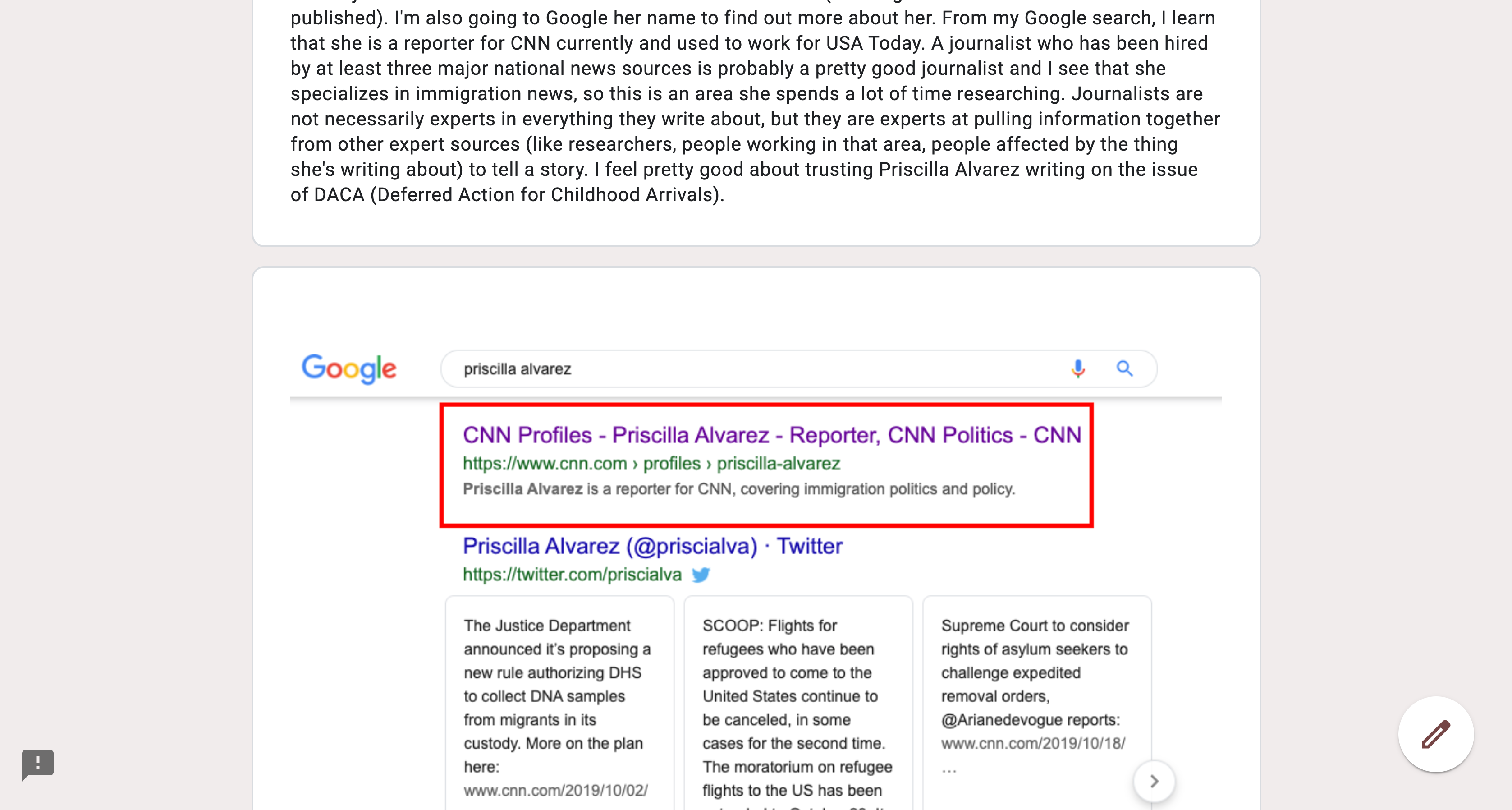
In this case, students would watch a video we have on techniques for evaluating sources. Then I demonstrate the use of those techniques, which predate Caulfield’s four moves, but are not too dissimilar. So they can see how I would go about evaluating this article from the Atlantic on the subject of DACA.
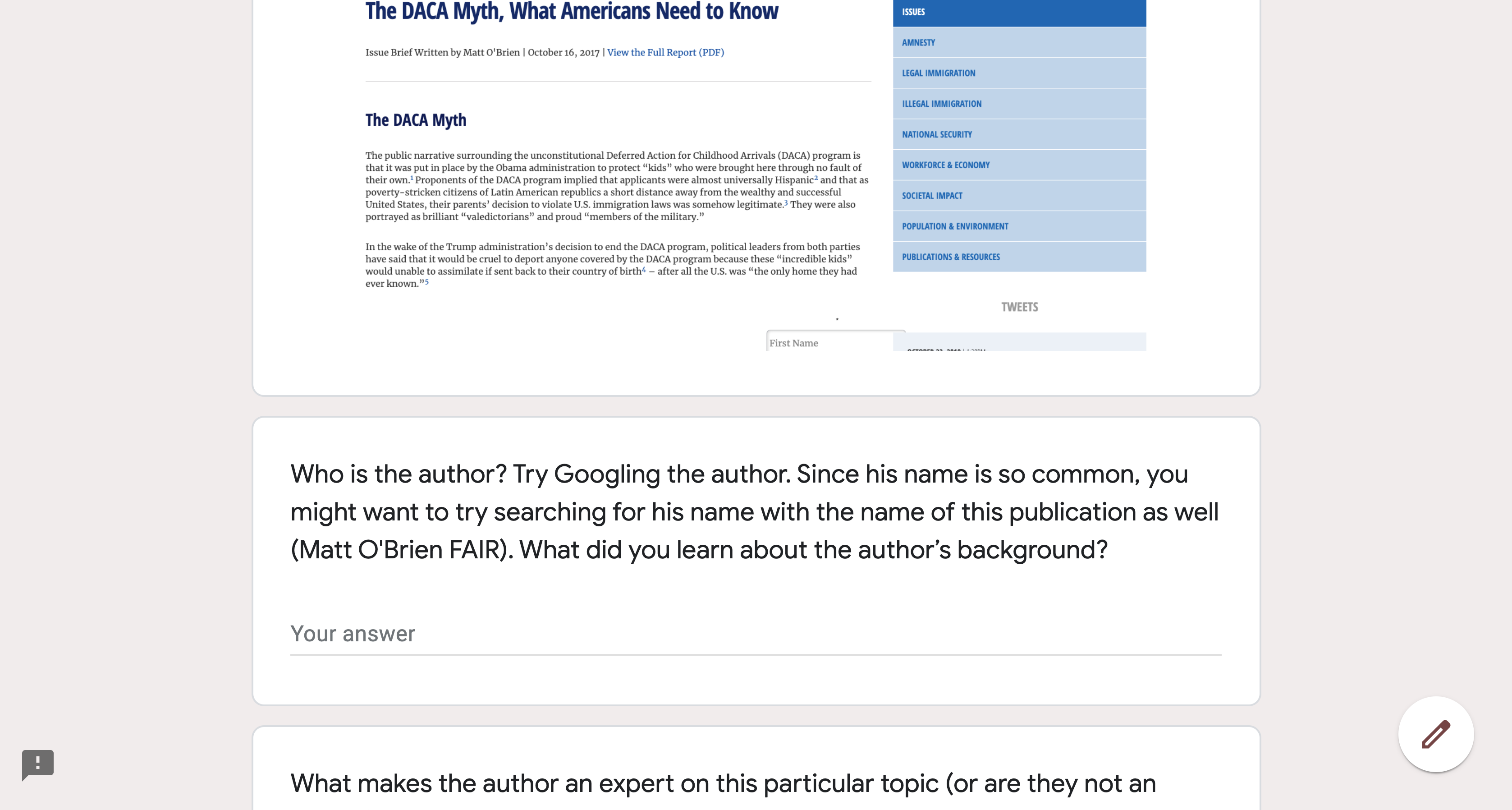
The students then will evaluate two sources on their own and there are specific questions to guide them.

During Fall term, I showed my proof of concept to my colleagues in the library as well as at faculty department meetings in some of my liaison areas. And there was a good amount of enthusiasm from disciplinary faculty – enough that I felt encouraged to continue.
One anthropology instructor who I’ve worked closely with over the years asked if I could create a tutorial on finding sources to support research in her online Biological Anthropology classes – classes I was going to be embedded in over winter term. And I thought this was a perfect opportunity to really pilot the use of the Google Form tutorial concept and see how students do.
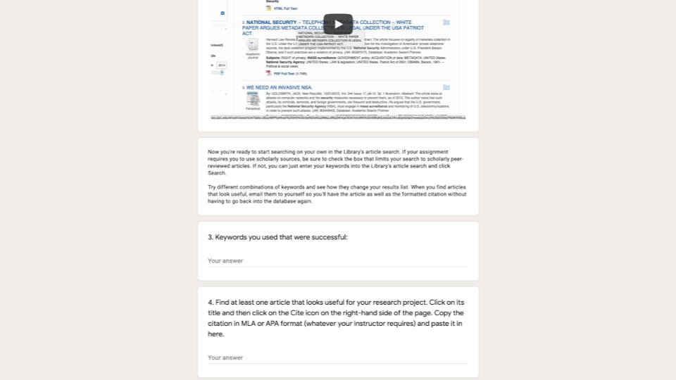
So I made an interactive tutorial where students go through and learn a thing, then practice a thing, learn another thing, then practice that thing. And fortunately, they seemed to complete the tutorial without difficulty and from what I heard from the instructor, they did a really good job of citing quality sources in their research paper in the course. Later in the presentation, you’ll see that I received clear data demonstrating the impact of this tutorial from the Anthropology department’s annual assessment project.

So my vision for having faculty make copies of tutorials to use themselves had one major drawback. Let’s imagine they were really successful and we let a thousand flowers bloom. Well, the problem with that is that you now have a thousand versions of your tutorials lying around and what do you do when a video is updated or a link changes or some other update is needed? I needed a way to track who is using the tutorials so that I could contact them when updates were made.
So here’s how I structured it. I created a Qualtrics form that is a gateway to accessing the tutorials. Faculty need to put in their name, email, and subject area. They then can view tutorials and check boxes for the ones they are interested in using.
Once they submit, they are taking to a page where they can actually copy the tutorials they want. So now, I have the contact information for the folks who are using the tutorials.
This is not just useful for updates, but possibly for future information literacy assessment we might want to do.
The individual tutorials are also findable via our Information Literacy Teaching materials toolkit.
So when the pandemic came just when I was ready to expand this, I felt a little like Nostradamus or something. The timing was very, very good during a very, very bad situation. So we work with Biology 101 every single term in Week 2 to teach students about the library and about what peer review means, why it matters, and how to find peer-reviewed articles.

As soon as it became clear that Spring term was going to start online, I scrambled to create this tutorial that replicates, as well as I could, what we do in the classroom. So they do the same activity we did in-class where they look at a scholarly article and a news article and list the differences they notice. And in place of discussions, I had them watch videos and share insights. I then shared this with the Biology 101 faculty on my campus and they assigned it to their students in Week 2. It was great! [You can view the Biology 101 tutorial here and make a copy of it here]. And during Spring term I made A LOT more tutorials.
The biggest upside of using Google Forms is its simplicity and familiarity. Nearly everyone has created a Google form and they are dead simple to build. I knew that my colleagues in the library could easily copy something I made and tailor it to the courses they’re working with or make something from scratch. And I knew faculty could easily copy an existing tutorial and be able to see student responses. For students, it’s a low-bandwidth and easy-to-complete online worksheet. The barriers are minimal. And on the back-end, just like with LibGuides, there’s a feature where you can easily copy content from another Google Form.

The downsides of using Google Forms are not terribly significant. I mean, I’m sad that I can’t create beautiful, modern, sharp-looking forms, but it’s not the end of the world. The formatting features in Google Forms are really minimal. To create a hyperlink, you actually need to display the whole url. Blech. Then in terms of accessibility, there’s also no alt tag feature for images, so I just make sure to describe the picture in the text preceding or following it. I haven’t heard any complaints from faculty about having to fill out the Qualtrics form in order to get access to the tutorials, but it’s still another hurdle, however small.

This Spring, we used Google Form tutorials to replace the teaching we normally do in classes like Biology 101, Writing 121, Reading 115, and many others. We’ve also used them in addition to synchronous instruction, sort of like I did with my pre-assignments. But word about the Google Form tutorials spread and we ended up working with classes we never had a connection to before. For example, the Biology 101 faculty told the anatomy and physiology instructors about the tutorial and they wanted me to make a similar one for A&P. And that’s a key class for nursing and biology majors that we never worked with before on my campus. Lots of my colleagues have made copies of my tutorials and tailored them to the classes they’re working with or created their own from scratch. And we’ve gotten a lot of positive feedback from faculty, which REALLY felt good during Spring term when I know I was working myself to the bone.
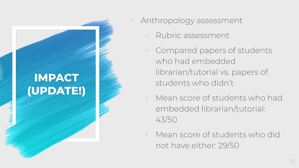
Since giving this presentation, I learned from my colleagues in Anthropology that they actually used my work as the basis of their annual assessment project (which every academic unit has to do). They used a normed rubric to assess student papers in anthropology 101 and compared the papers of students who were in sections in which I was embedded (where they had access to the tutorial) to students in sections where they did not have an embedded librarian or a tutorial. They found that students in the class sections in which I was involved had a mean score of 43/50 and students in other classes had a mean score of 29/50. That is SIGNIFICANT!!! I am so grateful that my liaison area did this project that so validates my own work.

Here’s an excerpt from one email I received from an anatomy and physiology instructor: “I just wanted to follow up and say that the Library Assignment was a huge success! I’ve never had so many students actually complete this correctly with peer-reviewed sources in correct citation format. This is a great tool.” At the end of a term where I felt beyond worked to the bone, that was just the sort of encouragement I needed.
I made copies of a few other tutorials I’ve created so others can access them:
This weekend past I ran the Generous & Open Galleries, Libraries, Archives & Museums (GO GLAM) Miniconf at LinuxConf.au, with Bonnie Wildie. Being a completely online conference this year, we had an increased pool of people who could attend and also who could speak, and managed to put together what I think was a really great program. I certainly learned a lot from all our speakers, and I'll probably share some thoughts on the talks and projects later this year.
I also gave a short talk, about my new Library Map project and some thoughts on generosity in providing open data. Unfortunately, Alissa is completely right about my talk. The tone was wrong. I spoke about the wrong things and in the wrong way. It was an ungenerous talk on the virtues of generosity. I allowed my frustration at underfunded government bureaucracies and my anxiety about the prospect of giving a "technical" talk that "wasn't technical enough" for LCA to overwhelm the better angels of my nature. I won't be sharing the video of my own talk when it becomes available, but here is a short clip of me not long after I delivered it:
So I'm trying again. In this post I'll outline the basic concepts, and the why of Library Map - why I wanted to make it, and why I made the architecture and design choices I've made. In the next post, I'll outline how I built it - some nuts and bolts of which code is used where (and also, to some extent, why). You may be interested in one, or the other, or neither post 🙂.
The Library Map is a map of libraries in Australia and its external territories. There are three 'layers' to the map:
The libraries layer shows every public library in Australia, plus an indicative 800m radius around it. Also mapped on additional overlays are State and National libraries, Indigenous Knowledge Centres, and most still-operating Mechanics Institutes.
The Rules layer has two overlays.
The Fines overlay colour-codes each library service area according to whether they charge overdue fines for everyone, only for adults, or not at all.
The Loan Periods overlay uses patterns (mostly stripes) to indicate the standard loan period in weeks (2, 3, 4, or 6 as it turns out).
The Library Management Software layer works basically the same as the Rules layer, except it colour codes library services according to which library management system (a.k.a Intergrated Library System) they use.
I've wanted something like this map at various times in the past. There is a fair amount of information around at the regional and state level about loan periods, or fine regimes, and even library management systems. But a lot of this is in people's heads, or in lists within PDF documents. I'm not sure I'd call myself a 'visual learner' but sometimes it is much clearer to see something mapped out visually than to read it in a table.
The intended audience for the map is actually a little bit "inside baseball". I'm not trying to build a real-time guide for library users to find things like current opening hours. Google Maps does a fine job of that, and I'm not sure a dedicated site for every public library but only libraries is a particularly useful tool. It would also be a nightmare to maintain. The site ultimately exists because I wanted to see if I could do it, but I had — broadly — two specific use cases in mind:
My talk at LCA2018 was called Who else is using it? — in reference to a question library managers often ask when confronting a suggestion to use a particular technology, especially something major like a library management system. This is understandable — it's reassuring to know that one's peers have made similar decisions ("Nobody gets fired for buying IBM"), but there are also genuine advantages to having a network of fellow users you can talk to about shared problems or desired features. I was interested in whether these sorts of networks and aggregate purchasing decisions might be visible if they were mapped out, in a different way to what might be clear from a list or table. Especially at a national level — I suspected there were strong trends within states in contrasts between them, but didn't have a really clear picture.
The State Library of Queensland was invaluable in this regard, because they have a list of every library service in the state and which library management system they use. When visiting library service websites it turned out that identifying the LMS was often the easiest piece of data to find — much easier than finding out whether they charge overdue fines! It turns out there are very strong trends within each state — stronger than I expected — but Western Australia is a much more fractured and diverse market than I had thought. I also discovered a bunch of library management systems I had never heard of, so that was fun. This layer is the most recent — I only added it today — so there may still be some improvements to be made in terms of how the data is displayed.
The second thing I wanted to map was whether and how libraries charge overdue fines, but my reason was different. I actually started the map with this layer, as part of a briefing I gave to some incoming Victorian local government Councillors about what they should know about public libraries.
Here, the goal is mapping as an advocacy tool, using the peer pressure of "who else is charging it?" to slowly flip libraries to go fine-free. Fines for overdue library books are regressive and counter-productive. I have found no compelling or systematic evidence that they have any effect whatsoever on the aggregate behaviour of library users in terms of returning books on time. They disproportionally hurt low income families. They need to go.
In Victoria there has been a growing movement in the last few years for public libraries to stop charging overdue fines. I wasn't really aware of the situation in other states, but it turns out the whole Northern Territory has been fine-free for over a decade, and most libraries in Queensland seem to also be fine-free. I'm still missing a fair bit of data for other states, especially South and Western Australia. What I'm hoping the map can be used for (once the data is more complete) is to identify specific libraries that charge fines but are near groups of libraries that don't, and work with the local library networks to encourage the relevant council to see that they are the odd ones out. I've worked in public libraries and know how difficult this argument can be to make from the inside, so this is a tool for activists but also to support library managers to make the case.
As if often a problem in libraries, I had to define a few terms and therefore "normalise" some data in order to have it make any sense systematically. So "no fines for children" is defined as any system that has a "younger than" exclusion for library fines or an exclusion for items designated as "children's books". Some libraries are fine free for users under 14, others for those under 17, some only for children's book loans and so on. On my map they're all the same. The other thing to normalise was the definition of "overdue fine", which you might think is simple but turns out to be complex. In the end I somewhat arbitrarily decided that if there is no fee earlier than 28 days overdue, that is classified as "no overdue fines". Some libraries charge a "notice fee" after two weeks (which does count), whilst others send an invoice for the cost of the book after 28 days (which doesn't).
As the project has progressed, some things have changed, especially how I name things. When I first added the Libraries layer, I was only looking at Victoria, using the Directory of Public Library Services in Victoria. This includes Mechanics Institutes as a separate category, and that seemed like a good idea, so I had two overlays, in different colours. Then I figured I should add the National Library, and the State Libraries, as a separate layer, since they operate quite differently to local public libraries.
Once I got to Queensland, I discovered that the State Library of Queensland not only provides really good data on public libraries, but also had broadly classified them into three categories: "RLQ" for Rural Libraries Queensland, a reciprocal-borrowing arrangement; "IND" for Independent library services, and "IKC" for "Indigenous Knowledge Centre". The immediate question for me was whether I would also classify any of these libraries as something different to a "standard" public library.
The main thing that distinguishes the RLQ network from the "independents" is that it is a reciprocal lending network. In this regard, it's much the same as Libraries Victoria (formerly the Swift Consortium), or ShoreLink. There are other ways that rural libraries in Queensland operate differently to urban libraries in Queensland, but I don't think these differences make them qualitatively different in terms of their fundamental nature.
But what about Indigenous Knowledge Centres? I admit I knew very little about them, and I still only know what I've gleaned from looking at IKC websites. The Torres Strait Island Regional Council website seems to be fairly representative:
Our Indigenous Knowledge Centres endeavour to deliver new technology, literacy and learning programs to empower our communities through shared learning experiences. We work with communities to preserve local knowledge and culture and heritage, to keep our culture strong for generations.
The big difference between an IKC and a typical public library is that the focus is on preserving local Indigenous knowledge and culture, which does happen through books and other library material, but is just as likely to occur through classes and activities such as traditional art and dance.
But the more I looked at this difference, the less different it seemed to be. Public libraries across the world have begun focussing more on activities and programs in the last two decades, especially in WEIRD countries. Public libraries have always delivered new technology, literacy and learning programs. And the Directory of Public Library Services in Victoria amusingly reports that essentially every library service in Victoria claims to specialise in local history. What are public libraries for, if not to "keep our culture strong for generations"?
Yet it still felt to me that Indigenous Knowledge Centres are operating from a fundamentally different mental model. Finally it dawned on me that the word "our" is doing a lot of work in that description. Our Indigenous Knowledge Centres, keep our culture strong for generations. I was taken back to a conversation I've had a few times with my friend Baruk Jacob, who lives in Aotearoa but grew up in a minority-ethnicity community in India. Baruk maintains that public libraries should stop trying to be universally "inclusive" — that they are fundamentally Eurocentric institutions and need to reconcile themselves to staying within that sphere. In this line of thinking, public libraries simply can't serve Indigenous and other non-"Western" people appropriately as centres of knowledge and culture. I could see where Baruk was coming from, but I was troubled by his argument, and the implication that different cultural traditions could never be reconciled. As I struggled to decide whether Indigenous Knowledge Centres were public libraries, or something else, I think I started to understand what Baruk meant.
I'd been thinking about this back to front. Indigenous Knowledge Centre is a usefully descriptive term. These places are centres for Indigenous knowledge. The problem wasn't how to classify IKCs, but rather how to classify the other thing. The activities might be the same, but the our is different. I thought about what a non-Indigenous Knowledge Centre might be. What kind of knowledge does it want to "keep strong for generations"? I thought about all those local history collections full of books about "pioneers" and family histories of "first settlers". If it's not Indigenous knowledge, it must be Settler knowledge. When I first saw this term being used by Aboriginal activists in reference to non-Indigenous residents generally, and white Australians specifically, I bristled. I mean, sure, the modern culture is hopelessly dismissive of 60,000 years of human occupation, culture and knowledge, but how could I be a "settler" when I have five or six generations of Australian-born ancestors? But a bit of discomfort is ok, and I have rather hypocritical ideas about other settler-colonial communities. It's exactly the right term to describe the culture most Australians live in.
So I renamed "public libraries" as "Settler Knowledge Centres". I initially renamed the National & State Libraries to "Imperial Knowledge Centres", but later decided it was more accurate to call them "Colonial Knowledge Centres". I also briefly renamed Mechanics Institutes to Worker Indoctrination Centres, but that's not entirely accurate and I realised I was getting carried away. I wasn't completely oblivious to the fact that this nomenclature could be a bit confusing, so I cheekily created two views: the "General" view which would be the default, and a second view which would appear on clicking "View in White Fragility mode". This second mode would show the more familiar names "Public Libraries" and "National & State Libraries".
While I was doing some soul searching this morning about my GO GLAM talk, I continued to work on the map. My cheeky joke about "White fragility mode" had made me slightly uncomfortable from the moment I'd created it, but I initially brushed it off as me worrying too much about being controversial. But I realised today that the real problem was that calling it "White fragility mode" sabotages the entire point of the feature. The default language of "Settler Knowledge Centre" and "Colonial Knowledge Centre" sitting next to "Indigenous Knowledge Centre" is intended to invite map users to think about the work these institutions do to normalise certain types of knowledge, and to "other" alternative knowledge systems and lifeworlds. The point is to bring people in to sit with the discomfort that comes from seeing familiar things described in an unfamiliar way. Calling it "White fragility mode" isn't inviting, it's smug. It either pushes people away, or invites them to think no more about it because they're already woke enough to get it.
So today I changed it to something hopefully more useful. General mode is now called Standard Mode, and White fragility mode is now called Colonial mode. It's the mode of thinking that is colonial, not the reader. Flicking to Colonial Mode is ok if you need the more familiar terms to get your bearings: but hopefully by making it the non-standard view, users of the map are encouraged to think about libraries and about Australia in a slightly different way. They don't have to agree that the "standard mode" terminology is better.
So that's some background behind why I started building the map and why I made some of the decisions I have about how it works. You can check it out at librarymap.hugh.run and see (most of) the code and data I used to build it on GitHub. Next time join me for a walk through how I made it.
Nearly four years ago I decided to start collecting tweets to Donald Trump out of morbid curiosity. If I was a real archivist, I would have planned this out a little bit better, and started collecting on election night in 2016, or inaguration day 2017. I didn’t. Using twarc, I started collecting with the Filter (Streaming) API on May 7, 2017. That process failed, and I pivoted to using the Search API. I dropped that process into a simple bash script, and pointed cron at it to run every 5 days. Here’s what the bash script looked like:
#!/bin/bash

DATE=`date +"%Y_%m_%d"`

cd /mnt/vol1/data_sets/to_trump/raw

/usr/local/bin/twarc search 'to:realdonaldtrump' --log donald_search_$DATE.log > donald_search_$DATE.json
It’s not beautiful. It’s not perfect. But, it did the job for the most part for almost four years save and except a couple Twitter suspensions on accounts that I used for collection, and an absolutely embarassing situtation where I forgot to setup cron correctly on a machine I moved the collecting to for a couple weeks while I was on family leave this past summer.
In the end, the collection ran from May 7, 2017 - January 20, 2021, and collected 362,464,578 unique tweets; 1.5T of line-delminted json! The final created_at timestamp was Wed Jan 20 16:49:03 +0000 2021, and the text of that tweet very fittingly reads, “@realDonaldTrump YOU’RE FIRED!“
The “dehydrated” tweets can be found here. In that dataset I decided to include in a number of derivatives created with twut which, I hope rounds out the dataset. This update is the final update on the dataset.
I also started working on some notebooks here where I’ve been trying to explore the dataset a bit more in my limited spare time. I’m hoping to have the time and energy to really dig into this dataset sometime in the future. I’m especially curious at what the leadup to the 2021 storming of the United States Capitol looks like in the dataset, as well as the sockpuppet frequency. I’m also hopeful that others will explore the dataset and that it’ll be useful in their research. I have a suspicion folks can do a lot smarter, innovative, and creative things with the dataset than I did here, here, here, here, or here.
For those who are curious what the tweet volume for the last few months looked like (please note that the dates are UTC), check out these bar charts. January 2021 is especially fun.
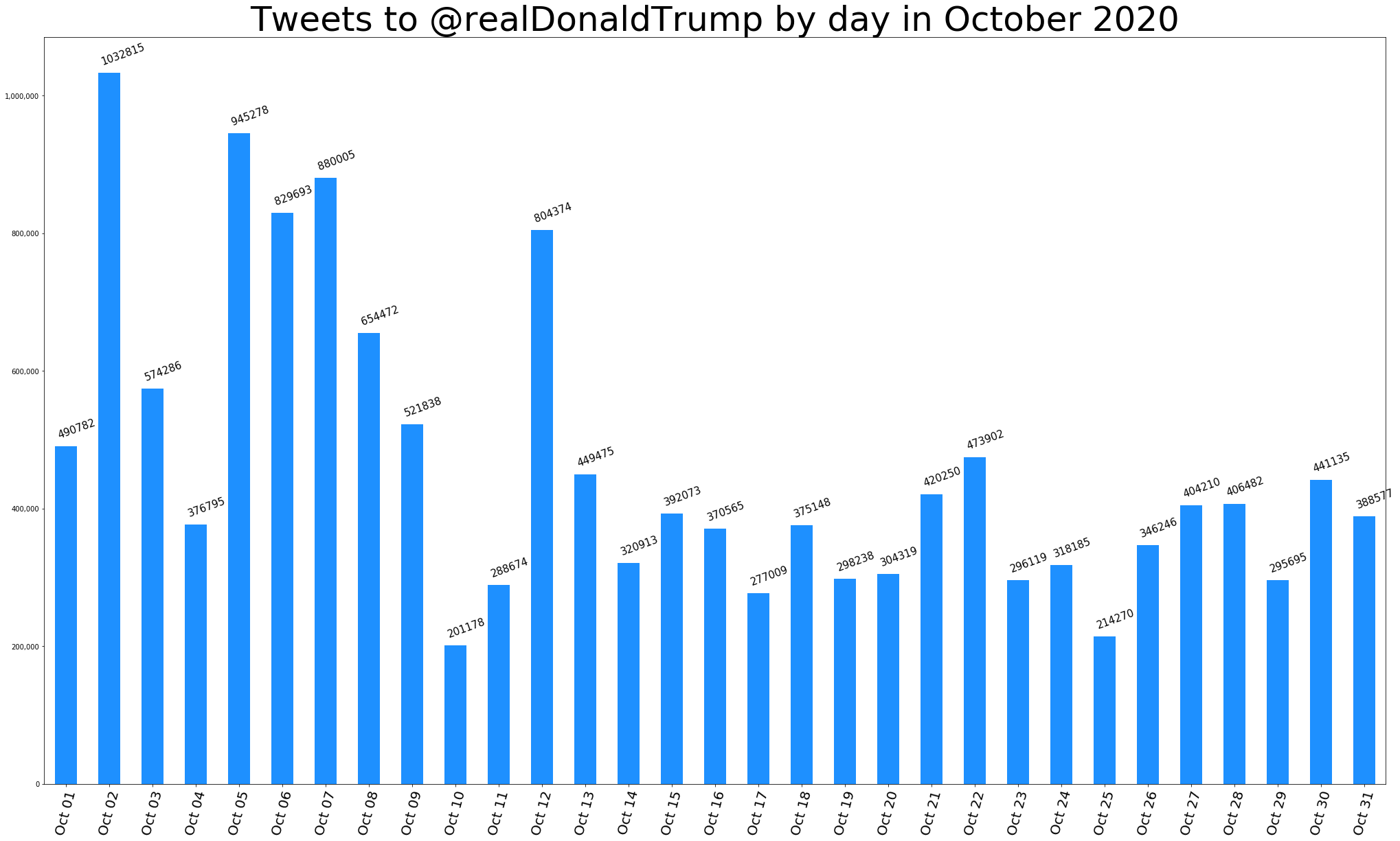
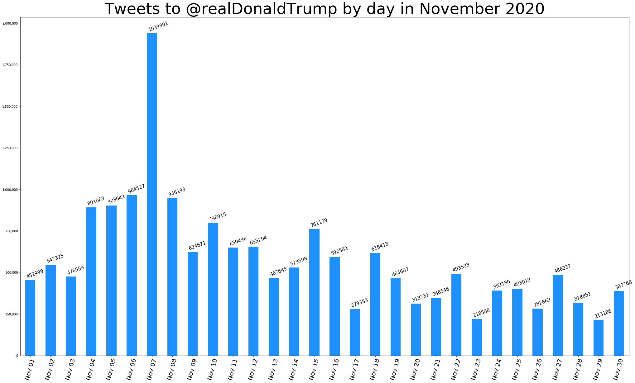
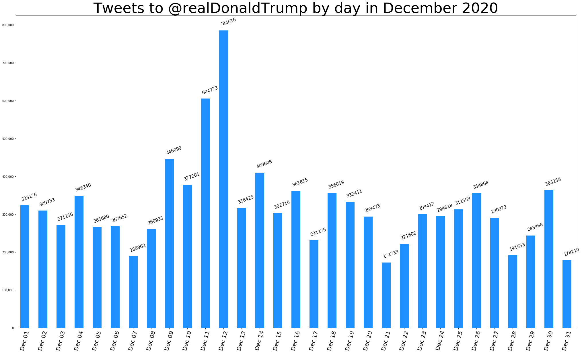
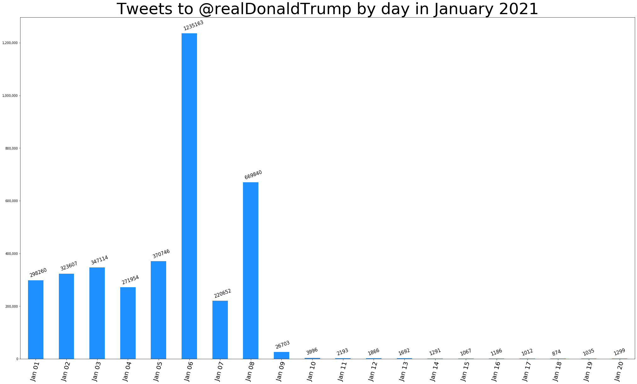
-30-
2021-01-23T05:00:00+00:00 Lucidworks: Consider a New Application for AI in Retail https://lucidworks.com/post/consider-a-new-application-for-ai-in-retail/How companies can plan for 2021 by weaving AI and machine learning into their digital experiences.
The post Consider a New Application for AI in Retail appeared first on Lucidworks.
2021-01-22T21:59:43+00:00 Garrett Schwegler Mita Williams: Weeknote 3 (2021) https://librarian.aedileworks.com/2021/01/22/weeknote-3-2021/Hey. I missed last week’s weeknote. But we are here now.
This week I gave a class on searching scientific literature to a group of biology masters students. While I was making my slides comparing the Advanced Search capabilities of Web of Science and Scopus, I discovered this weird behaviour of Google Scholar: a phrase search generated more hits than not.

I understand that Google Scholar performs ‘stemming’ instead of truncation in generating search results but this still makes no sense to me.
New to me: if you belong to an organization that is already a member of CrossRef, you are eligible to use a Similarity Check of documents for an additional fee. Perhaps this is a service we could provide to our OJS editors.
I’m still working through the Canadian Journal of Academic Librarianship special issue on Academic Libraries and the Irrational.
Long time readers know that I have a fondness for the study of organizational culture and so it should not be too surprising that the first piece I wanted to read was The Digital Disease in Academic Libraries. It begins….
THOUGH several recent books and articles have been written about change and adaptation in contemporary academic libraries (Mossop 2013; Eden 2015; Lewis 2016), there are few critical examinations of change practices at the organizational level. One example, from which this paper draws its title, is Braden Cannon’s (2013) The Canadian Disease, where the term disease is used to explore the trend of amalgamating libraries, archives, and museums into monolithic organizations. Though it is centered on the impact of institutional convergence, Cannon’s analysis uses an ethical lens to critique the bureaucratic absurdity of combined library-archive-museum structures. This article follows in Cannon’s steps, using observations from organizational de-sign and management literature to critique a current trend in the strategic planning processes and structures of contemporary academic libraries. My target is our field’s ongoing obsession with digital transformation beyond the shift from paper-based to electronic resources, examined in a North American context and framed here as The Digital Disease.
I don’t want to spoil the article but I do want to include this zinger of a symptom which is the first of several:
If your library’s organizational chart highlights digital forms of existing functions, you might have The Digital Disease.
Kris Joseph, The Digital Disease in Academic Libraries, Canadian Journal of Academic Librarianship, Vol 6 (2020)
Ouch. That truth hurts almost as much as this tweet did:

I wrote the following text on my tablet with a stylus, which was an interesting experience:
So, thinking about ways to make writing fun again, what if I were to write some of them by hand? I mean I have a tablet with a pretty nice stylus, so maybe handwriting recognition could work. One major problem, of course, is that my handwriting is AWFUL! I guess I’ll just have to see whether the OCR is good enough to cope…
It’s something I’ve been thinking about recently anyway: I enjoy writing with a proper fountain pen, so is there a way that I can have a smooth workflow to digitise handwritten text without just typing it back in by hand? That would probably be preferable to this, which actually seems to work quite well but does lead to my hand tensing up to properly control the stylus on the almost-frictionless glass screen.
I’m surprised how well it worked! Here’s a sample of the original text:
And here’s the result of converting that to text with the built-in handwriting recognition in Samsung Notes:
Writing blog posts by hand
So, thinking about ways to make writing fun again, what if I were to write some of chum by hand? I mean, I have a toldest winds a pretty nice stylus, so maybe handwriting recognition could work.
One major problems, ofcourse, is that my , is AWFUL! Iguess
I’ll just have to see whattime the Ocu is good enough to cope…
It’s something I’ve hun tthinking about recently anyway: I enjoy wilting with a proper fountain pion, soischeme a way that I can have a smooch workflow to digitise handwritten text without just typing it back in by hand?
That wouldprobally be preferableto this, which actually scams to work quito wall but doers load to my hand tensing up to properly couldthe stylus once almost-frictionlessg lass scream.
It’s pretty good! It did require a fair bit of editing though, and I reckon we can do better with a model that’s properly trained on a large enough sample of my own handwriting.
 Photo from WOCinTech chat, CC-BY
This is the last post in a weeklong series exploring DEI professional competencies. Again, I believe the five key competencies for DEI professionals are:
Yesterday’s post was about influencing others. This post will explore getting cross functional projects done. I’ll also share some other DEI career resources.
Great ideas without action are totally meaningless. As a DEI leader you’ll be working across departments and functions to get stuff done. Strong project management skills and collaboration are key in making change to existing processes and developing new ways of doing things. Here’s two examples to illustrate this competency.
One of my first projects at Mozilla was working with People Ops and a Tableau expert in IT to build a dashboard to track our diversity metrics, which was more difficult and time consuming than I first thought. When I started the project was off the rails, so I suggested we restart by introducing ourselves, what we thought we brought to the table and then developed a RASCI for the project. With these foundations in place we shifted us to be a very effective team. We completed the project and became friends. Having a dashboard for diversity metrics was important as leaders owned accountability goals and needed to know how they were doing.
Engineers started Mozilla’s first mentorship program. I joined the team and was the only non-technical person and marvelled at some of the skills and ways of thinking that the others brought. It was one of those wonderful experiences where we were more than the sum of our parts. We were a small group of people with different backgrounds, doing different jobs, at various job levels and we were able to stand up and support a mentorship program for about 100 people. I credit the leadership of Melissa O’Connor, Senior Manager of Data Operations. She often said “tell me what I’m missing here” to invite different options and ran the most efficient meetings I’ve ever attended in my life.
Great ideas without action are totally meaningless. Turning thoughts into actions as a leader in DEI is a necessary art–to get things done you’ll need to effectively collaborate with people at different levels and in different functions.
I’m excited to be one of the panelists for Andrea Tatum’s DEI careers panel tomorrow, January 23. The event is sold out but she’ll be simulcasting live on YouTube at January 23 at 10am Pacific. Andrea also introduced me to Russell Reynold’s list of competencies of a Chief Diversity Officer.
Aubrey Blanche’s post How can I get a job in D&I? starts by trying to talk the reader out of going into this line of work then gets into five key areas of expertise.
Dr. Janice Gassam’s Dirty Diversity Podcast has an episode where she interviews Lambert Odeh, Diversity and Inclusion Manager at Olo Inc. on How to Land a Career in DEI.
The post Diversity, equity and inclusion core competencies: Get cross functional projects done (Part 5 of 5) appeared first on Tara Robertson Consulting.
2021-01-22T14:01:09+00:00 Tara Robertson Open Knowledge Foundation: How to run your Open Data Day event online in 2021 https://blog.okfn.org/2021/01/22/how-to-run-your-open-data-day-event-online-in-2021/
For Open Data Day 2021 on Saturday 6th March, the Open Knowledge Foundation is offering support and funding for in-person and online events anywhere in the world via our mini-grant scheme.
Open Data Day normally sees thousands of people getting together at hundreds of events all over the world to celebrate and use open data in their communities but this year has not been a normal year.
With many countries still under lockdown or restricted conditions due to the Covid-19 pandemic, we recognise that many people will need to celebrate Open Data Day by hosting online events rather than getting together for in-person gatherings.
To support the running of events, anyone can apply to our mini-grant scheme to receive $300 USD towards the running of your Open Data Day event whether it takes place in-person or online. Applications must be submitted before 12pm GMT on Friday 5th February 2021 by filling out this form.
If you’re applying for a mini-grant for an online event, we will accept applications where the funds are allocated to cover any of the following costs:
It might feel challenging to plan a great online event if you are used to running events in the real world. But many people and organisations have overcome these challenges this year, and there are many tools that can help you plan your event. Here are some tips and tools that we use for remote events that we think will help with your preparations.
Open Knowledge Foundation is a remote working organisation with our team spread around the world. We use Zoom, Google Meet or Slack to host our internal and external video meetings and rely on Google Docs, Github, Gitter and Discourse to allow us to share documents and talk in real-time. Many of these tools are free and easy to set up.
Two members of our team are also on the organisation team of csv,conf, an annual community conference for data makers which usually hosts several hundred people for a two-day event. For csv,conf,v5 in May 2020, the team decided to make their event online-only and it proved to be a great success thanks to lots of planning and the use of good online tools. Read this post – https://csvconf.com/2020/going-online – to learn more about how the team organised their first virtual conference including guidance about the pros and cons of using tools like Crowdcast, Zenodo, Zoom and Spatial Chat for public events.
Other organisations – including the Center for Scientific Collaboration and Community Engagement and the Mozilla Festival team – have also shared their guidebooks and processes for planning virtual events.
We hope some of these resources will help you in your planning. If you have any further questions relating to an Open Data Day 2021 mini-grant application, please email opendataday@okfn.org.
2021-01-22T11:06:44+00:00 Stephen Abbott Pugh Ed Summers: Trump's Tweets https://inkdroid.org/2021/01/21/trumps-tweets/TLDR: Trump’s tweets are gone from twitter.com but still exist spectrally in various states all over the web. After profiting off of their distribution Twitter now have a responsibility to provide meaningful access to the Trump tweets as a read only archive.
This post is also published on the Documenting the Now Medium where you can comment, if the mood takes you.
So Trump’s Twitter account is gone. Finally. It’s strange to have had to wait until the waning days of his presidency to achieve this very small and simple act of holding him accountable to Twitter’s community guidelines…just like any other user of the platform.
Better late than never, especially since his misinformation and lies can continue to spread after he has left office.
But isn’t it painful to imagine what the last four years (or more) could have looked like if Twitter and the media at large had recognized their responsibility and acted sooner?
When Twitter suspended Trump’s account they didn’t simply freeze it and prevent him from sending more hateful messages. They flipped a switch that made all the tweets he has ever sent disappear from the web.
These are tweets that had real material consequences in the world. As despicable as Trump’s utterances have been, a complete and authentic record of them having existed is important for the history books, and for holding him to account.
Twitter’s suspension of Donald Trump’s account has also removed all of his thousands of tweets sent over the years. I personally find it useful as a reporter to be able to search through his tweets. They are an important part of the historical record. Where do they live now?
— Olivia Nuzzi (@Olivianuzzi) January 9, 2021
Where indeed? One hopes that they will end up in the National Archives (more on that in a moment). But depending on how you look at it, they are everywhere.
Twitter removed Trump’s tweets from public view at twitter.com. But fortunately, as Shawn Jones notes, embedded tweets like the one above persist the tweet text into the HTML document itself. When a tweet is deleted from twitter.com the text stays behind elsewhere on the web like a residue, as evidence (that can be faked) of what was said and when.
It’s difficult to say whether this graceful degradation was an intentional design decision to make their content more resilient, or it was simply a function of Twitter wanting their content to begin rendering before their JavaScript had loaded and had a chance to emboss the page. But design intent isn’t really what matters here.
What does matter is the way this form of social media content degrades in the web commons. Kari Kraus calls this process “spectral wear”, where digital media “help mitigate privacy and surveillance concerns through figurative rather than quantitative displays, reflect and document patterns of use, and promote an ethics of care.” (Kraus, 2019). This spectral wear is a direct result of tweet embed practices that Twitter itself promulgates while simultaneously forbidding it Developer Terms of Service:
If Twitter Content is deleted, gains protected status, or is otherwise suspended, withheld, modified, or removed from the Twitter Applications (including removal of location information), you will make all reasonable efforts to delete or modify such Twitter Content (as applicable) as soon as possible.
Fortunately for history there has probably never been a more heavily copied social media content than Donald Trump’s tweets. We aren’t immediately dependent on twitter.com to make this content available because of the other other places on the web where it exists. What does this copying activity look like?
I intentionally used copied instead of archived above because the various representations of Trump’s tweets vary in terms of their coverage, and how they are being cared for.
Given their complicity in bringing Trump’s messages of division and hatred to a worldwide audience, while profiting off of them, Twitter now have a responsibility to provide as best a representation of this record for the public, and for history.
We know that the Trump administration have been collecting the @realDonaldTrump Twitter account, and plan to make it available on the web as part of their responsibilities under the Presidential Records Act:
The National Archives will receive, preserve, and provide public access to all official Trump Administration social media content, including deleted posts from @realDonaldTrump and @POTUS. The White House has been using an archiving tool that captures and preserves all content, in accordance with the Presidential Records Act and in consultation with National Archives officials. These records will be turned over to the National Archives beginning on January 20, 2021, and the President’s accounts will then be made available online at NARA’s newly established trumplibrary.gov website.
NARA is the logical place for these records to go. But it is unclear what shape these archival records will take. Sure the Library of Congress has (or had) it’s Twitter archive. It’s not at all clear if they are still adding to it. But even if they are LC probably hasn’t felt obligated to collect the records of an official from the Executive Branch, since they are firmly lodged in the Legislative. Then again they collect GIFs so, maybe?
Reading between the lines it appears that a third party service is being used to collect the social media content: possibly one of the several e-discovery tools like ArchiveSocial or Hanzo. It also looks like the Trump Administration themselves have entered into this contract, and at the end of its term (i.e. now) will extract their data and deliver it to NARA. Given their past behavior it’s not difficult to imagine the Trump administration not living up to this agreement in substantial ways.
This current process is a slight departure from the approach taken by the Obama administration. Obama initiated a process where platforms [migrate official accounts] to new accounts that were then managed going forward by NARA (Acker & Kriesberg, 2017). We can see that this practice is being used again on January 20, 2021 when Biden became President. But what is different is that Barack Obama retained ownership of his personal account @barackobama, which he continues to use.NARA has announced that they will be archiving Trump’s now deleted (or hidden) personal account.
A number of Trump administration officials, including President Trump, used personal accounts when conducting government business. The National Archives will make the social media content from those designated accounts publicly available as soon as possible.
The question remains, what representation should be used, and what is Twitter’s role in providing it?
Meanwhile there are online collections like The Trump Archive, the New York Times’ Complete List of Trump’s Twitter Insults, Propublica’s Politwoops and countless GitHub repositories of data which have collected Trump’s tweets. These tweets are used in a multitude of ways including things as absurd as a source for conducting trades on the stock market.
But seeing these tweets as they appeared in the browser, with associated metrics and comments is important. Of course you can go view the account in the Wayback Machine and browse around. But what if we wanted a list of all the Trump tweets? How many times were these tweets actually archived? How complete is the list?
After some experiments with the Internet Archive’s API it’s possible to get a picture of how the tweets from the @realDonaldTrump account have been archived there. There are a few wrinkles because a given tweet can have many different URL forms (e.g. tracking parameters in the URL query string). In addition just because there was a request to archive a URL for something that looks like a realDonaldTrump tweet URL doesn’t mean it resulted in a successful response. Success here means a 200 OK from twitter.com when resolving the URL. Factoring these issues into the analysis it appears the Wayback Machine contains (at least) 16,043,553 snapshots of Trump’s tweets.
https://twittter.com/realDonaldTrump/status/{tweet-id}Of these millions of snapshots there appear to be 57,292 unique tweets. This roughly correlates with the 59K total tweets suggested by the last profile snapshots of the account. The maximum number of times in one day that his tweets were archived was 71,837 times on February 10, 2020. Here’s what the archive snapshots of Trump’s tweets look like over time (snapshots per week).
It is relatively easy to use the CSV export from the [Trump Archive] project to see what tweets they know about that the Internet Archive does not and vice-versa (for the details see the Jupyter notebook and SQLite database here).
It looks like there are 526 tweet IDs in the Trump Archive that are missing from the Internet Archive. But further examination shows that many of these are retweets, which in Twitter’s web interface, have sometimes redirected back to the original tweet. Removing these retweets to specifically look at Trump’s own tweets there are only 7 tweets in the Trump Archive that are missing from the Internet Archive. Of these 4 are in fact retweets that have been miscategorized by the Trump Archive.
One of the three is this one, which is identified in the Trump Archive as deleted, and wasn’t collected quick enough by the Internet Archive before it was deleted:
Roger Stone was targeted by an illegal Witch Hunt tha never should have taken place. It is the other side that are criminals, including the fact that Biden and Obama illegally spied on my campaign - AND GOT CAUGHT!"
Sure enough, over at the Politwoops project you can see that this tweet was deleted 47 seconds after it was sent:
Flipping the table it’s also possible to look at what tweets are in the Internet Archive but not in the Trump Archive. It turns out that there are 3,592 tweet identifiers in the Wayback machine for Trump’s tweets which do not appear in the Trump Archive. Looking a bit closer we can see that some are clearly wrong, because the id itself is too small a number, or too large. And then looking at some of the snapshots it appears that they often don’t resolve, and simply display a “Something went wrong” message:
Yes, something definitely went wrong (in more ways than one). Just spot checking a few there also appear to be some legit tweets in the Wayback that are not in the Trump archive like this one:

Notice how the media will not play there? It would take some heavy manual curation work to sort through these tweet IDs to see which ones are legit, and which ones aren’t. But if you are interested here’s an editable Google Sheet.
Finally, here is a list of the top ten archived (at Internet Archive) tweets. The counts here reflect all the variations for a given tweet URL. So they will very likely not match the count you see in the Wayback Machine, which is for the specific URL (no query paramters).
The point of this rambling data spelunking, if you’ve made it this far, is to highlight the degree to which Trump’s tweets have been archived (or collected), and how the completeness and quality of those representations is very fluid and difficult to ascertain. Hopefully Twitter is working with NARA to provide as complete a picture as possible of what Trump said on Twitter. As much as we would like to forget, we must not.
Acker, A., & Kriesberg, A. (2017). Tweets may be archived: Civic engagement, digital preservation and obama white house social media data. Proceedings of the Association for Information Science and Technology, 54(1), 1–9.
Kraus, K. (2019). The care of enchanted things. In M. K. Gold & L. F. Klein (Eds.), Debates in the digital humanities 2019. Retrieved from https://www.jstor.org/stable/10.5749/j.ctvg251hk.17
Updated Fusion integration with Drupal provides easier setup and additional monitoring.
The post Lucidworks Announces Updated Integration with Drupal appeared first on Lucidworks.
2021-01-21T19:59:50+00:00 Tom Allen