Arms outstretched, standing on a mottled rock with legs spread apart, one slightly bent backward, and with multicolored rays shining behind him, “Albion Rose” greeted viewers entering the Tate Blake retrospective. The title comes from the inscription “Albion rose from where he labourd at the Mill with Slaves” on a later state of this plate, which includes the signature “WB inv 1780.”Rosenwald Collection, National Gallery of Art, Washington, DC, 1943.3.8990. Since the first state was etched in the mid-1790s, this visionary dating suggests Blake’s emancipation from his apprenticeship as an engraver (1772–79).Leo Damrosch, Eternity’s Sunrise: The Imaginative World of William Blake (New Haven: Yale University Press, 2015) 96-101. Casting aside the artisan printmaker who was central to the previous Tate exhibition (2000–01) and to William Blake: Apprentice and Master at the Ashmolean (2014–15), the 2019–20 exhibition started with Blake’s enrollment in the Royal Academy (1779–85?).Martin Myrone, “William Blake as a Student of the Royal Academy: A Prosopographical Perspective,” Blake 51.2 (fall 2017). Placed on the threshold of the exhibition, “Albion Rose” articulated a shared idiom of art practice through a dynamic, almost dancing allusion to Leonardo’s Vitruvian Man, while the red, yellow, and blue rays radiating outward behind him brought to mind a prismatic color wheel.
See enlargement.
Both “Albion Rose” and “The Ancient of Days,” the first and last objects in the exhibition, had a double life inside and outside books, as book parts and as separate plates. As Martin Myrone points out in the catalogue, the version of “Albion Rose” on view was originally placed at the end of the Huntington Library copy of The Song of Los, offering the promise of a “glad day” to offset the grueling apocalyptic crescendo of the continental prophecy.Catalogue 9-12. Robert N. Essick argues that “Albion Rose” was placed as the final plate sometime between 1903, when The Song of Los (E) was sold from the Crewe collection, and 1915, when Henry Huntington acquired it (see Essick, The Works of William Blake in the Huntington Collections: A Complete Catalogue [San Marino, CA: Huntington Library, 1985] 165-68, 195-97. However, on the basis of the strong offset that “Albion Rose” left on the last plate of copy E, Martin Butlin believes that it may have been placed much earlier, indeed possibly by Blake himself (see Butlin, “Footnotes on the Huntington Blakes,” Blake 22.1 [summer 1988]: 17-18). “The Ancient of Days” functioned as a frontispiece to Europe a Prophecy (1794), but was also printed as a separate plate. The cyclical returns to this print could be considered as spiritual exercises: the Manchester impression hanging in the exhibition was the last work Blake colored before he died, “the best I have ever finished.”As reported by Frederick Tatham, quoted in Amy Concannon’s catalogue essay “‘A New Kind of Man’” 197. The exhibition paid great attention to the “‘bookishness’ of the books” and their modes of operation, suggesting their different “environments and experiences,” “how they are material objects held in a hand or put on a desk before you, how the context of a library or print collection is quite unlike the modern gallery setting,”Myrone in Luisa Calè, “William Blake: The Artist (Tate Britain, 11 September 2019–2 February 2020): An Interview with Martin Myrone,” Blake 53.1 (summer 2019). and sourcing works in their original bindings, where possible. The contrast between different rhythms of reading and looking could be detected in the rich, informative captions displayed around the vitrines, as opposed to the more minimalist ones placed alongside works hanging on the walls.
While the exhibition was informed by a deep investment in “the history of the print as an object,” the choice to limit the exhibition commentary left the viewer “free to decide quite otherwise—as the makers of tote bags and the designers of libertarian websites have discovered” (Myrone, catalogue 12). This attention to the dissemination and transmediation of Blake’s works chimes with Mike Goode’s call for a “pragmatics of fragmentation and circulation in pieces.”Mike Goode, “The Joy of Looking: What Blake’s Pictures Want,” Representations 119.1 (2012): 1-36 (see 5). In the current climate, the short captions and information panels steered away from “elitist, recondite … undemocratic ‘expertise’” (12). In producing a “Blake for all,” the curators claim that “as exhibition makers we must acknowledge and work with the full spectrum of experiences Blake’s works might be expected to elicit” (14). Their Blakean invitation to “rouze the faculties to act” is inherent in a phenomenological experience of the work.
Just as Cincinnatus gave the cue for the Royal Academy display, the second part of “‘Blake: Be an Artist!’” was defined by a huge book of prints from the Boydell Shakespeare Gallery (1803), open to Richard Earlom’s engraving of Henry Fuseli’s King Lear Casting Out His Daughter Cordelia (1792), in a vitrine in the proximity of Blake’s Oberon, Titania, and Puck with Fairies Dancing (c. 1786). Biblical watercolors from the 1780s showed how Blake’s idiom developed out of a common idiom of historical painting from the 1760s. His evolution as a new kind of artist combining text and illustration was documented through his work on Tiriel (c. 1789), represented by a wall of wash drawings, including the juxtaposition of Har and Heva Bathing, Mnetha Looking On and James Barry’s “Jupiter and Juno on Mount Ida,” from the Iliad, an etching, line engraving, and mezzotint dated 1804–05.This engraving reproduces Jupiter and Juno on Mount Ida, oil on canvas, c. 1804, Museums Sheffield; an earlier painting of the same subject, exhibited at the Royal Academy in 1773, now lost, may be reproduced in an engraving from 1777 in the Ashmolean, which has a different composition. William L. Pressly suggests that the striking similarity with Blake’s Har and Heva Bathing, Mnetha Looking On may indicate Barry’s being influenced by Blake’s design, unless Barry “had made preparatory drawings for the canvas as early as the 1780s” (see Pressly, The Life and Art of James Barry [New Haven: Yale University Press, 1981] 38-41, 149-51). The Tiriel manuscript was displayed in the adjacent vitrine; Myrone suggests that Blake “planned to have the poem set in conventional type, and to print the illustrations separately,” perhaps “issued as single plates,” following the model of illustrated texts promoted by the literary galleries exemplified by the Boydell Shakespeare. While Blake had a press with which he could produce the prints, “he did not have the facilities to print the text of the poem in the conventional manner” (catalogue 35). The fact that the project remained unfinished might explain his need for a new form of invention as a self-published artist, “a method of Printing which combines the Painter and the Poet” (E 692), freed from the division of labor, mediation, and tyranny of printsellers like Boydell.
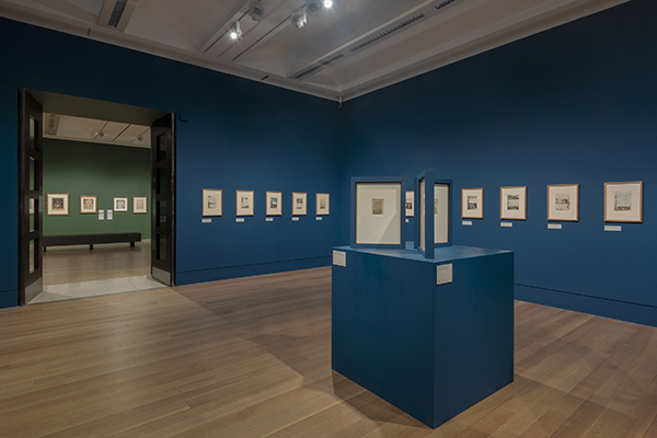
Room 2: Making Prints, Making a Living
In the second section of the exhibition, a selection of Blake’s illuminated books in a vitrine at the center of the room showcased their range and scale through copies that survive in their early bindings, while disbound impressions of some of the designs were hung on the opposite wall under the title “Books of Designs.” The vitrine featured a late copy of The Book of Urizen (G), decorated with watercolor and gold leaf, reflecting the style that appealed to collectors associated with the Roxburghe Club, who might seek Blake’s illuminated books “as knowing surrogates for archaic manuscripts and incunabula” (Myrone, catalogue 83). A spectacular full-page design (plate numbered 14) showed how Blake’s late illuminated printing emulated the print gallery format through books printed on the recto only. Next to it stood two copies of Europe: copy A open to the title page and copy E open to the ending, to contrast the gallery style with the more bookish look of the two-page spread associated with recto-verso printing. On the other side of the vitrine were The Book of Thel (copy I), For Children (copy E), the tiny emblem book gifted by Fuseli to the young daughter of one of his friends, and There is No Natural Religion (copy B). The copy of The Marriage of Heaven and Hell acquired by the print collector Francis Douce, open to the title page and facing “Our End Is Come,” repurposed as a bespoke frontispiece, was next to John Linnell’s copy, open to the “Memorable Fancy” about the printing house in hell.
Plates from the Books of Designs occupied most of the wall facing the entrance and the adjacent partition wall. The information panel explained that Blake “had more success selling his watercolours and individual prints. He produced several groups of prints taken from the illuminated books, with the texts masked out.” One such collection was described as a “small quarto volume of twenty-three engravings of various shapes and sizes” in 1828,John Thomas Smith, Nollekens and His Times, 2 vols. (London: Colburn, 1828) 2: 480. but the tendency to identify such works as Books of Designs limits their potential to circulate as “visual compendiums of plates detached from literary contexts” (Myrone, catalogue 63) or as illustrations inserted into other books in what was a more mobile and hybrid book culture in which the boundaries between books were less stable and definite. The claim on the information panel that this printing initiative “reimagined the plates as independent works of art” was borne out by the wall hang, but the pressure of the book environment was reflected in inconsistent captions that often reattributed the designs to the illuminated books that they were originally produced for.
The display started with two plates tagged as the frontispiece and plate 4 of Visions of the Daughters of Albion, from the Tate’s collection, followed by “Urizen, Plate 3” from the British Museum Department of Prints and Drawings. The subsequent plate was tagged “Small Book of Designs, Plate 7, ‘Of life on his forsaken mountains,’” following the habit of a prints and drawings department to identify a plate by the first line of text, although in this case the practice turns the plate into a ghost of its former bookish instantiation, since none of the text can be found on this design.British Museum, Department of Prints and Drawings, 1856,0209.431; the first line is taken from the corresponding plate of The First Book of Urizen, BM 1859,0625.66. The British Museum mounts often included multiple items within a single frame, visible through windows narrowly cut around the printed area. This conservation practice forecloses the identities of these prints as individual works on paper. By contrast, the Tate’s own separate plates hanging on the adjacent partition wall were framed in such a way as to show the full page including the margin, which emphasized their palpable paper format and identity as detached pieces.
The Tate’s plates from Small Book copy B are remarkable for the poetic inscriptions added in manuscript in the bottom margins, though these were not registered in the captions, which here too identified the plates through reference to the original books for which the designs were produced. The image of a female seated on the ground, bent over to attend to two miniature figures, one of them a small child, is inscribed with the line “‘Doth God take Care of these.’” While the gallery caption redirected the viewer to “The Book of Thel, Plate 6,” the allusive inscription invited us to think about it anew. Religious viewers would recognize Blake’s biblical allusion to “Doth God take care for oxen” (1 Cor. 9.9), extracted from a passage commenting on the Law of Moses, which is important to Blake’s Proverbs of Hell. The most striking image in this series was perhaps the one captioned “First Book of Urizen, Plate 21” and inscribed with the Miltonic-sounding “‘Fearless tho in pain’ / ‘I travel on.’” Compared to the British Museum version captioned “Small Book of Designs, Plate 7” on the adjacent wall, the watercolor detailing suggests that the bearded figure may have aged, while the lion’s facial features have become more unmistakably anthropomorphic, perhaps registering Blake’s interest in physiognomy as then developed in the visionary heads. To convey “‘Vegetating in fibres of Blood,’” the design labeled “First Book of Urizen, Plate 15,” Blake used red to mark out the back of a kneeling figure whose body seems to melt into the red globe beneath. The wall ended with a plate captioned “First Book of Urizen Plate 6,” bearing the inscription “‘I sought Pleasure & found Pain’ / ‘Unutterable.’” Mouth open and eyes popping out in surprise and terror, the expressive figure compressed in this plate shaped the viewer’s engagement with the series, functioning as an ending or an alternative beginning, depending on the direction of travel along the wall. Evidence of stitching suggests that these plates were once bound,Martin Butlin and Robin Hamlyn, “Tate Britain Reveals Nine New Blakes and Thirteen New Lines of Verse,” Blake 42.2 (fall 2008): 52-72 (see 54-57). thus producing a book of emblems, and the exhibition captions identified them as variants of the illuminated books. However, in their disbound form as a series hanging on the wall they broke away from their bookish sequences and identities and articulated new visual possibilities shaped by different ways of seeing in different directions and from different angles.
To the left of the “Books of Designs,” the viewer could be guided leftward by the powerful outstretched hand of Lucifer and the Pope in Hell (1794–96), a vivid color print that elegantly echoes the gesture that points Lucifer/the King of Babylon toward a group of crowned heads in the adjacent pen and gray wash drawing “Hell beneath is moved for thee, to meet thee at thy coming” (Isaiah 14.9) (c. 1780–85). This juxtaposition of pictures showed Blake’s stylistic evolution in handling his denunciation of kingship and priestcraft in different media, but it also led us backward into the gray-tone world of his earlier historical watercolors and the vitrines detailing the commercial work by which he made his living.
The commitment to reconstructing the material conditions that shaped artistic careers was underpinned by Myrone’s discussion of “how the socially determined temporalities experienced by different artists might direct those choices that might otherwise appear to be freely made: genre, scale, manner, even technique” (catalogue 54), and by admirably detailed research on the professional geographies of Blake’s London in the catalogue. These details shaped the financial information provided around the commercial book engraving vitrine, where the viewer was invited to reflect on Blake’s earnings as a commercial book engraver in comparison to a tradesperson or shopkeeper with a likely income of £80-150 a year and a middle-class professional earning £200-500 a year. Captions informed us that Blake is likely to have been paid £21 for engraving Thomas Stothard’s design of Clarence’s dream for William Enfield’s The Speaker (1780), over £100 for his plates for the Wit’s Magazine (1784), £53 for his large engraving after William Hogarth’s The Beggar’s Opera for John Boydell (1790), £25 for engraving “Fertilization of Egypt” after Fuseli for Erasmus Darwin’s The Botanic Garden (1791), over £330 for his thirty-two illustrations to Mary Wollstonecraft’s translation of C. G. Salzmann’s Elements of Morality (1791), £10 for ten drawings and over £120 for the engravings illustrating Wollstonecraft’s Original Stories from Real Life (1791), and “about £50” for the small plates after Fuseli for The Plays of William Shakspeare (1805). The display of illustrations to John Gabriel Stedman’s Narrative, of a Five Years’ Expedition, against the Revolted Negroes of Surinam (1796) was accompanied by a “Content Warning: a work in this showcase depicts the brutal treatment of an enslaved person.” Alongside this trigger warning, the public was also invited to judge for themselves the racist potential of the images: “Are such images critical of colonial exploitation, or do they participate in it?” These illustrations were placed in proximity to the 1792–93 watercolor Los and Orc, which documented how Blake used the chained slave motif in different media and contexts, including the “Preludium” to America a Prophecy, on view in the second part of the room.
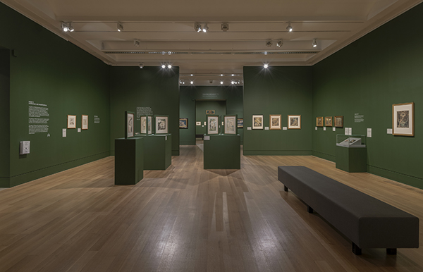
The Songs of Innocence and of Experience were presented on the threshold to the second section of the room through a vitrine showing copy S, decorated with gold, open to “The Tyger,” chosen for being Blake’s best-loved poem. Later in the exhibition’s run the page was turned to “The Little Black Boy,” with a careful caption detailing the racial issues involved in contrasting black and white: in representing skin color as “but a cloud” (E 9), the poem “reflect[s] the racist European conventions of the period.” The caption concluded that “it is impossible to say whether Blake is endorsing or questioning this viewpoint.” On the wall, color prints of designs from “The Shepherd” and “Spring” from the Yale Center for British ArtPaul Mellon Fund, B1978.1.2 and B1978.1.1. came across as richly decorated miniatures, while the center of the room was taken up by a different kind of display that evoked an open book by placing three two-sided stands on plinths that enabled viewers to see both sides of each leaf from a disbound copy of Songs of Innocence (copy X, National Gallery of Victoria), printed in green ink and colored with a luminous blue wash.
While the stands encouraged intimate viewing and reading of the disbound copy of Songs, different viewing formats presented America: a frontispiece from the Fogg Art Museum suggested an independent art work, a bound copy (copy a) open to canceled plate c in a vitrine referenced the work as a book, and finally the eighteen plates from the splendid disbound copy M occupied all four walls of the room. Displaying one leaf next to the other along the wall meant adapting the medium of the book to the medium of painting, which can only present actions by placing bodies next to one another in space, as G. E. Lessing argued. Hanging America as a series of plates supported different ways of seeing, from the panoramic view to slower-paced kinds of engagement that alternated and combined viewing and reading, one plate at a time. The choice harked back to the installation of the whole 100 plates of Jerusalem in the Tate’s 2000–01 retrospective and of Europe a Prophecy at the Petit Palais in Paris in 2009 and at the Ashmolean in Oxford in 2014–15. The Jerusalem hang of 2000–01 was criticized for its visual monotony.David Bindman, “William Blake: London and New York,” Burlington Magazine 143.1176 (March 2001): 172-74. Art historians and curators might object to the time required to view and read such “walls of words,” which may run counter to the functioning of the exhibition as a medium, since it slows down the rhythm of people’s progress through space. On the other hand, book people might say that this mode of display neuters the book as a reading tool. These different points of view demonstrate that Blake’s illuminated books are hybrid objects that offer different aesthetic experiences through different modes of perception.
Room 3: Patronage and Independence
“I call myself now Independent. I can be Poet Painter & [written over f ] Musician as the Inspiration comes,” Blake wrote to his friend George Cumberland in 1800.Transcribed in Robert N. Essick and Morton D. Paley, “‘Dear Generous Cumberland’: A Newly Discovered Letter and Poem by William Blake,” Blake 32.1 (summer 1998): 4-13; discussed in Sarah Haggarty, Blake’s Gifts: Poetry and the Politics of Exchange (Cambridge: Cambridge University Press, 2010) 44. That year he exhibited at the Royal Academy a large tempera, with his name marked in the catalogue as “H” for “honorary,” meaning “not expecting to derive a living from the practice of art.” Myrone points out that “the moment at which Blake might justifiably consider himself to be an artist, in the sense that we might consider to define professional status, is also the moment that he disavowed professional standing” (catalogue 105). This new phase in his career as an artist occupied a large gallery divided into three sections, dedicated to the works he produced for patrons. In contrast to the blue-sky room devoted to the illuminated books, “Patronage and Independence” was painted a vivid green, perhaps to allude to Blake’s preference for the “Green House” of Thomas Butts as opposed to the “cold gallery of fashion” (E 724). Myrone vividly reconstructs the social profiles of Blake’s patrons in the associated catalogue chapter: Butts, “a clerk in the office of the Commissary General of Musters … running a boarding school for girls with his wife, Elizabeth, the daughter of a carver and gilder but trained as a schoolmistress”; Cumberland, “a clerk in the Royal Exchange Assurance Company, while spending time as a student at the Royal Academy”; Elizabeth Ilive, “the daughter of an Oxford printer and school teacher, who became the mistress of the Earl of Egremont at Petworth” and then his wife; the Reverend Joseph Thomas, “a sometime naval chaplain” who married well enough “to indulge his interests in art collecting and preparing his book of religious emblems without having a church appointment”; John Flaxman, “the son of a successful plaster-figure maker”; and William Hayley (catalogue 85).
A display on the right-hand side of the room showcased an alternative book medium: while the prospectus of 1793 had advocated illuminated printing as a uniform medium that combined poet and painter, Flaxman’s commission to decorate a copy of Thomas Gray’s poems for his wife in 1797 resulted in a work that stages the separation of media, as Gray’s letterpress text is disbound and mounted in larger leaves decorated with splendid watercolor and pen and ink drawings. The format was inspired by the 537 preliminary watercolors that Blake produced for an illustrated edition of Edward Young’s Night Thoughts (1797). A vitrine in the corner showed a hand-colored copy of the 1797 Night Thoughts edition owned by John Soane, open to the arresting scene of darkness “brooding o’er unfinish’d fates / With raven wing incumbent” around the letterpress text, while the river of souls flows in the bottom margin. The facing page shows “angels sent on errands full of love” to relieve the grieving (pp. 54-55). It would have been wonderful to be able to compare some specimen of the original watercolor series for Young with the Gray watercolors, though probably there was a limit on loans from the British Museum Blakes. Like the National Gallery of Victoria Songs, the disbound pages from Gray’s Poems were mounted on two-sided stands on plinths, evoking the form of an open book that viewers could circumnavigate. The selection loaned by the Yale Center for British Art included a youthful swan-riding poet soaring in the blue sky, painted in the margins of the title page to allude to Gray’s Pindaric endeavors, while walking around to the other side of the leaf we saw the poet seated in the pose of a Michelangelesque prophet, with the blank back of the letterpress title page inscribed with Blake’s list of titles of designs and an address to the reader in the bottom margin, “Around the Springs of Gray my wild root weaves / Traveller repose & Dream among my leaves.” In addition to the title page and the envoy poem to the dedicatee, Ann Flaxman, the display included the designs for “Elegy Written in a Country Church-Yard.” Blake’s pictorial marginalia surround the printed words of the poet, confronting “the short and simple annals of the poor,” capturing “a flower” “born to blush unseen / And waste its sweetness on the desert air,” and giving voice to “some mute inglorious Milton.” The process of extra-illustration places pages of Gray’s text above the scenes of plowing and harvesting that Blake drew in the lower margins of pages 5 and 6 of the poem. The elevated position of the words dramatize social inequality, differentiating the poet’s work from the laborer’s: while the poet has the prospect view and leisure time necessary for the practice of sympathy and philosophical abstraction, the laborer is bent downward, engaged in manual work that keeps him focused on repetitive detail, his outlook confined like a work animal limited to seeing through “narrow chinks” (E 39). If we take plowing as a metaphor for engraving, Blake might have used these images to reflect on and denounce the social inequality structuring the distinction between poet and illustrator, invention and execution.
The first thing that struck the eye upon entering the “Patronage and Independence” room was the extraordinary series of biblical watercolors on the facing wall. The Number of the Beast is 666 features a seated, naked, horned, multiheaded figure looking up to and perhaps addressing a bat-winged multiheaded horned beast at the center of the composition. The figure facing away may involve a satirical allusion to Moses’s access to the divine (“Thou shalt see my back parts,” Exod. 33.23), yet it fails to interrupt direct access to the beast; in fact, it may function as a proxy, offering a sense of scale and a vicarious place for the viewer in the composition.In my analysis of the figure as a proxy for the viewer I follow Joseph Leo Koerner, rather than the face-to-face structure of sympathy discussed by Steven Goldsmith: see Koerner, Caspar David Friedrich and the Subject of Landscape, 2nd ed. (London: Reaktion Books, 2009) 190-94, 210-13, 245; Goldsmith, “(Without) Sympathy,” William Blake in Context, ed. Sarah Haggarty (Cambridge: Cambridge University Press, 2019) 333-44. The brilliant curatorial hang made the most of its demonic outstretched hand, for this powerful gesture extends outside the boundaries of the painting, turning the viewer’s option to go left or right into a sort of choice of Hercules: those of us who were of the demonic party would follow the outstretched hand inviting the beast and us to turn our eyes to the left and encompass the full frontal heroic male body of The Great Red Dragon and the Beast from the Sea. A great counterpart to this drawing might have been Ezekiel’s Wheels,Butlin, The Paintings and Drawings of William Blake, 2 vols. (New Haven: Yale University Press, 1981) no. 468, c. 1803–05, Museum of Fine Arts, Boston, 90.108. revealing a striking similarity in color and composition, which suggests that the multiform demonic body of the Red Dragon is close to the fourfold body seen in the vision of the Merkabah, variants in the collective body of the eternals. Instead, what we found when we turned to the right was the more feminine and ambiguous Apollonian radiance of Satan in His Glory: “Thou Wast Perfect Till Iniquity Was Found in Thee,” winged like a cherub, which introduces the demonic mutation of angel into devil, but in this context mediated the transition from the demonic visions of Revelation to the Christological world of the Gospels as we moved toward the stunning dark compositions of The Magdalene at the Sepulchre, The Crucifixion, The Entombment, and The Angel Rolling Away the Stone. Blake’s miniature portraits of Thomas and Elizabeth Butts, placed next to The Great Red Dragon, introduced the owners of the biblical watercolors hanging in this section. Myrone points out David Bindman’s suggestion that these watercolors may have been produced with a view to extra-illustrating a Bible (catalogue 98).Malcolm Cormack, William Blake: Illustrations of the Book of Job, with an afterword by David Bindman (Richmond: Virginia Museum of Fine Arts, 1997) 76-77. That is what happened to The Conversion of Saul, on display elsewhere in the room, which used to be in the Kitto Bible among 30,000 other biblical subjects, including Blake’s engraving of “Fertilization of Egypt” and engravings from The Grave.The Conversion of Saul was inserted as leaf 10173 into volume 56 of The Holy Bible, Illustrated by J. Gibbs, a copy of John Kitto’s The Pictorial Bible, 3 vols., augmented to sixty volumes (Huntington Library, call no. 49000). Essick catalogues the Blakes in the Kitto Bible in The Works of William Blake in the Huntington Collections 121-22, 154-55, 174, 206, 210, 217-18, 222. As with the plates associated with the Books of Designs, here we saw the alternative possibilities of Blake’s designs as a series. Three temperas displayed to the left of the Butts portraits completed the biblical sample, selected from up to 200 works that the Butts owned, some perhaps displayed in Elizabeth’s school. Behind Saul an intermediate room was beautifully hung with impressions of the large color prints—whose only known contemporary collector was Butts—conveying how they reinterpret the format of pictorial cycles for Renaissance palaces in a medium and at a scale to fit “the decent-sized house of a senior civil servant … heroic art reduced to the private realm” (Myrone, catalogue 115).

Work commissioned by Thomas was comprehensively represented, from the Miltonic series of twelve designs for Paradise Lost (1807) on loan from the Huntington to six for “On the Morning of Christ’s Nativity” (1809) from Manchester. Four of Blake’s six contributions to Thomas’s extra-illustrated folio of Shakespeare, commissioned in 1801 together with Comus but executed between 1806 and 1809,The terms of the commission are detailed in the postscript to a letter from Flaxman to Hayley, 31 July 1801, quoted in Marcia Allentuck, “Blake, Flaxman, and Thomas: A New Document,” Harvard Library Bulletin 20 (1972): 318-19. were hung at the other end of the room. These works were inserted into a second folio embellished with works by painters including William Hamilton, Flaxman, Robert Ker Porter, and William Mulready between 1801 and 1809. Seeing them as a series, rather than as parts of the book, reflected their archival history, since the British Museum has taken them out of the book and classified them under the name of the artist.See British Museum 1954,1113.1.11, 1954,1113.1.21, 1954,1113.1.22, 1954,1113.1.26. The exhibition placed them under the portrait of Shakespeare that Blake produced for Hayley’s library, but it did not mention their book context otherwise, so the potential for comparison with the work of other artists included in the extra-illustrated folio was not available to the viewer. Imagining these works in connection with Hayley’s library in Sussex makes sense, given that they were commissioned during Blake’s stay at Felpham by way of correspondence between Hayley and Flaxman.
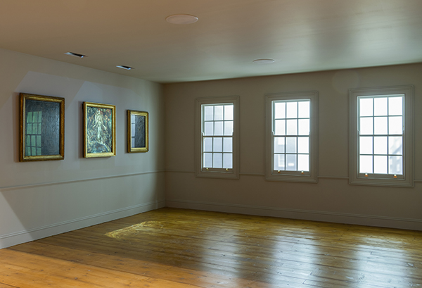
The final part of the room was introduced by a vitrine in the middle with Blake’s relief-etched Milton (copy D) from the Rosenwald Collection, open to the plate in which he inscribes his name and home in the prophecy: “Blakes Cottage at Felpham.” This extraordinary visionary miniature showing the poet addressing the Virgin Ololon descending through midair guided our perception of the works Blake produced in Sussex; it faced the radiant watercolors that register his new experience of the sea, which were framed by the stunning chimney panels Evening and Winter, produced for the Norfolk rectory of the Reverend John Johnson, William Cowper’s cousin. The heads of the poets Shakespeare, Spenser, Cowper, Milton, and Dante, commissioned for Hayley’s library, were hung high on three sides. To the left, beneath the portrait of Milton, were the tempera Satan Calling Up His Legions, inspired by Paradise Lost, and the watercolor The Vision of the Last Judgment (1808), which Blake produced for Elizabeth Ilive, the Countess of Egremont. The choreography of this swirling composition of bodies converges in an opening that suggests a vulva at the center of the picture beneath the more conventional figure of the Lord unrolling a scroll above. This feminine articulation of the other world celebrates families going to heaven, including a female figure surrounded by six children, thought to represent Ilive herself with her surviving children with the earl, their short marriage being over by 1803.Andrew Loukes, “‘Under a fortunate star’: The Petworth Blakes in Context,” William Blake in Sussex: Visions of Albion, ed. Loukes (London: National Trust, in association with Paul Holberton Publishing, 2018) 58, 60. Hung in the corner, before the opening to the next room, The Vision of the Last Judgment announced Blake’s illustrations to Robert Blair’s The Grave in the following section.
Room 4: Independence and Despair
“Independence and Despair” was introduced by Thomas Phillips’s 1807 portrait of Blake, eyes turned upward, envisioning a visit from the Archangel Gabriel, who “‘stood in the sun, and beckoning to [him], moved the universe.’” For Amy Concannon, “Phillips’s portrait marks the beginning of a period in which Blake, too, sought to stand in the sun: to actively seek a larger public for his work, to rejuvenate his professional profile and claim his place in the London art world” (catalogue 133). The portrait was exhibited at the Royal Academy in 1807, then engraved as the frontispiece to Blake’s illustrations to Blair’s The Grave (1808), commissioned in 1805 by Robert Hartley Cromek. Cromek obtained an impressive list of 589 subscribers, including the president of the Royal Academy, Benjamin West, the professor of painting, John Opie, the architect Sir John Soane, the engravers Thomas Bewick and John Landseer, and patrons such as Thomas Hope and William Locke: “This was the greatest show of support from the art world that Blake was ever to receive in his lifetime” (Concannon, catalogue 140). The volume’s marketing also included a dedication to Queen Charlotte. Blake’s work on The Grave was richly documented in the exhibition with copies of the book, with the respective drawings hanging around them on the wall. Looking down, we could peruse in a vitrine the Egremonts’ copy, open to “The Death of the Good Old Man,” and Soane’s copy, with “Christ Descending into the Grave,” while, lifting our eyes from the pages, we could look at the corresponding designs in ink, watercolor, and graphite on the wall, thus comparing Schiavonetti’s engravings to Blake’s originals. This elegant display allowed us to experience the different modes of address by which Christ walks toward the viewer in a horizontally displayed design functioning as an illustration in a book or a vertical view of a composition on the wall. The hang of the watercolors demonstrated a claim made in the volume’s description of the engravings: “These Designs, detached from the Work they embellish, form of themselves a most interesting Poem.”Robert Blair, The Grave, a Poem. Illustrated by Twelve Etchings Executed from Original Designs (London: Printed by T. Bensley … for the proprietor, R. H. Cromek … and sold by Cadell and Davies [et al.], 1808) 33. The beautiful sequence hung along three walls included—in addition to The Death of the Good Old Man and Christ Descending into the Grave—Death of the Strong Wicked Man, The Soul Hovering over the Body Reluctantly Parting with Life, and The Counseller, King, Warrior, Mother & Child, in the Tomb, as well as an alternative title page from the Huntington and subjects that were not engraved in the book. The exhibition documented the Spanish reception of the designs by displaying José Joaquín de Mora’s Meditaciones poéticas (1826).
Blake’s “Chaucers Canterbury Pilgrims” was hung at the other end of the room. At that point his relationship with Cromek had turned sour. The deterioration was already clear early on in the Blair commission, which quickly shifted from both invention and execution to the designs only, with Schiavonetti employed for the engravings. The conflict emerging from Cromek’s concurrent Chaucer project was brilliantly visualized by the curatorial hang of Blake’s original engraving from 1810 and a later impression of Blake’s plate sometime prior to 1881 hung on either side of the competing engraving (1809–17) by Schiavonetti and James Heath after Stothard’s The Pilgrimage to Canterbury, published by Cromek. First, the pilgrims’ processions depicted in the two original engravings collided into each other, whereas the two compositions took opposite paths when we turned to look at the Cromek pilgrims next to the later impression of Blake’s engraving. Blake’s high stakes in “Chaucers Canterbury Pilgrims” are clear from his 1809 prospectus, where he looks back to Dürer “and the old original Engravers, who were great Masters in Painting and Designing, whose method, alone, can delineate Character as it is in this Picture, where all the Lineaments are distinct” (E 567). While the second prospectus markets the engraving for its precision and attention to historical detail down to “every particular of Dress or Costume” (E 568), in A Descriptive Catalogue of Pictures, Poetical and Historical Inventions (1809) Blake celebrates his painting of the pilgrims as eternal “characters which compose all ages and nations,” “physiognomies or lineaments of universal human life,” and “visions of the eternal attributes, or divine names, which, when erected into gods, become destructive to humanity” (E 532-36). His investment in the subject is evident in his return to “Chaucers Canterbury Pilgrims Being a Complete Index of Human Characters as they appear Age after Age” as the starting point for a virulent, wide-ranging attack on commerce and patronage, calling on artists to “Resist the Contemptible Counter Arts” (E 580), in the manuscript “Public Address” penned in the Notebook around 1809–10.
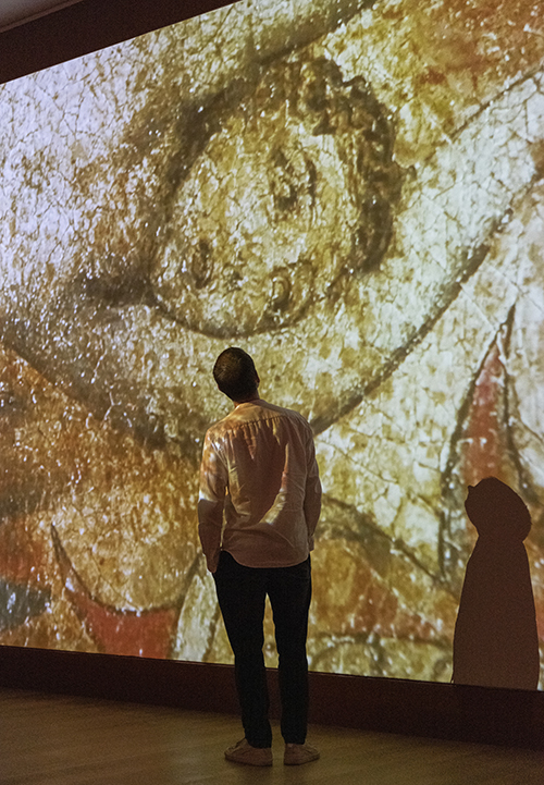
The Descriptive Catalogue was central to the Tate’s powerful reconstruction of the exhibition of 1809. “Mr. B. appeals to the Public, from the judgment of those narrow blinking eyes, that have too long governed art in a dark corner” (E 529). Darkness barely visible indeed governed the recreation of the exhibition.
After the historical reconstruction of the actual exhibition space, digital experiments captured the tensions that shape the dialectic of scale in the Descriptive Catalogue: “The Artist has endeavoured to emulate the grandeur of those seen in his vision, and to apply it to modern Heroes, on a smaller scale” (E 531). This statement invokes the performative power of the viewer to reimagine Blake’s works, using his drawings as sketches or models for gigantic works and imagining what British visual culture might look like if Blake had realized his visions on a larger scale. How can the “grandeur” of “those wonderful originals seen in my visions, … some of them one hundred feet in height” (E 531) be captured within the space of the modern exhibition? Moving from the desperate darkness of the 1809 exhibition along the wall marked out to register the empty space that might have been occupied by Blake’s lost largest canvas, The Ancient Britons, and past his largest extant canvas, An Allegory of the Spiritual Condition of Man (1811?), viewers were confronted with counterfactual experiments in perception in which the curators attempted to translate his work to the scale envisaged in the Descriptive Catalogue. A screen showed the apotheoses of Nelson and Pitt magnified to a hundred feet in height, emulating “oriental apotheoses.”
The location of Blake’s exhibition outside the main trajectories of art appreciation is documented through an admirable discussion of the professional and trade associations of the Broad Street address, also pointing out how Blake’s choice of media, and his refusal to paint in oils in particular, foreclosed exposure through the exhibitions that shaped artists’ professional recognition (Concannon, catalogue 153-54). As we turned to enter the final section of the exhibition, the transition to the next phase of Blake’s life was elegantly marked on the wall by a quotation from Jerusalem that brought home the apocalyptic geography of Blake’s fourfold London eternal: “The Corner of Broad Street weeps; Poland Street languishes / To Great Queen Street & Lincolns Inn, all is distress & woe” (84.15-16, E 243).
Room 5: “‘A New Kind of Man’”
The title of this section comes from Alexander Gilchrist’s collection of testimonies from a younger generation of artists gathered around Blake, who saw him as “a new kind of man, wholly original.”Francis Oliver Finch, a pupil of John Varley’s, quoted in Gilchrist 1: 299, quoted in Concannon, catalogue 161. His reputation as a “grey-haired visionary” was exemplified by works chosen from over 100 visionary heads, including the spectacular tempera The Ghost of a Flea (c. 1819–20), which Blake supposedly saw in his nocturnal visions and penned on paper for John Varley, who published a selection engraved by Linnell in his Treatise on Zodiacal Physiognomy (1828). Linnell’s observation that Varley “believed in the reality of Blake’s visions more than even Blake himself” leads Concannon to suggest that Blake “was thus enticed to perform with verve his role as the visionary artist” (catalogue 164). While Linnell’s pencil portrait of Blake during a walk through Hampstead is characterized by “informality and intimacy” (161), the language of the visionary prophet shapes the recollections of Blake’s followers. Younger artists would congregate at “The House of the Interpreter”; for Samuel Palmer he was “one of the Antique patriarchs.”Gilchrist, 1: 300; A. H. Palmer, The Life and Letters of Samuel Palmer (London: Seeley, 1892) 9, quoted in Concannon, catalogue 161.
The first part of this section focused on works that were shaped by Blake’s crucial encounter with Linnell in 1818. Linnell’s role as a patron and mediator is explored through his copies of seventeen exquisite miniature woodcuts that Blake produced for The Pastorals of Virgil, with a Course of English Reading, Adapted for Schools (1821), a Latin textbook published by Linnell’s family doctor, Robert Thornton. A vitrine documented Blake’s Illustrations of the Book of Job, commissioned by Linnell in 1823 and published in 1826. The watercolor series produced for Butts c. 1805–06 was unfortunately not represented in the exhibition, nor was the second series, traced for Linnell in 1821, nor the Fitzwilliam sketchbook in which the original watercolor compositions were reduced to the scale used for the engravings. While these engraved works were given great emphasis in the 2014–15 Ashmolean exhibition, which had a whole section devoted to Blake’s late printing in relation to the reception by Palmer and Edward Calvert in particular, what dominated the Tate reconstruction of Blake’s encounter with Linnell was Dante.
Palmer remembered Blake as “the Maker, the Inventor; one of the few in any age: a fitting companion for Dante.”Quoted in Gilchrist 1: 301. Linnell’s commission to illustrate Dante’s Commedia occupied the last years of Blake’s life (1824–27), producing an unfinished series of 102 drawings in ink and watercolors, sketched in a large folio, illustrating seventy-two subjects from Hell, twenty from Purgatory, and ten from Paradise. The National Art Collections Fund bought the Linnell Dantes in 1918 and divided them among seven collections in the UK, USA, and Australia. The exhibition represented the Dante series through a powerful selection that supplemented the Tate’s own splendid designs with loans from the National Gallery of Victoria, the Ashmolean, and the British Museum. The captions did not include references to the relevant cantos from Dante’s Commedia, despite the fact that Blake carefully noted them in the bottom foreground of each design. The choice to adopt the titles given to these drawings by William Michael Rossetti in Gilchrist’s Life (1863) paved the way for seeing them as independent works, rather than illustrations that follow the sequence of the text.
The display started with The Inscription over Hell-Gate, Plutus, The Symbolic Figure of the Course of Human History, and The Simoniac Pope (Inferno 3, 7, 14, 19). Blake’s fascination with the metamorphosis of thieves into serpents led him to produce a sequence of eight illustrations for Inferno 24-25 to capture the metamorphoses through dramatic points in time.On this sequence, see my “Bestial Metamorphoses: Blake’s Variations on Transhuman Change in Dante’s Hell,” Beastly Blake, ed. Helen P. Bruder and Tristanne Connolly (Cham: Palgrave Macmillan-Springer, 2018) 153-81. While these were dispersed among different collections in 1918, the exhibition reunited the Tate’s The Serpent Attacking Buoso Donati with a rich loan from the National Gallery of Victoria. However, the logic of the hang sometimes broke up direct connections for the sake of alternating vertically and horizontally oriented drawings. Curatorial choices privileged the visual resonance between the horizontal form of Cerberus, the three-headed dog that guards access to Hell (Inferno 6), and the blasphemer Capaneus (Inferno 14), placing these two designs around the vertical form of Vanni Fucci “Making Figs” against God (Inferno 25.1-15).
Vibrant coloring connects Blake’s Dante to the set of twenty-eight Pilgrim’s Progress watercolors, another wonder of this exhibition, once owned by Richard Monckton Milnes, then acquired from the Crewe collection for the Frick in 1941, but harder to see since it was deaccessioned in 1996 and acquired by a private collector. While Robert Essick attributed the lack of enthusiasm for the series when it went on the market to Catherine Blake’s coloring,Essick, “Blake in the Marketplace, 1996,” Blake 30.4 (spring 1997): 100, referring to Butlin, Paintings and Drawings 1: 599-606, who indicates that this attribution goes back to Rossetti’s catalogue in Gilchrist 2: 235-36. renewed attention to the gendering of labor in artistic households and recent scholarship on Catherine shaped the reassessment of her “creative and practical influence” (Alex Farquharson, catalogue 6) as part of the exhibition’s mission to focus on Blake’s career as an artist.Angus Whitehead, “‘an excellent saleswoman’: The Last Years of Catherine Blake,” Blake 45.3 (winter 2011–12): 76-90; Mark Crosby and Angus Whitehead, “Georgian Superwoman or ‘the maddest of the two’? Recovering the Historical Catherine Blake, 1762–1831,” Re-envisioning Blake, ed. Crosby, Troy Patenaude, and Whitehead (Basingstoke: Palgrave Macmillan, 2012) 83-107; Morton D. Paley and Mark Crosby, “Catherine Blake and Her Marriage: Two Notes,” Huntington Library Quarterly 78.3 (2015): 479-91; Ashley Reed, “Craft and Care: The Maker Movement, Catherine Blake, and the Digital Humanities,” Essays in Romanticism 23.1 (2016): 23-38. This shift was palpable from the first room of the exhibition, where the couple was presented through a delicate pencil portrait of Catherine placed next to William’s. Concannon points out her role in printing and coloring illuminated books and engaging with patrons, as well as her practical management. After Blake’s death she “continued to work as ‘an excellent sales-woman’, building on her husband’s legacy by printing and colouring his illuminated books, just as she had done in his lifetime” (catalogue 197).For a different viewpoint, see Joseph Viscomi, “Posthumous Blake: The Roles of Catherine Blake, C. H. Tatham, and Frederick Tatham in Blake’s Afterlife,” Blake 53.2 (fall 2019): 141 pars.
Jerusalem had pride of place in the final room, with a two-sided stand with proof impressions of plates 28 and 35 from the Yale Center for British Art mediating the transition from the Dante area, a vitrine in the middle of the room showing copy H open to the frontispiece—a traveler entering the door to the interior of the book—and the whole disbound copy B, comprising twenty-five plates, displayed in a long vitrine against the wall. Relief etched in light brown with black and blue washes, this copy was once owned by another associate of Linnell’s, the writer, collector, forger, and poisoner Thomas Griffiths Wainewright, whose collection of Blake books was perhaps the largest during the artist’s lifetime.G. E. Bentley, Jr., “William Blake and His Circle: A Checklist of Publications and Discoveries in 2001,” Blake 36.1 (summer 2002): 6. Joseph Viscomi has argued that this copy included only the first twenty-five plates in order to approximate the formats of Europe and America, with which it was bound around 1821.Bentley, Blake Books (Oxford: Clarendon Press, 1977) 102, 258-59; Viscomi, Blake and the Idea of the Book (Princeton: Princeton University Press, 1993) 352-56. Wainewright comes up in the exhibition captions and the catalogue in association with the suggestion that later printings of Blake’s illuminated books appealed to collectors as surrogate or facsimile illuminated manuscripts (Myrone, catalogue 82-83). This possibility can be evinced from Wainewright’s early account of Jerusalem in the London Magazine: Dr. Tobias Ruddicombe, M. D. is, at my earnest entreaty, casting a tremendous piece of ordnance …. It is an account of an ancient, newly discovered, illuminated manuscript, which has to name ‘Jerusalem the Emanation of the Giant Albion!!!’ It contains a good deal anent one “Los,” who, it appears, is now, and hath been, from the creation, the sole and fourfold dominator of the celebrated city of Golgoonoza! The doctor assures me that the redemption of mankind hangs on the universal diffusion of the doctrines broached in this M.S.Janus Weathercock [Thomas Griffiths Wainewright], “Mr. Weathercock’s Private Correspondence, Intended for the Public Eye,” London Magazine 2.9 (September 1820): 299-301 (see 300) (italics mine). The italicized part of this quotation was reproduced on the wall above the vitrine, together with other early mentions of Jerusalem, such as an 1811 entry from Henry Crabb Robinson’s diary, the Lady’s Monthly Museum reaction to specimens displayed in 1812, and descriptions from J. T. Smith’s (1828) and Allan Cunningham’s (1830) biographical accounts. Myrone claims that Wainewright’s “unexpectedly playful notice” was an unsuccessful “puff” that failed to provide customers for Blake (catalogue 14, 83), but the context spells out Blake’s place as another “new kind of man” within the Cockney counterculture of the London Magazine. Penned under the pseudonym of Cockney art critic and bibliomaniac Janus Weathercock, Wainewright’s early parodic appreciation of Jerusalem registers and debunks the pretentious exclusive world of Blake’s Roxburghe collectors with a brilliant riff on the medical context of Thomas Frognall Dibdin’s Bibliomania. Wainewright’s performance, in other words, offers a fitting counterpart to Blake’s performative visionary commerce with spirits.
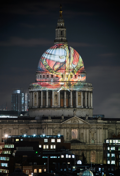
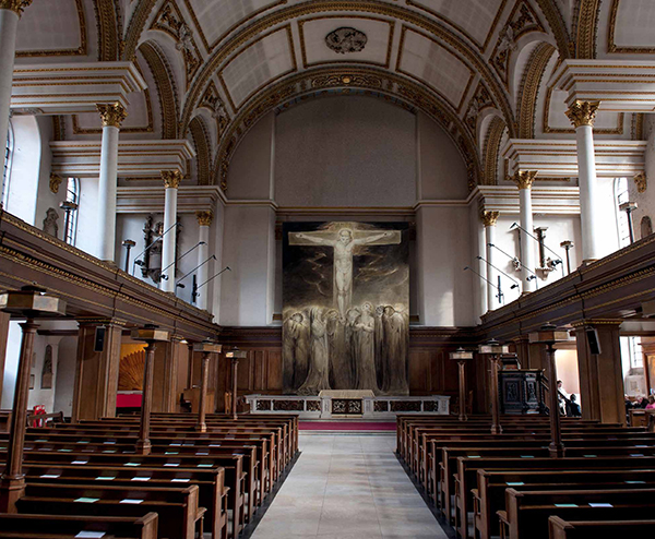
Blake’s last version of “The Ancient of Days” (University of Manchester) was symbolically placed next to the exit, but its power extended beyond the boundaries of the exhibition space, out into the city, when it was projected onto the dome of St. Paul’s Cathedral.<https://www.stpauls.co.uk/history-collections/the-collections/arts-programme/william-blake-at-st-pauls-cathedral>. Advertising temporarily granted Blake’s counterfactual wish for monumental national commissions that might realize his works “on an enlarged scale” (E 531, 549). His Descriptive Catalogue recalls the language of artists’ bids to turn St. Paul’s into a modern British pantheon for “modern heroes.”Plans for St. Paul’s as a modern pantheon are discussed in Holger Hoock, “The British Military Pantheon in St Paul’s Cathedral: The State, Cultural Patriotism, and the Politics of National Monuments, c. 1790–1820,” Pantheons: Transformations of a Monumental Idea, ed. Richard Wrigley and Matthew Craske (Aldershot: Ashgate, 2004) 81-105. Courtesy of the technique of projection bombing rather than Blake’s portable fresco, an ephemeral modern counterpart of the apotheosis lit up the London sky, a gift that marked Blake’s birthday on 28 November 2019 for four days. Illuminations had celebrated the civic splendor of the Romantic city on patriotic public occasions such as Lord Mayor’s Day, the proclamation of the Peace of Amiens, the prince’s birthday, Buonaparte’s defeats, and the coronation. On such occasions, public buildings, including Mansion House, the Bank, the Admiralty, and East India House, as well as theatres, coffee houses, and commercial premises, such as Rudolph Ackermann’s Repository of Arts, were lit by lamps and transparent paintings. The iconography included mottoes, devices, and allegorical compositions featuring crowns, royal initials, and military trophies, such as Victory crowning Wellington with laurels.See, for instance, “Lord Mayor’s Day,” Morning Post (10 November 1807), British Library Newspapers; “The Illuminations” or “Illuminations” (all military celebrations), Times (18 August 1812, 6 July 1813, 6 November 1813, 12 April 1814), Times Digital Archive. Needless to say, such patriotic displays are far from Blake’s fourfold London eternal. Projected onto St. Paul’s, the red tones of “The Ancient of Days” presented Blake’s Urizenic God as a visionary portent: for some, it marked Blake’s apotheosis as a hero of British visual culture, following his absorption into a national canon since Sir Hubert Parry’s “Jerusalem” hymn; others might see it as a form of imposition identifying St. Paul’s as the seat of priestcraft.